Posts
Updated:
Ask Jane
I answer questions I get from people who want to learn more about what it's like to work in data visualization. This post will be regularly updated as I get questions from others.
Failing to freelance in data visualization
After freelancing in data visualization for a little over a year, I decided to call it quits. I reflect on what went wrong and what you could learn from my mistakes.
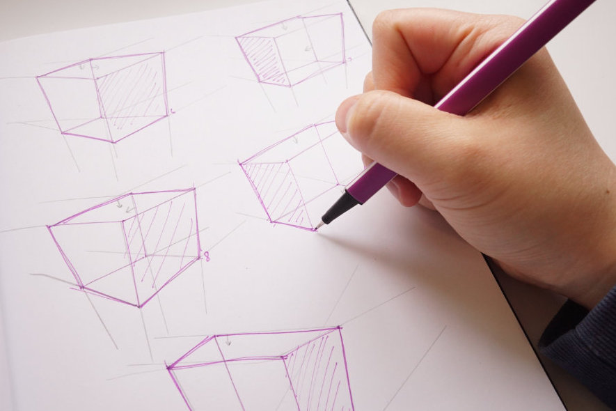
Why I'm Finally Learning to Draw
I've hit a roadblock in my dataviz creative process, so I set on a journey to learn how to draw. I embark on this new challenge motivated by my love of historical Chinese TV shows.
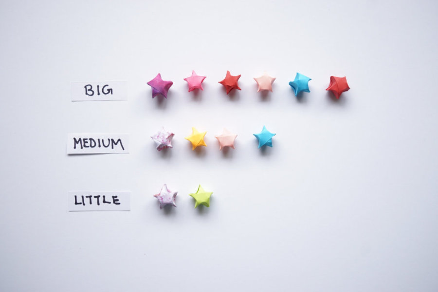
Taking a Moment to Celebrate
I created a new system where I keep track of wins I get in life with paper stars. It is a way to remind me of my progress so far through physical data visualization.
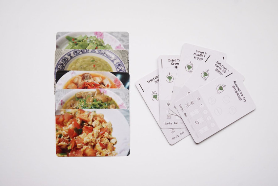
Cataloguing My Family's History Through Food
How could I show recipes beyond the standard cookbook? What are some ways I could visualize data that could last for generations to come?
Building My Hugo Website as a Noob
With very little web development skills, I spent over 80 hours learning how to put my site together with Hugo and Netlify.

Teaching My First Data Visualization Workshop in Toronto
What it was like to create my first workshop and what I learned from the experience.
