Home / Blog
Teaching My First Data Visualization Workshop in Toronto
What it was like to create my first workshop and what I learned from the experience.

Table of contents
In September 2020, I ran my first data visualization workshop in Toronto. It was a fun and challenging experience. I learned a lot about what it was like to teach data visualization and how to give feedback. I was quite surprised at how there weren’t any resources that existed publicly on how to put together a data visualization workshop. The data visualization community pumps out a lot of content regularly, but I have yet to see one about how to create and run a workshop. Maybe they exist somewhere but I couldn’t find them. To clarify, I am not saying folks who run their business selling workshops should be writing about it and sharing it publicly. I am specifically talking about people like me, who might be doing it as a one-off kind of thing. I have been told that there is a channel on the DVS (Data Visualization Society) slack on teaching that could be helpful for those who are looking for resources. I’d recommend you to join DVS and check out that Slack channel for support.
So, I am putting this together to share my experiences in hope that it can be helpful to those thinking about running a local (or remote) data visualization workshop. And, when I say workshop, I am talking about an experience where the instructor personally teaches the material live.
I want to preface this post by saying that I have zero experience running a data visualization workshop, but I have a lot of experience teaching. I used to volunteer to teach students English at my university. We ran mini classes and students could sign up for free. We held conversation circles and explained commonly used idioms. So although it was my first time running a data visualization workshop, I had skills in teaching that helped me run it smoothly. Keep this in mind as you read this post.
Why run a workshop in the first place?
It can be time-consuming to create and run a workshop, but there are a lot of upsides to them. Let’s go through them in detail.
How the workshop benefits you as the instructor
Workshops are great ways to help build expertise externally and internally. Externally, you are putting yourself out there for others to see. You become more top-of-mind so that the next time someone needs a workshop, they think about you. Top-of-mind is really important. What is the first brand of potato chips you think of when you crave them? Usually, top-of-mind is influenced by advertising and workshops are a form of that. It helps people become aware of you. This is the most important benefit to you as a professional.
Internally, workshops force you to become aware of what you know and how you think. If you’ve ever tutored someone, you know what this feels like. Just because you know how to do something, it doesn’t mean you truly understand it. It’s only when you start to teach it to someone else, you can see the process from an outside perspective and truly understand what you are doing. As a designer, the design process is chaotic. I am not always present with what’s happening and I am just doing all I can to solve problems and make progress. When I take a step back and look at what I did, I start to reflect and understand why I made certain decisions and how I could be better next time.
I always believe we become experts by articulating and gaining awareness of ourselves. A writer becomes more of an expert after all the work and research they put into writing their book. If you are starting out in your career, I strongly urge you to document your work and share it. Write about it as much as you can. If you have the chance to speak at a conference, take it up and practice speaking. It will help you build confidence.
How the workshop benefits the participants
The most obvious reason why participants would attend a workshop is to learn from you. Maybe they need help understanding how to collect data, or how to construct a narrative. There are many complex nuances to creating data visualization and it’s very, very hard to navigate. Often, people are stressed out about it and it feels intimidating. Ann K. Emery told me about her experience delivering a workshop at a company. One of the employees walked up to her, almost in tears, and she said she was working at the company for over 20 years and she was dealing with data in a way that felt like a chore. After the workshop, she happily claimed that she couldn’t wait to get back to work and play with the data and graph it in new ways. This story is a good reminder that most of society find working with data to be a frustrating and painful experience.
Here’s the audio clip of when I interviewed Ann for an article I wrote:
Ann talks about why she gets hired for her workshops
How the workshop benefits society
Indirectly, by helping more people understand the process of data analysis and visualization, it can benefit society as a whole. Unfortunately, it’s an everyday occurrence when data is leveraged to mislead people. Social media becomes a platform to quickly share these visualizations and people don’t always question it. So many people in the world don’t know how to critically consume data. I always see ads on the subway with something along the lines of:
“1 in 5 people have…"
I always want to pull my hair out because there’s no context for statistics like this and the data source isn’t cited. Who collected this data? How was it collected? Who funded it?
Workshops are great ways to reveal the process of data visualization. When people understand that data visualizations can be very messy through a hands-on approach, they will have a better understanding of how to consume it in the world.
Creating my first data visualization workshop
I was working with a lot of unknowns for my first workshop. Here’s my experience and what I learned.
How LinkedIn helped me get the opportunity
In mid-August, I got a LinkedIn message from the academic coordinator of the Institute without Boundaries, part of George Brown College in Toronto. I attended this program a few years ago so I am an alumni. The academic program has its own LinkedIn page, and they followed my account about one or two years ago. The current coordinator (who I never met before) have seen some of my posts on LinkedIn and thought I would be a good fit for the workshop. It just so happens that this year, the students have an assignment where they need to visualize data.
I spoke with the coordinator and we worked out the details. It was going to be delivered online over Zoom. I asked about the students' backgrounds, if they have familiarity with data, and what topics she wanted me to cover. She kept stressing that she did not want me to overwhelm the students. I suspect they’ve been getting feedback from students that workshops tend to get have too much going on.
How I was paid
I was paid the amount of time I spent delivering it and preparing it. The school would pay me $83.50 per hour for 5 hours (3 hours for the actual workshop, 2 hours for prep). In total, I would be paid $417.50. I have nothing to base off of whether this is fair rate or not. I know corporate workshops charge a lot more than this, but what about academic institutions? No idea. And, 2 hours isn’t a lot of time to prepare a workshop. In total, I actually spent about 4.5 hours to put my workshop together.
To get paid, I had to enroll as an employee of the school. This meant I wasn’t going to be paid directly, but through payroll. It’s not ideal as an independent, but it’s just part of their process. The final amount I was paid was $411.61, the rest of the amount was deducted for pension and benefits (which doesn’t make much sense since I wasn’t a regular employee). To get more mileage out of this opportunity, I decided to record my workshop and upload it online. This way, it gets seen beyond the classroom and shows my capabilities. I recorded a speed-run version here:
How I designed the workshop
Through the Data Visualization Society slack, I met someone from Toronto who teaches data visualization workshops internally in the government. I asked about her experience running workshops and if she had any pointers. Her biggest tip was that participants have very short attention spans. Focus on one concept and teach it really well, don’t try to teach too much.
Tip: Don’t overwhelm participants with your content, keep it simple and straightforward. If you had to focus on one message, what would it be?
I started brainstorming ideas in my notebook.
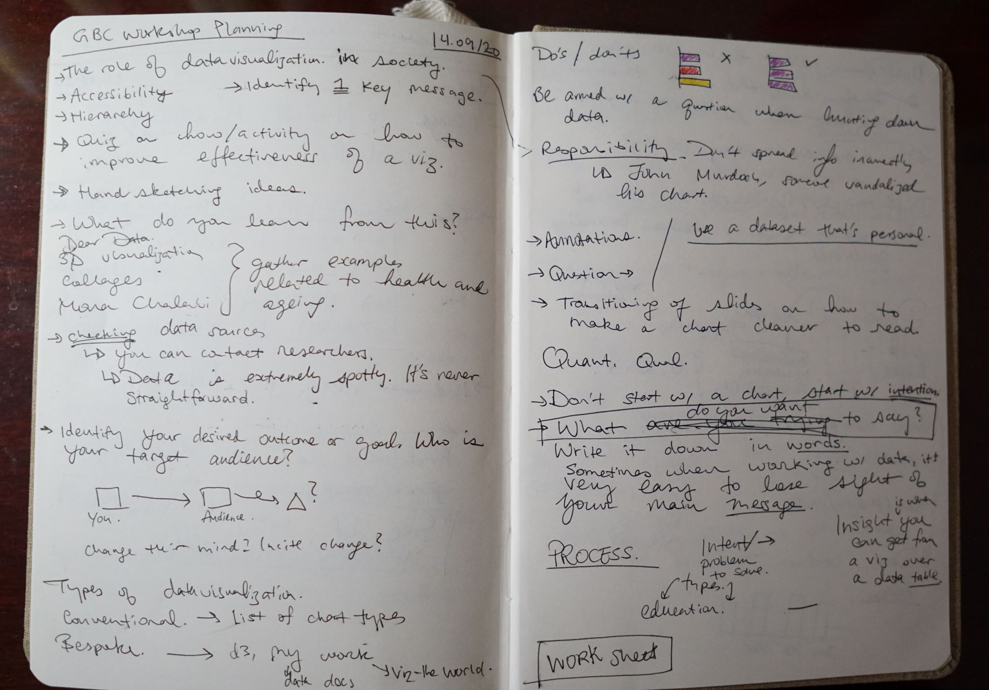
I outlined some key concepts I wanted to cover. Very quickly, I filled up several pages with ideas. As I kept penning them down, one line stuck out to me: “What do you want to say?" (on the right page). This became the title of my workshop. Since the goal is to give students a broad introduction of data visualization, I wanted the title act as a guide for them.
Here is the finalized outline of my workshop:
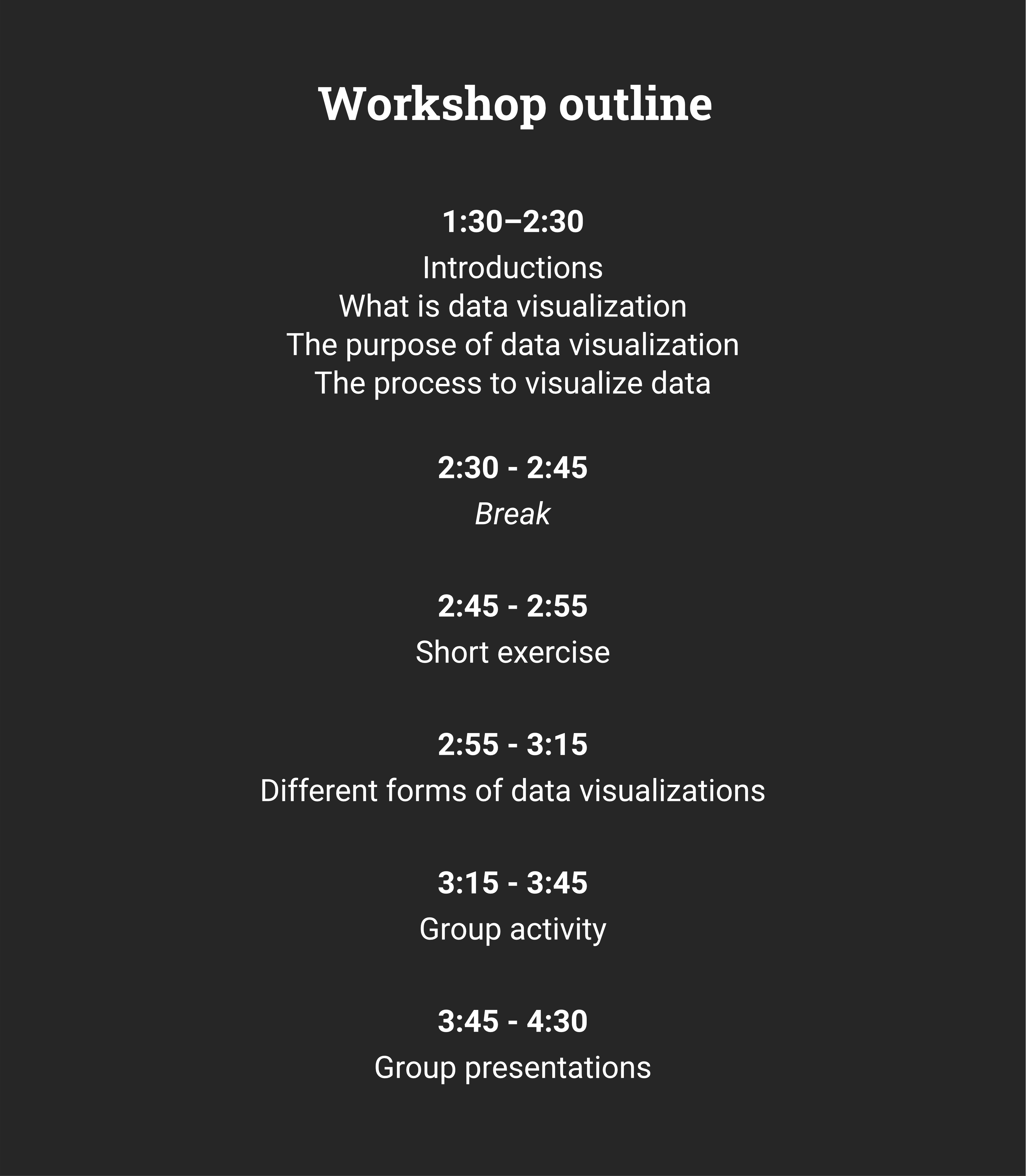
At a high level, the outline starts with a short lecture. We have a break. Engage in a small exercise. Then, there’s more lecture. Finally, there’s a group activity and at the end, students present what they come up with. I tried to keep the workshop broad, which is tough. Because everyone comes from different backgrounds and have different levels of familiarity with data. As I was teaching, some students wanted me to go more in-depth.
I started the workshop off with a some introductions and a lecture. I explain what data visualization is and the different ways they manifest in the real world. I was inspired by Alberto Cairo’s book How Charts Lie to guide this section. The biggest takeaway I wanted students to have is that they have a responsibility when designing data visualizations. It’s not something they should take lightly. And, if they never make another visualization in their life, then they need to be more informed about how they interact with it. I close the lecture going over the process of visualizing data, using one of my own projects as a case study. By then, it’s been an hour and it’s time for a short break.
After the break, I engage the class with two mini-exercises to get them engaged. The exercises look at two data visualizations and we break down their key messages. We move onto another short lecture looking at the different forms of visualizations. I talk about the mediums they would typically see visualizations exist and briefly go through common charts they will see.
Tip: Don’t spend all your time teaching, take some time out to engage participants with short exercises throughout the workshop. This will help them reflect on what they’ve learned and it gives them an opportuniity to ask questions.
The workshop ended with a hands-on activity. I struggled with how to put one together. I did some research on existing workshops out there for ideas. All the workshops I’ve come across were very different. Some were very specific and got very technical. Others were broad and focused on fundamentals.
Based on what I discussed with the academic coordinator, I wouldn’t need to cover anything about tools. This meant the workshop would be tool-agnostic. As a result, participants can use any medium to their liking to visualize data.
For my workshop, I encouraged students to use tools they were comfortable with. The students chose to use pen and paper, Google Sheets, and Illustrator. Since the class was so small (about 10 students), I provided the dataset. This was a huge challenge to find. The best resource I could think of at the time was MakeOverMonday. The dataset was already cleaned and the source was clearly listed.
Tip: Consider checking out MakeOverMonday for clean datasets to use in your workshop.
I paired students up into breakout rooms on Zoom and asked them to visualize the data for 30 minutes. When they were done, they all came back and they all presented their work. I provided feedback and comments for each one. Here’s a video of one of the feedback sessions, it was from the first group that presented.
Students visualized a dataset in pairs. This was the first group to present their work and I gave them feedback and comments. I practiced the presentation a few times and was constantly worried I wouldn’t hit the 3 hour mark. But, it worked out perfectly. When I finished putting the deck together, I wish I had more time to finesse it. But, I was strict with how much time I could spend on it. I didn’t want to throw hours away making something perfect. It’s always better to be done than be perfect.
Tip: Don’t overthink how to design the presentation, spend time getting it done first rather than having it polished. Give yourself a time limit to control how much time you spend on it.
As I was teaching students, I noticed that one of the students asked me to repeat something. It sounded like English was not her first language. And it dawned on me that I was speaking really fast. I tend to talk fast when I am nervous. Reflecting on this experience, I will work on speaking slower so that people who aren’t strong in English can hear what I am saying.
Tip: Consider not everyone speaks English as their first language, try to slow down how you speak and tone down the use of jargon.
Why workshops remain in demand
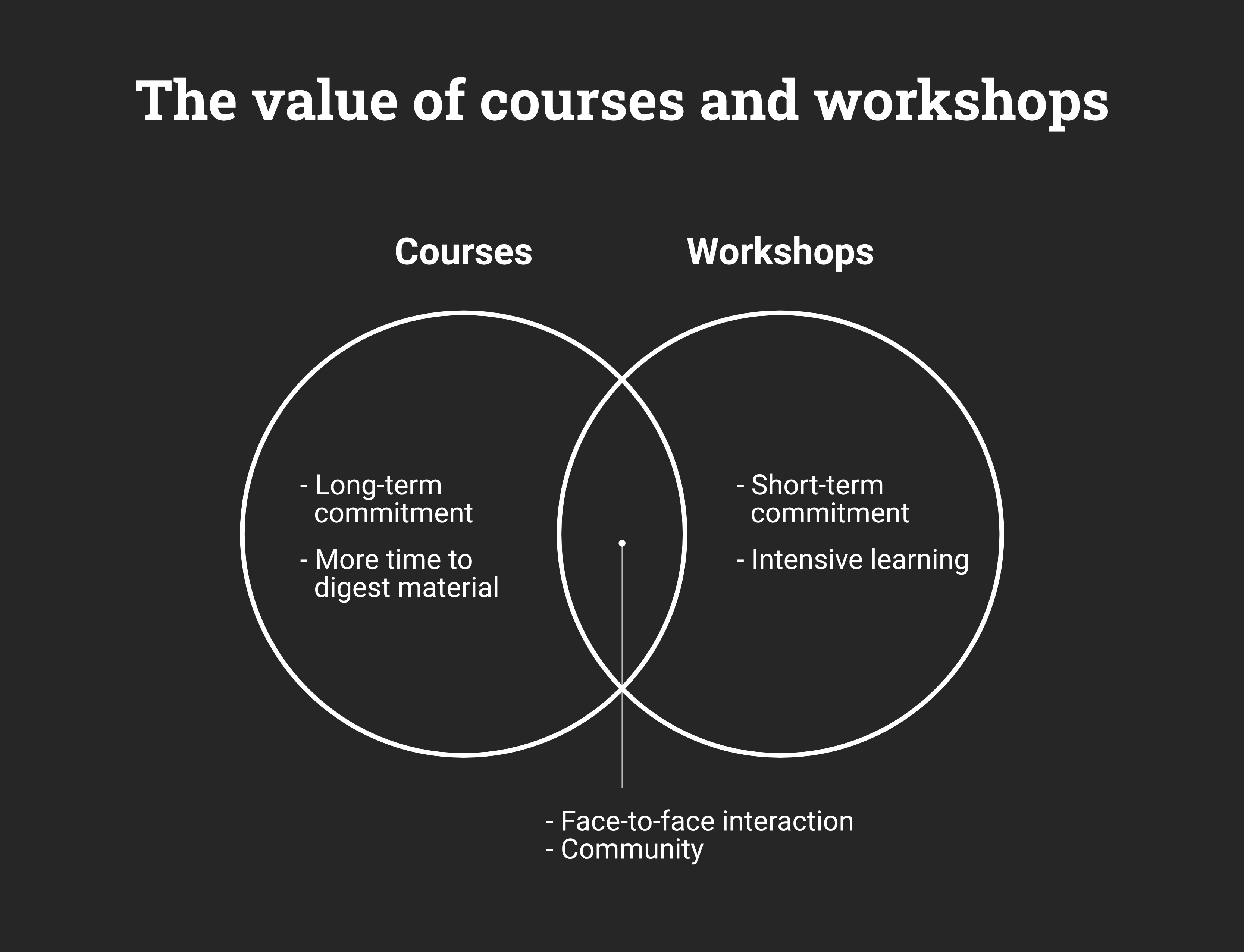
There are many ways for someone to teach data visualization. Free YouTube tutorials, recorded online courses on LinkedIn Learning, or a course at an accredited academic institution. With all these available, what is the value proposition of a workshop? What makes it different from the other formats?
Courses are very similar to workshops. They both have the option for the instructor and the participant to interact. Participants can ask detailed questions and instructors can provide guidance on how to solve them. A fundamental value courses and workshops provide is a community. By participating in this learning experience, all participants have a shared interest in solving similar problems. Being part of a community, being in the moment and having an experience, is what makes live interactions stand out. If the exact same material could be delivered via recorded video, which would you prefer? Live or recorded? Similarly, think about concerts. It’s the same music that you can stream for free online, why bother to pay money to listen to it live? What is the added value? Take a moment to think about your personal experiences and why you prefer certain formats of learning over others.
What makes workshops different from courses is the long-term commitment from the participant. Courses could span several weeks. They cover a lot of material and are spaced out to make them easier to learn. Workshops are usually more intensive and can be done in a day. The short length of workshops is very appealing for organizations because they could block out a whole day for training, rather than block out 2–3 hours every week for a month. In addition, courses also require instructors to grade papers. Which isn’t time that’s paid for. Generally, courses from academic institutions would pay for your time preparing the materials and teaching it (from my experience and what I’ve heard so far). Grading and answering questions outside of class isn’t usually accounted for in the pay.
The combination of short-term commitment and live interaction with the instructor is what creates demand for workshops. I believe that people want to establish connection with others, it’s a fundamental aspect of human nature. And, as busy people, we are always short on time and want to do things quickly. Workshops meet all of these requirements and this is why they will continue to see a demand in the future.
Building a case for good data visualization
The main reason I took on the workshop opportunity was so that I could show the value of good data visualization. I was once part of the service design industry and spent a lot of time learning about it. It was so small and niche in Toronto. One thing I learned from watching it grow was that service designers never stopped educating clients and the public about their value. They wrote books, articles, gave talks, shared case studies, partnered with notable companies and so on. They actively engaged with the community. I know my impact was small, maybe negligible. But, for me, it was better than doing nothing. Every step counts.
On a final note, it felt good to teach. There’s something very positive about seeing how participants finally grasp a complex concept and you were the one who catalyzed that. It’s very fulfilling.
I hope this post is a useful resource for you as you consider building your workshop. Workshops require a lot of time and energy, but, I think they are always worth it if you find joy in sharing your knowledge.