Home / Blog
Data Visualization Style Guide: How I Learned to Design One
What’s a data visualization style guide? Why and when is it needed? How do we create one? I initiated a project to better understand them by designing one for Slack.
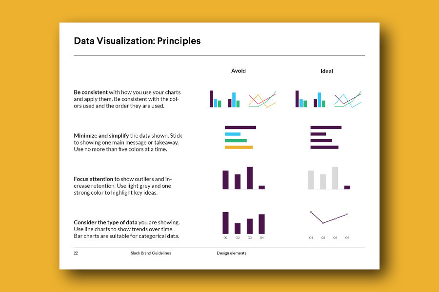
Table of contents
What’s a data visualization style guide? Why and when is it needed? How do we create one? Ever since Amy Cesal wrote about them on Nightingale, I have deeply admired them. In the design world, brands typically have branding guidelines that help create a cohesive brand voice. Branding = identity, and it’s no different from a person’s personality. As people, we have personalities that are relatively stable and predictable. Your family and friends know what will make you happy, or what will make you upset. And this is because you have a consistent personality. When it comes to brands that represent organizations, it is harder to have consistency since so many people have access to it. This is why branding guidelines are necessary to create that consistency.
Sadly, branding guidelines generally do not account for best practices visualizing data. This is where data visualization style guides come in handy. They are integrated with the overall branding guidelines and provide direction on best ways to show data.