Beyond the surface
This was a personal project I did to better understand the connection between my mental and physical health. I started developing a new reaction to stress in my early 20's. I would have intense muscle tension and when it was chronic, it lead to severe pain. By documenting and visualizing my own data, I was able to better understand how to manage my symptoms.
Brief
Problem being solved: Over many years of having muscle tension, it became challenging to identify what triggers it. The stimulation I experience in a day is tremendous and it’s hard to sift through all that. I needed a way to record my life and analyze it to better understand myself.
Target audience: This project was meant for me to learn how to better manage my muscle tension and understand key triggers. I also made this project for others like me, who are learning to manage their mental health. I am very open about mental health because it is an invisible condition that we all have, making this project was about bringing awareness and letting people know it’s OK to be vulnerable about this topic.
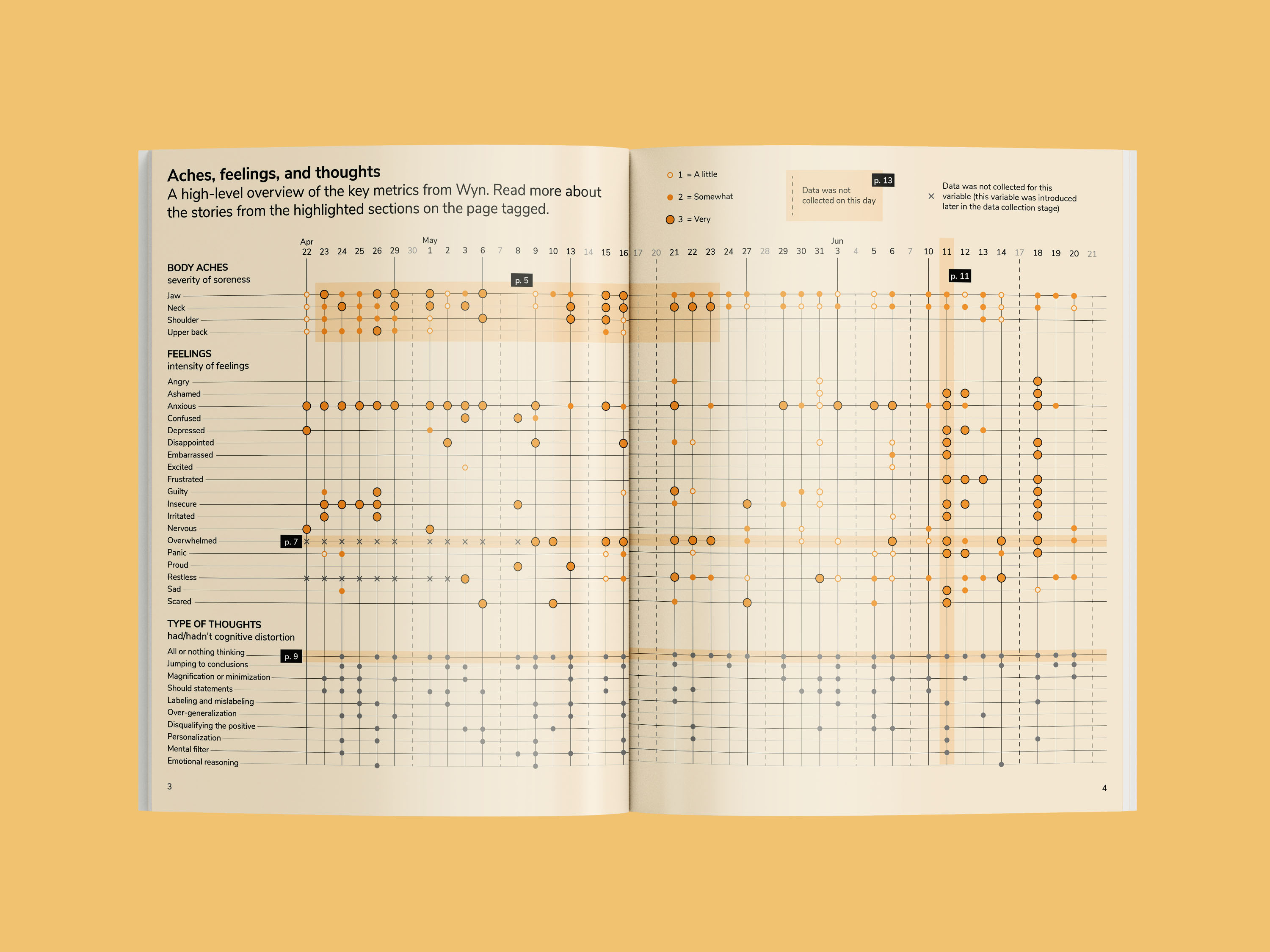
Key objective: To collect data on myself for several months and develop key insights to better manage my overall health. The overall findings will be compiled into a report with a unique form of storytelling through fiction.
Process
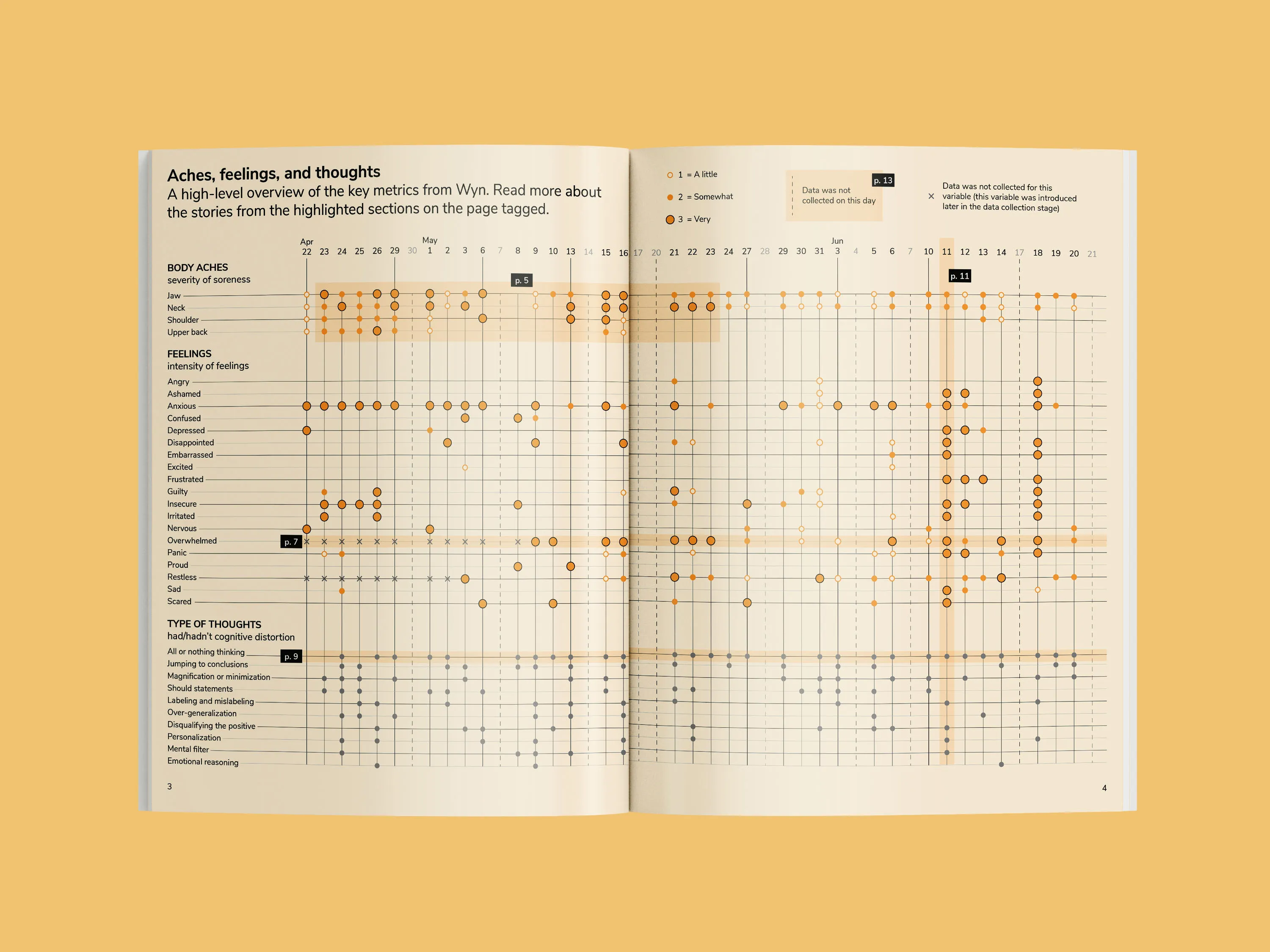
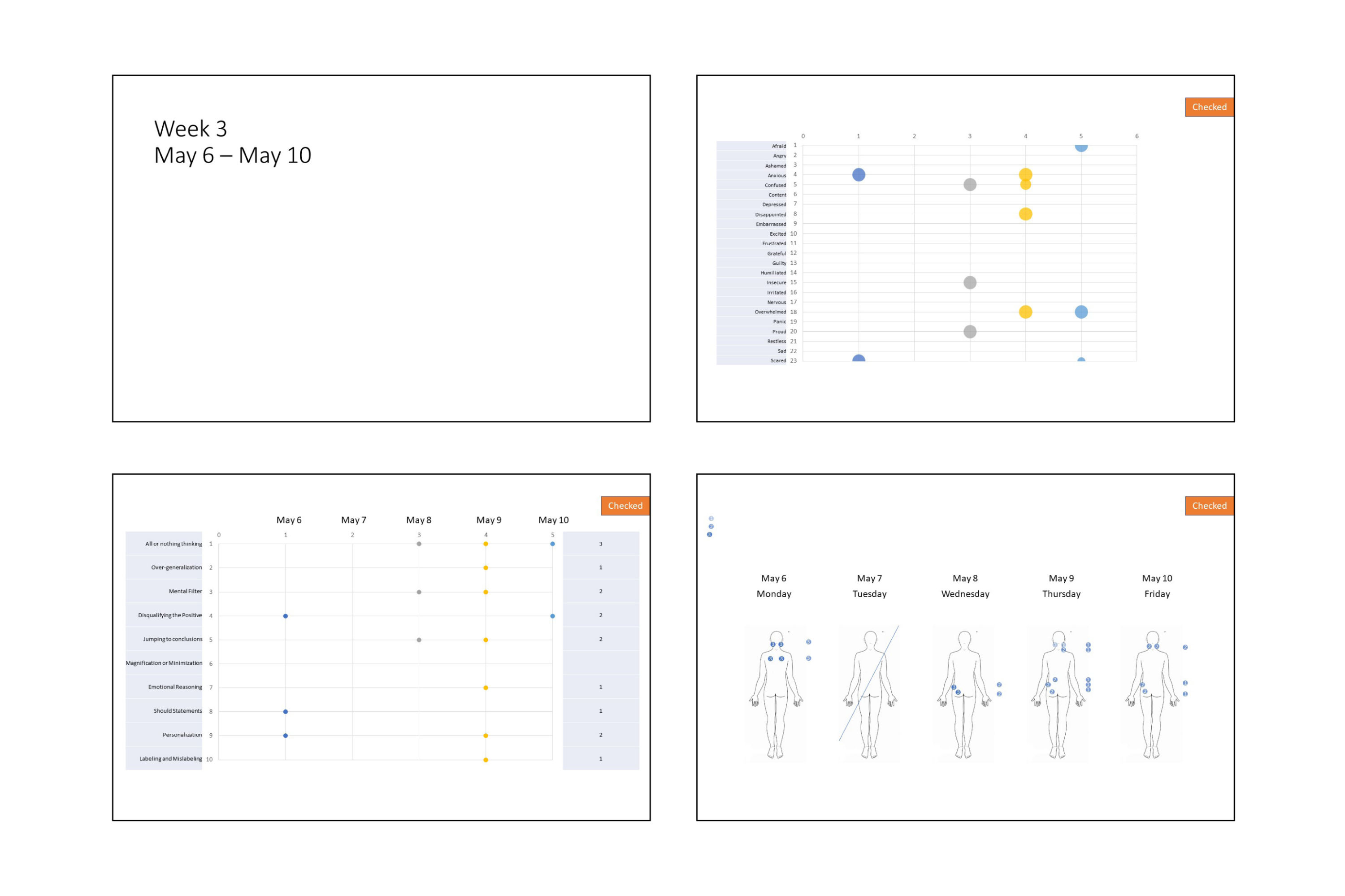
I collected all my data through Google Forms from April 22-June 21 2019. I set a notification on my calendar every morning with a link to the survey. At first, I wanted to do the survey every day, but this was a challenge so I only managed to complete the survey on weekdays during my commute.
After I finished collecting the data, I organized it and cleaned it up on MS Excel. It was a mess to comb through. I am most comfortable with MS PowerPoint so I plotted the data there. These charts were really rough and it was just meant for me to show the information quickly.
This is an early sketch for the concept. It started off as benign doodling, but when I looked at it, I saw potential for it to be something more.
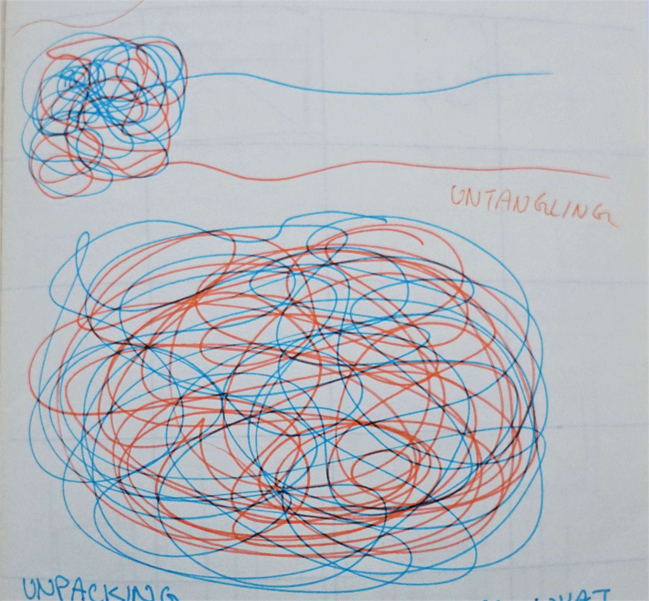
The concept of the book is to untangle by digging deeper together.
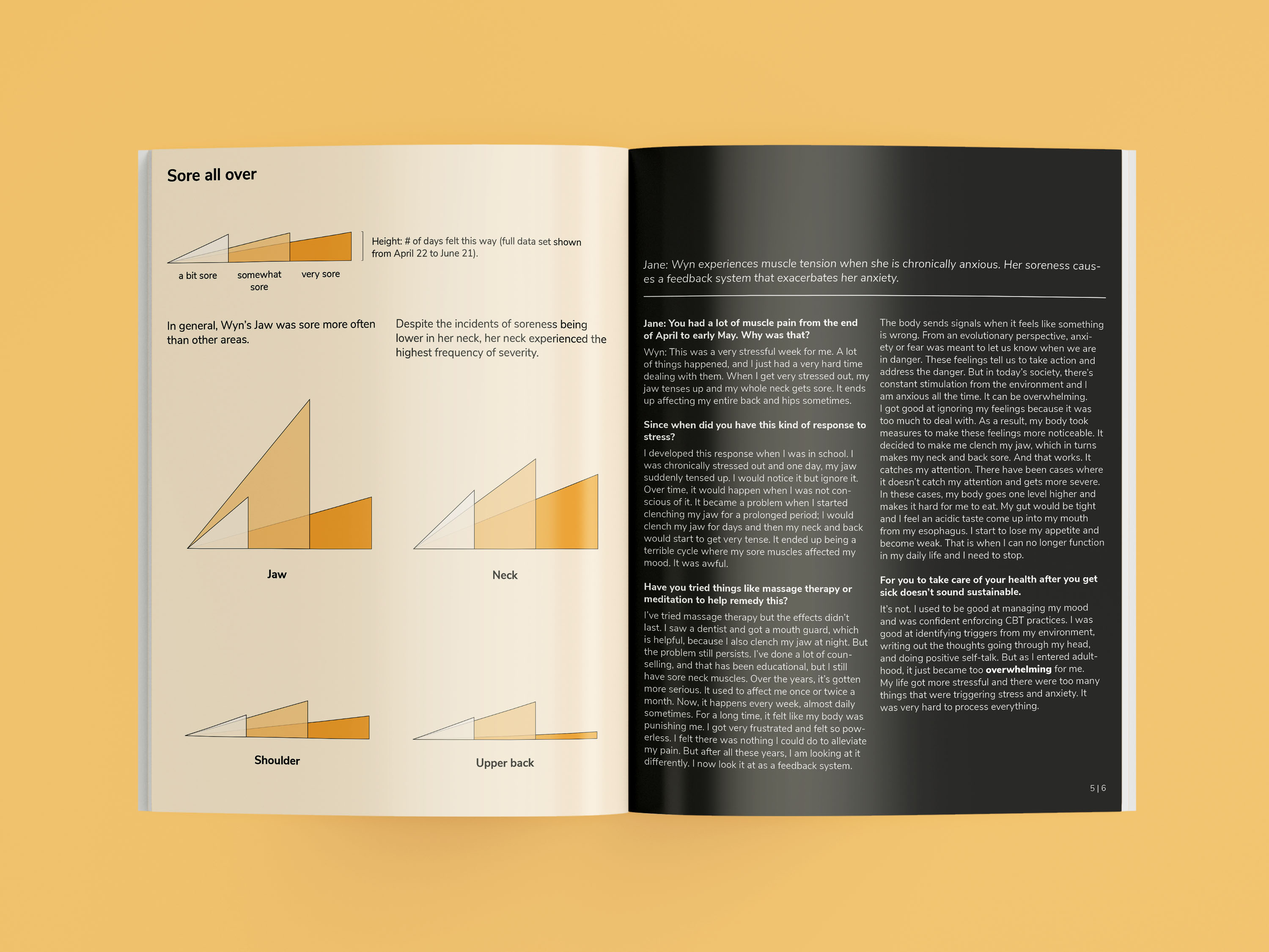
I dig deep into my mental health by progressing back into my history. The story starts with looking at how anxiety has impacted me in a very obvious way, muscle tension. I dig deeper to understand how this started and why I developed them. As I investigate, I go back to my past and look for how my upbringing affects how I live today.
The aspect of ‘together’ is where I deal with this in a “two-ness” approach. This idea was inspired by the game The Beginner’s Guide by Davey Wreden. The storytelling in the game is phenomenal and deeply emotional. In the game, Davey narrates the story and we get to play the games his friend, Coda, has made. Davey says that Coda has stopped making games. Davey hopes that by putting Coda’s games out there, Coda would be inspired to make games again. There are many interpretations to the story and it’s very meta. My interpretation is that Coda is not a real person, I think it is an alternate self of Davey and when I realized this, it blew my mind. Until the very end of the game, I was convinced that Coda was a real person. I believed that Coda was Davey’s friend. The fact that Davey was able to pull this off astonished me. I couldn’t believe it. I was engaged with the story and the story resonated with me. Somehow, I wanted to implement this in my project. So, I went on to create an alternate character called Wyn. This name was taken to be a homonym to my Chinese name, 文 (pronounced as wen).
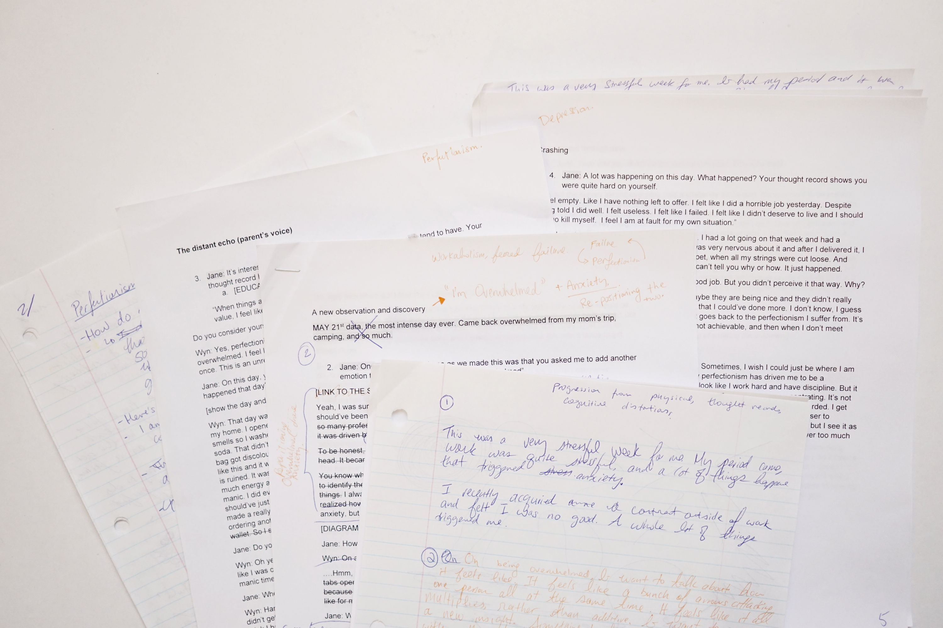
I didn’t realize how hard it was to do creative writing until working on this project. I looked at my thought records and tried to figure out how I could write a cohesive story. This was very challenging. I organized the qualitative data on Trello and looked for trends. What were things that consistently came up? What was something new I learned?
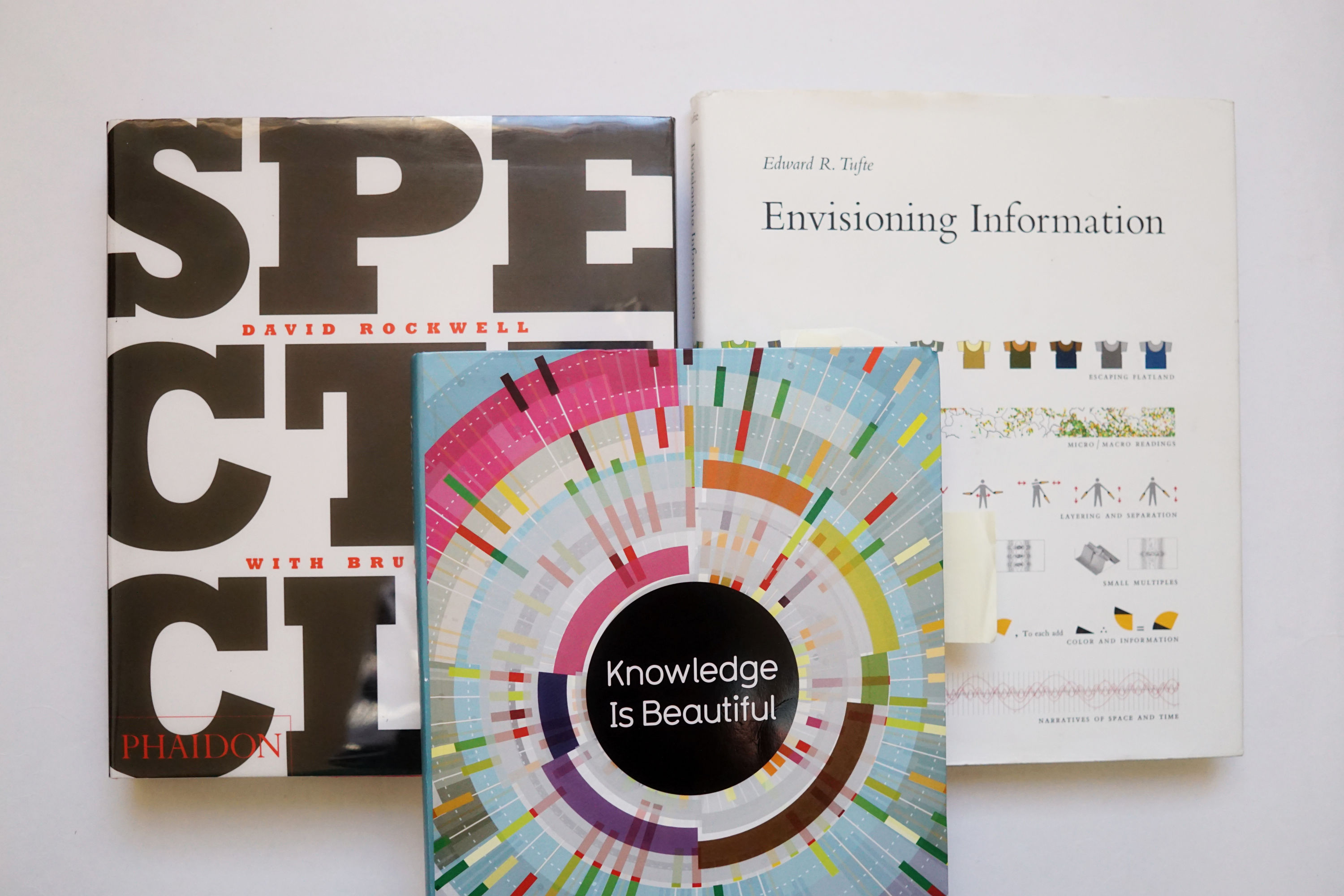
I studied several books to learn layout design. Here are the main three that I referenced. Spectacle, Envisioning Information, and Information is Beautiful.
I explored colour through paper and pencil, it was a lot easier to figure out this way. I decided to go with an orange colour because it was a warm and hopeful colour. When I think back to why this project exists, it’s to help people understand and develop compassion. I also want people to know that life can get better. The topics I talk about are heavy but I want it to be in a positive light.
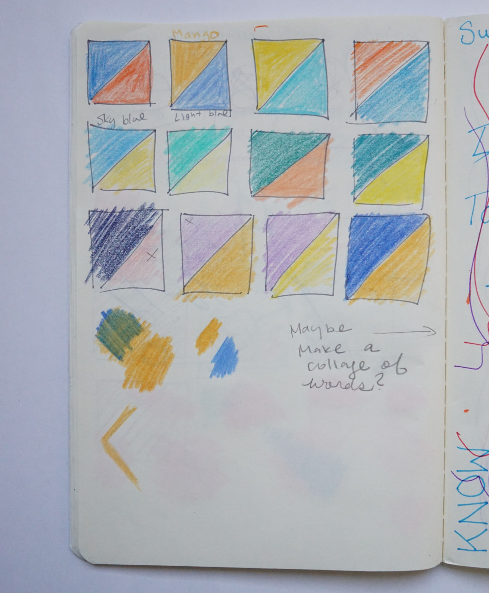
Here are some initial layouts and colours I tried out. This process involves a lot of exploration.
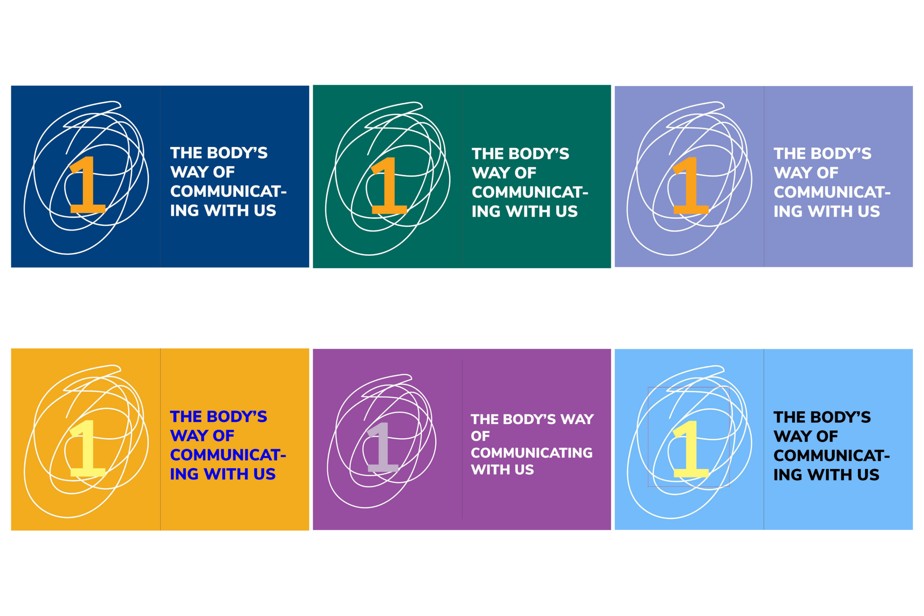
I tried many variations for the main layout. This spread that I developed was discarded and it inspired the following layout below:
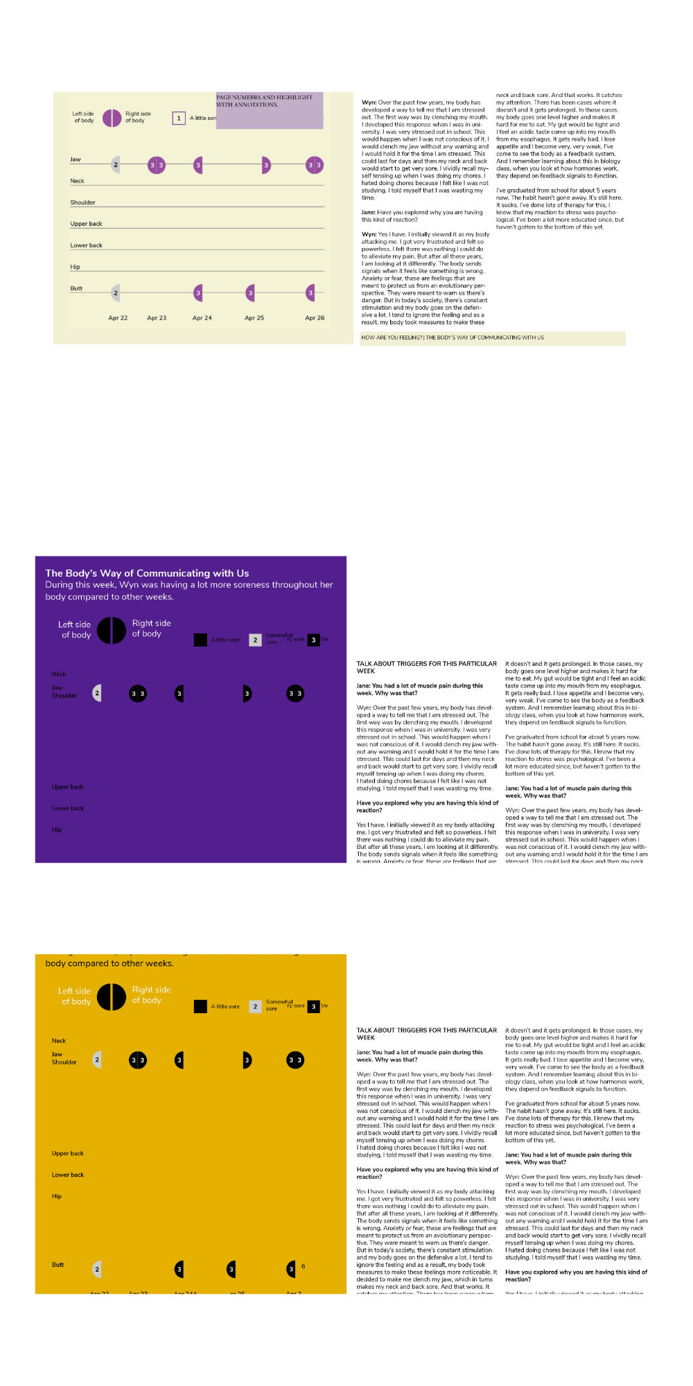
This spread was derived from the idea of showing everything in a glance. To provide a bird-eye view of the data.
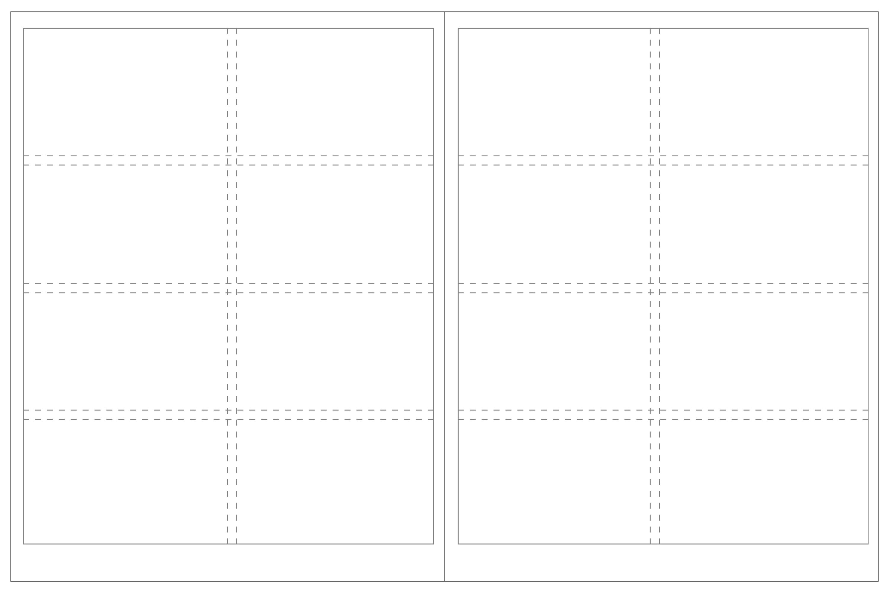
This is the final grid I used throughout the booklet. It’s a two-column layout (following the idea of “two-ness”). The layout is has narrow margins to give more space for visualizations. There is a lot of space in the footer for the page number and additional notes if needed.
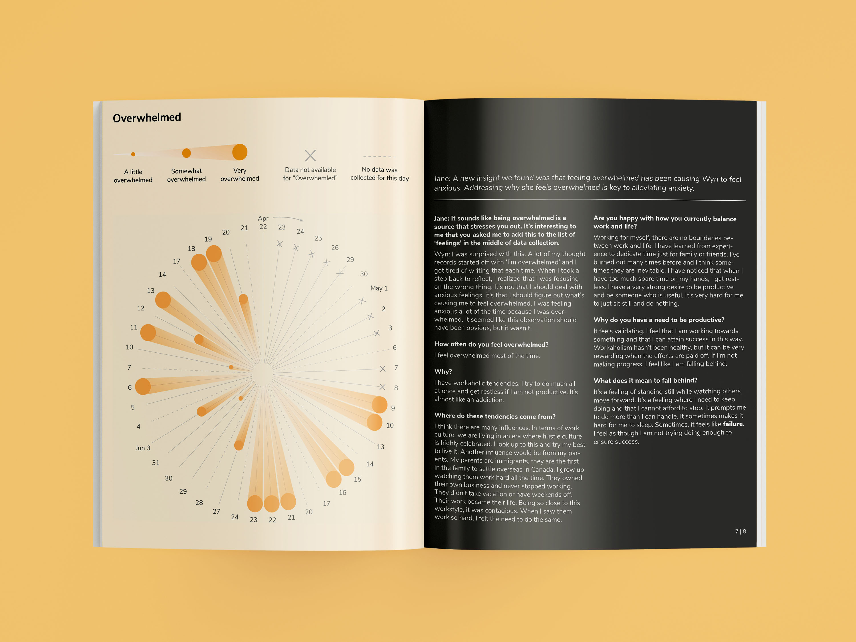
The biggest insight I learned from this project was that feeling overwhelmed was the major trigger for my muscle tension. Overwhelmed was never a term I used to define how I felt, it was only through this project did I learn this. This is important. By collecting data everyday, I got a better sense of how I was feeling. I saw how many aspects of my life was connected. My energy levels and my eczema were all connected.
As I worked on this project, I realized that the kind of work I leaned towards were similar to documentaries. I was interested in capturing things as they happened and going in-depth on the why. It is like qualitative research where you look at a small sample size but work to create insights with depth. So how is my work different from people who make documentaries through film? I think film tell stories over time. You watch a film that lasts anywhere between 50-70 minutes. What about data documentaries? I think it has the ability to condense time. I can quickly show you all that has happened to me in three months with a timeline. You can quickly experience my life with a page spread. Although, it might not be as impactful as watching a 60-minute film. But I think that is the key difference between film and data.
There’s something interesting in looking at everyday data. It’s almost like a daily vlog. A snapshot of mundane life. Vlogs are interesting in that they capture other people’s perspectives. Why are we so interested in the lives of others? Maybe we wonder what it’s like to work on Singapore Airlines, or we are curious of the average day of a medical student studying to become a doctor. We are curious to know how other’s live and want to understand their way of life. Maybe we are just searching to understand something.