Home / Blog
Cataloguing My Family's History Through Food
How could I show recipes beyond the standard cookbook? What are some ways I could visualize data that could last for generations to come?

Table of contents
This is a post about a completed project. Click here to see it.
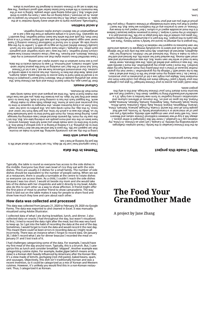
Preserving culture and identity
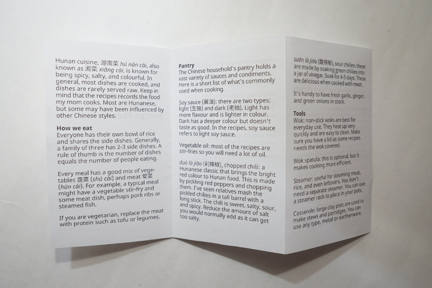
There were many reasons I started a data visualization project documenting my mom’s recipes. Our family is from Hunan province, which is known for 湘菜 (xiāng cài), Hunan cuisine. Hunan cuisine is spicy, colourful, and savoury.
I am very proud of the Hunan food we eat, it’s delicious and rich in flavour. I’ve always found comfort in Hunan food and had a desire to preserve them somehow. It’s hard to pinpoint a single moment that inspired me to start this project. Maybe it started during the usual dinners I have with my mom. Sometimes we talk about our day, other times we talk about our family history. I loved hearing stories about my maternal grandmother. She was illiterate her entire life, she couldn’t read or write her own name. Yet, she was smart and had so much foresight. She knew how to run her business selling crops she planted. She excelled at mental calculations as she could quickly calculate the change a customer needed after a transaction (she could calculate this to the decimal).
My grandmother was a progressive thinker, she had 10 children, 8 survived. Of the 8, she had 2 daughters. She always believed all her children, including her daughters, deserved an education. She lived a hard life as a farmer without any formal education. My mom was the only one of her siblings who was lucky enough to go to school and do well enough to study abroad in Canada. In fact, if my grandmother didn’t support my mom to study, I wouldn’t be born. China had a strict one-child policy at the time, I am the second child. This is also why I’ve never met my grandmother. I only know about her through my mom’s stories.
My mom took a chance and planted new roots in Canada, beginning a new era for the family. I am the first in our family’s history to be born in Canada (at least to my knowledge). I had a lot of challenges growing up as a Chinese-Canadian. I had many issues with identity and understanding how I belonged. Children of first-generation immigrants generally make two choices when it comes to identity. The first is the one I see more often, they absorb the Western identity and become idly distant to their ancestral identity. The second choice is to embrace both and have a balanced approach to it. This choice is harder to maintain because there is no incentive to do so. I am working towards the second option. I have a deep love and appreciation for being Chinese. I work hard to learn the language and keep myself engaged in Chinese culture through Chinese music and TV shows.
My nephews (they’re under 10) prefer to speak to me in English over Mandarin. Losing the language has been a huge fear of mine. I struggle to speak Mandarin properly and it scares me a little. I want to pass on the language to the next generation, but it’s hard to do that when I can’t communicate it well. Maybe the biggest drive for the project is fear of loss. I am afraid of losing traditions, identity, language, culture, and so much more over time. Being so far away from the motherland, it’s easy to forget where we come from and what it means to be Chinese. When my mom tells me stories about our family, it only exists between my mom and I. It doesn’t exist anywhere else. These stories are retained in our minds until we pass it on to someone else.
Maybe that’s what this project is about. I wouldn’t want all this information to be forgotten. Right now, my mom is the closest source to being Chinese for me. I only speak Mandarin to her and she cooks all of the comforting Chinese dishes that warms my heart and soul. She knows all the traditional remedies that can heal anything. Have a sore back? Slap a medical plaster on it. Have urinary inflammation? Drink boiled dandelion stems. My mom has a lot of knowledge that I hope to preserve for future generations in our family.
The idea of recording something to be remembered has been a long practice on my mom’s side of the family. Many Chinese families have genealogy books that document their entire clan’s history, they are called 族谱 (zú pǔ). My mom’s family has volumes of these books that date back many centuries. It lists every single person that was alive in the family, including their spouse and children. These books have somewhat inspired my desire to record something about our family. A record for future generations to reference and gain an understanding of who we were. I see this project as a means for future generations to relate to us. To understand who we are and how we live. Perhaps they can see themselves in us.
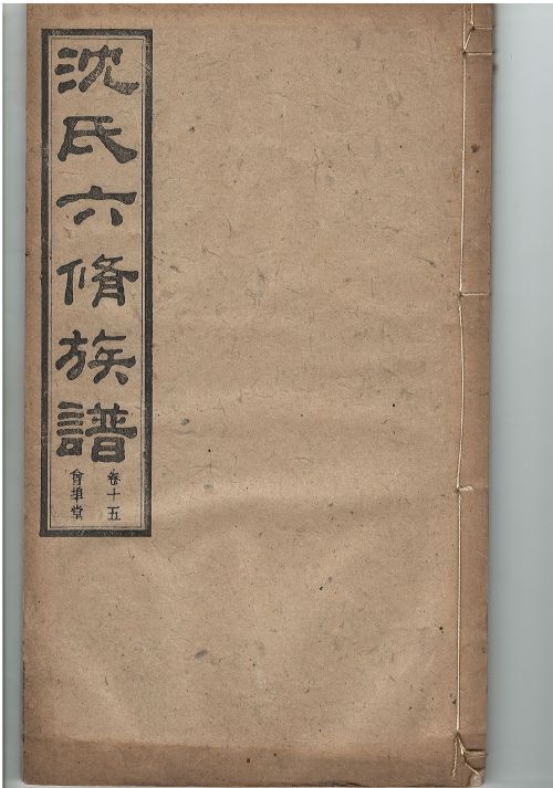
Old books in China were read from right to left. This is one of the genealogy volumes from my mom's side. This is volume 15.
Dismembering a book
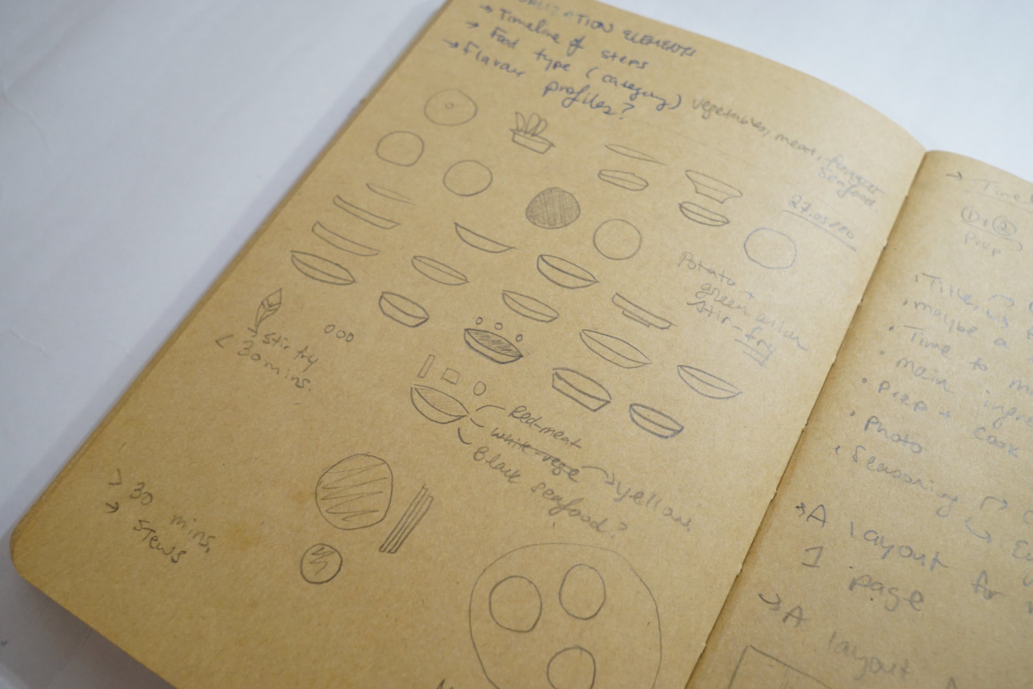
The original output of this project was going to be a cookbook. During the initial brainstorming phase, I didn’t hold back and explored anything that came to mind. I sketched a lot of ideas during the spring and summer of 2020.
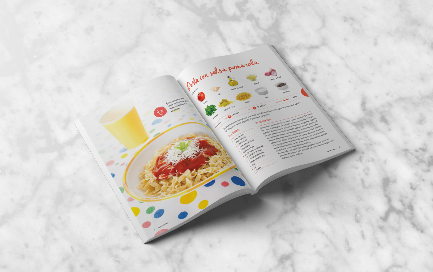
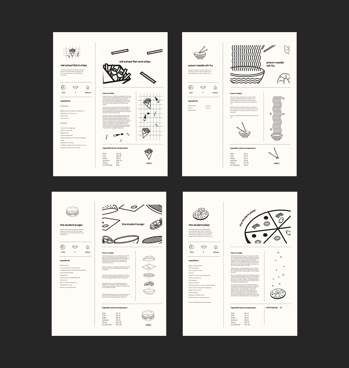
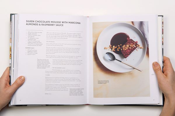
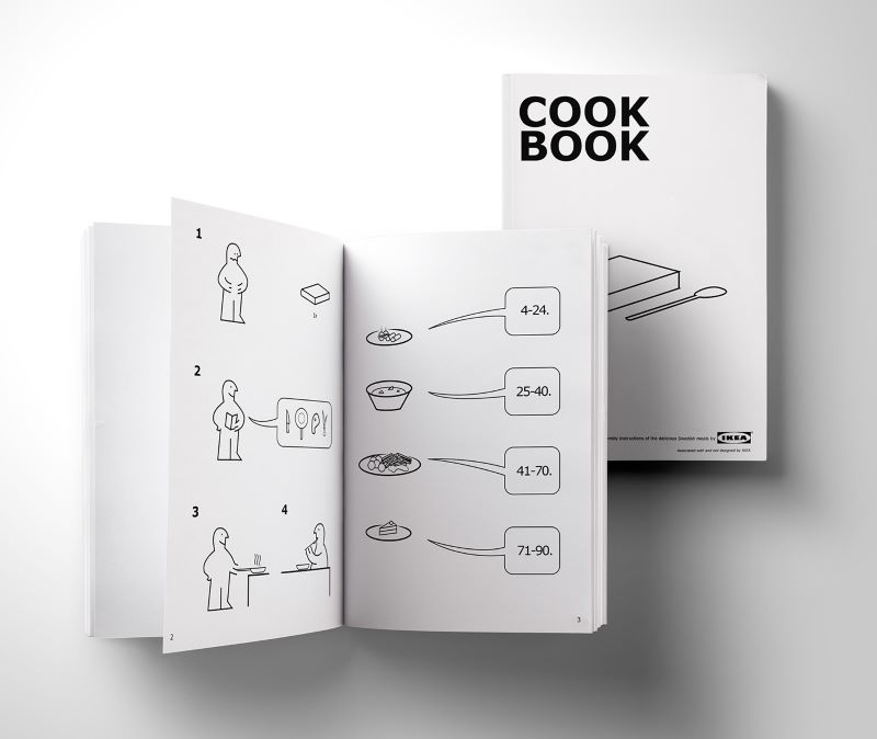
I have zero experience designing cookbooks. I had to do some research to gain some familiarity with them. Here are some ideas and inspiration I found on Behance:
I struggled to come up with a layout that would work in book format. I kept testing out different layouts but nothing seemed to work. Why wasn’t it working? What about it felt off? Maybe it was because I wasn’t entirely sure of the content. I still had to work out what data I wanted to visualize and how it would look like.
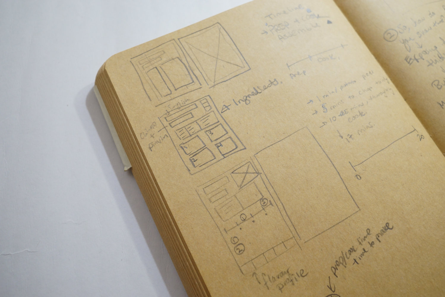
A new habit I developed during this process was to write my thoughts out. I developed this because I had other work going on. Developing several projects in parallel makes it hard to keep track of all my progress. I sometimes come back to a project after a day and forget what I did. The design process is always a blur. I spend time to go over my notes and figure out what I was doing. It helped to write out next steps so I could remember what I did.
Developing a new habit of goal setting at the beginning of a design session.
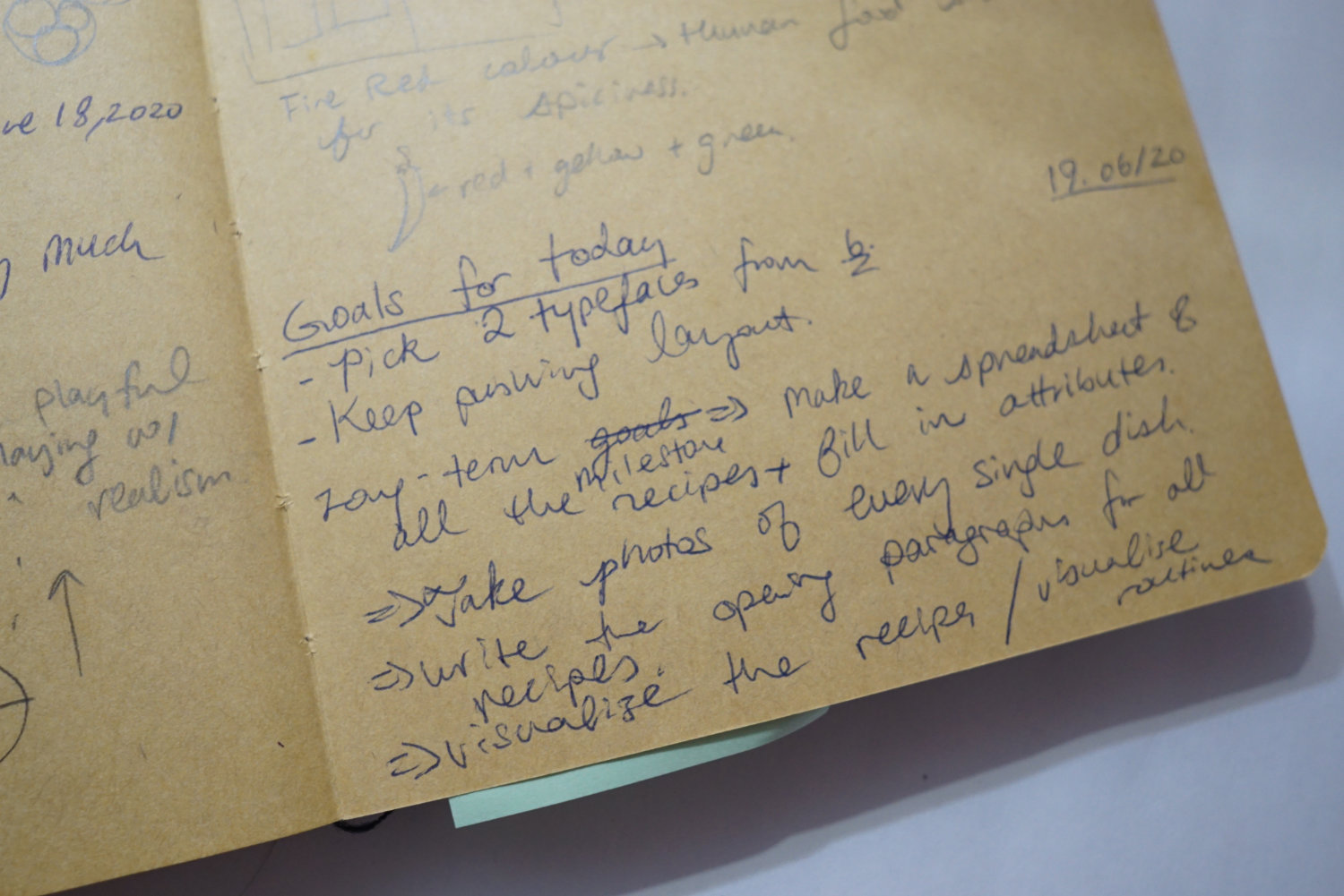
Teachable moment: Write out your thoughts as you work through something. It helps you think out loud and see what is happening at a high level. Writing is a good way to plan your tasks. Before you start working, write out some goals you want to accomplish, like a to-do list. At the end, write out next steps. A list of next steps reduces procrastination of the next session and helps you remember what you need to do.
I was also very overwhelmed with the scope of this project. I was a one-person team and no one was paying me to make this. The project kept getting pushed back as other things took priority. I was determined to see this through. So, I started a new rule which was to focus on one project at a time and finish it before picking up anything else.
I got serious about this project in the fall of 2020, right after I finished my Tekken project. The Tekken project had drastically changed my design process. It propelled me to focus designing data visualizations on cards for the purpose of teaching people how to think about something.
When I was getting back into this recipe project, I realized that a book was not the right format. Maybe that’s why I struggled, because the format was off. A book is restrictive in how the content populates. The content is fixed and cannot be added on over time, unless a new book is released. But, cards are different. Like booster packs of popular trading card games, the content is dynamic and can be added on over time. There is no limit to how much content could be added at any given time. When I was fixed on the book format, I decided to record 100 recipes in it. It wouldn’t make sense to just show a small handful. 100 recipes is a lot of writing. It’s terrifying to start something of that scope. But, if it were cards, I could start small and still call it “done”. I could make 50 cards, one per recipe. And feel like I accomplished something. When I was ready, I could add more easily, without needing to re-do the book. Say if I wanted to organize the recipes in a certain way, maybe based on the ingredients or the cooking method. In a book, that’s hard to do if I intend to update the book with more recipes. With cards, this is easier to achieve because they are all independent entities. I don’t need to reconsider layouts and update how the pages flow.
Teachable moment: I’ll be honest, I didn’t want to start over after 6 months of working on this project on and off. I did a lot of work before and the idea that I won’t fully use them sucks. This project taught me an important lesson of not falling in love with my initial idea, no matter how much work I put into it.
The idea with the cookbook was to split it into two sections. The first section would be story-driven and provide an overview of what my diet is like as a Chinese-Canadian. This sounds mundane, but it might be interesting for someone to look at after 100 years. I am fascinated with what my grandmother’s daily life was like. There are a lot of stories I could build around my eating habits and you could derive what kind of person I was. The second section would be a cookbook, a list of all the recipes with a data visualization flair.
Now that I am moving away from book format, it would be something that exists in several components. Unexpectedly, this project became a combination of two streams of my work:
- Data documentary: looking at what I eat everyday and documenting what life was like through food. This would exist as large foldable poster, double-sided.
- Viz the world: This means injecting data visualizing into places that don’t normally use data visualization. I really wanted to try my hand at cookbooks and understanding how to visualize recipes. The final format is a set of cards and recipe sheets.
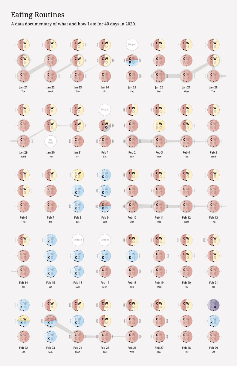
Section 1: A data documentary of how I eat
What is the purpose of film documentaries? When I think about films like BBC’s Planet Earth, they allow us to have an immersive experience and empathize with the subjects. When I work on data documentaries, it serves a similar function to films documentaries. I create them to give you an in-depth look at how I live so you can understand something about me, and maybe something about the human condition.
I hope that future generations in my family can look through the data and have a good understanding of how I lived. Food is a great medium to tell the story of one’s life. It explores social and economic conditions, as well as how societal pressures drive certain diets. In my case, culture plays a large role in how I eat.
Collecting personal data with Google Forms
I had some practice on collecting data on an older project through Google Forms. Exporting data from Google Forms into a spreadsheet can be a bit of a nightmare if it’s not set up properly. The key is when you have a question which allows more than one answer, set each choice as a separate question. If you set all of them under one question, you have to split them up into different columns to be usable.
This question is about cooking method, which could have more than one answer. To make it easier to process on Excel, I put each option as a separate question.
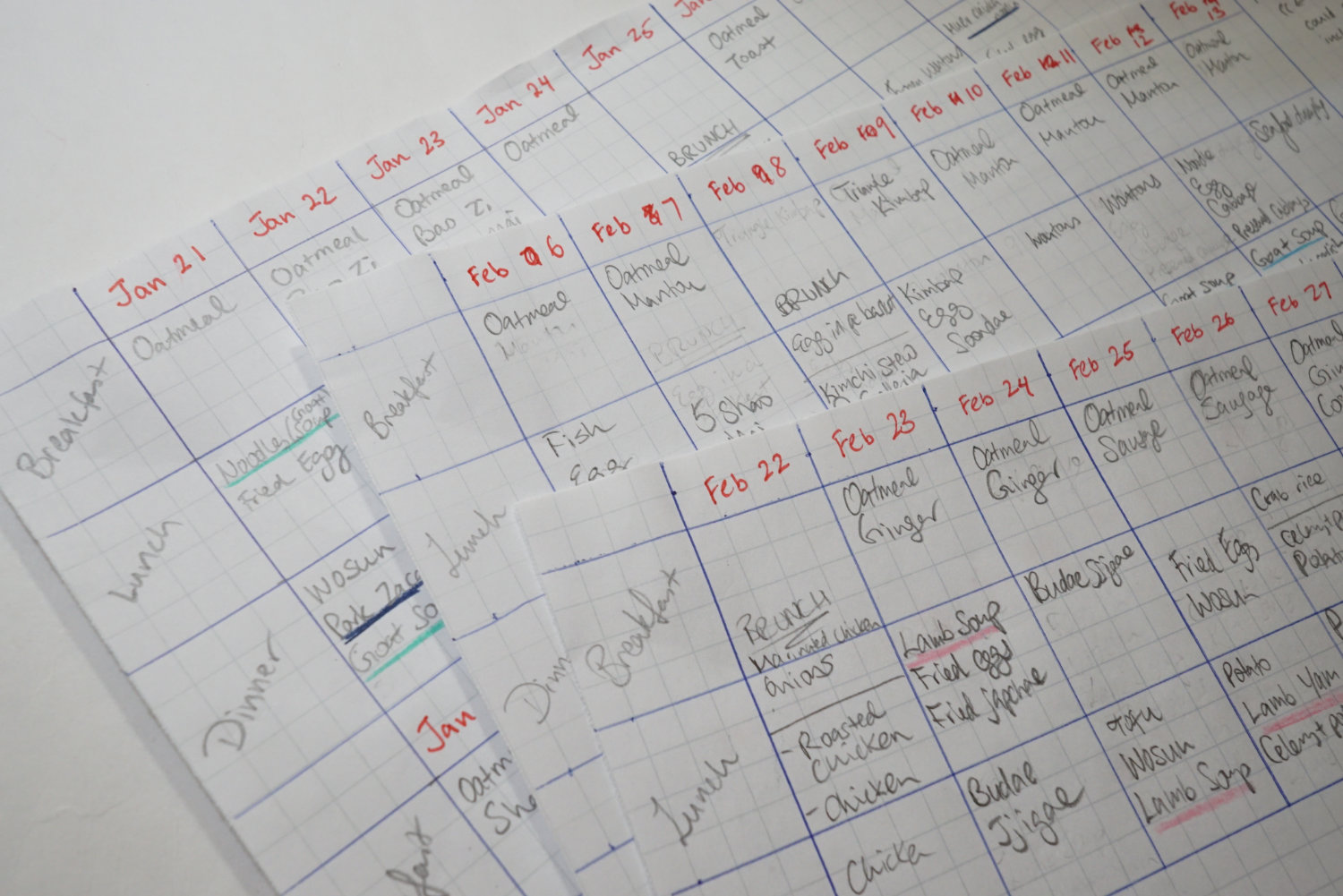
I collected data for all my meals and snacks. I collected data for a little over one month, from the end of January 2020 to the end of February 2020. I initially had a system where I recorded data after each meal. As you can imagine, this was a hard habit to keep up with. I observed that I was not consistent with this system and I risked the quality of the data since I didn’t want to record it so many times in a day. I eventually shifted it to recording all the data at the end of the day. Of course, I am no robot. I forgot to record data sometimes and I was aware of this possibility. I designed around this and put in options in the form where I note if I was recording the data for another day.
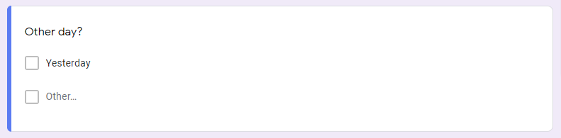
This is the first question in the survey. If I was recording data from another day, I would note it here.
If you ever tried to form a new habit, such as exercising regularly, you know how hard it is to sustain it. Collecting personal data is no different. It’s very hard to remember to do it every day. I dreaded when I was about to start data collection because I feared I would miss a day and screw up the entire process. I think fear of failure is the biggest cause of procrastination. To overcome it, I decided to accept I would fail and do everything I can to minimize consequences.
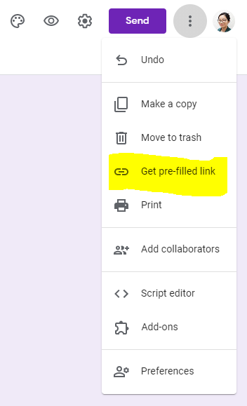
I bookmarked the link to the survey on my browser. As I filled out the forms in the first week, I noticed that most of my responses were the same. I don’t live an exciting life, I eat the same things everyday. I simplified the process further by making pre-filled forms. This is an awesome feature in Google Forms, you can make this yourself by going to your form, click on the three dots at the top, then click on “Get pre-filled link”. Save this link somewhere and you can open it up and submit it as is. I made pre-filled forms for breakfast since it doesn’t change too much day-to-day.

Bookmarking the links in my browser.
Setting a pre-filled link for repetitive answers.
Teachable moment: When collecting personal data, be aware of how you work. What are barriers to the process? Identify them and list steps to address them. Do everything you can to make the process of data collection easier for yourself. The most important thing is to not judge yourself and be aware of what’s working and what isn’t.
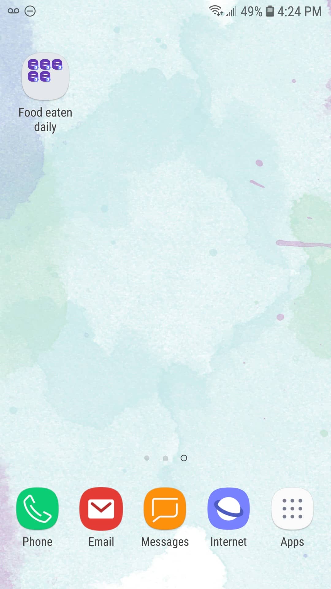
The main mode of data collection was through my computer. I knew that I wouldn’t always be home so I also made a way to record the data on my phone. On my Android phone, I opened the link to the form on the Internet app, then added the page to my “Home Screen”. This way, I had quick access to the survey no matter where I was.
I made modifications to the survey as I was collecting data. I added new categories to consider or modified some of the existing options. It was important to me to start the data collection and modify it as I was testing it out. I think a good practice would be to start data collection one week early then intended as a test run. Use that time to see how it feels to collect data and modify as needed. Of course, once that week is over, it doesn’t mean that modifications can’t be made, it would just be minimized.
All the data collected was then exported to an Excel sheet. I cleaned the data up and spent a lot of time checking it. To make it easier to check the data later on, I wrote down what I ate on a sheet of paper.
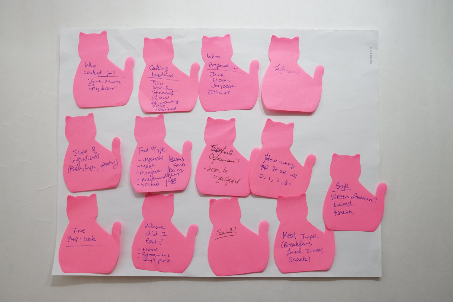
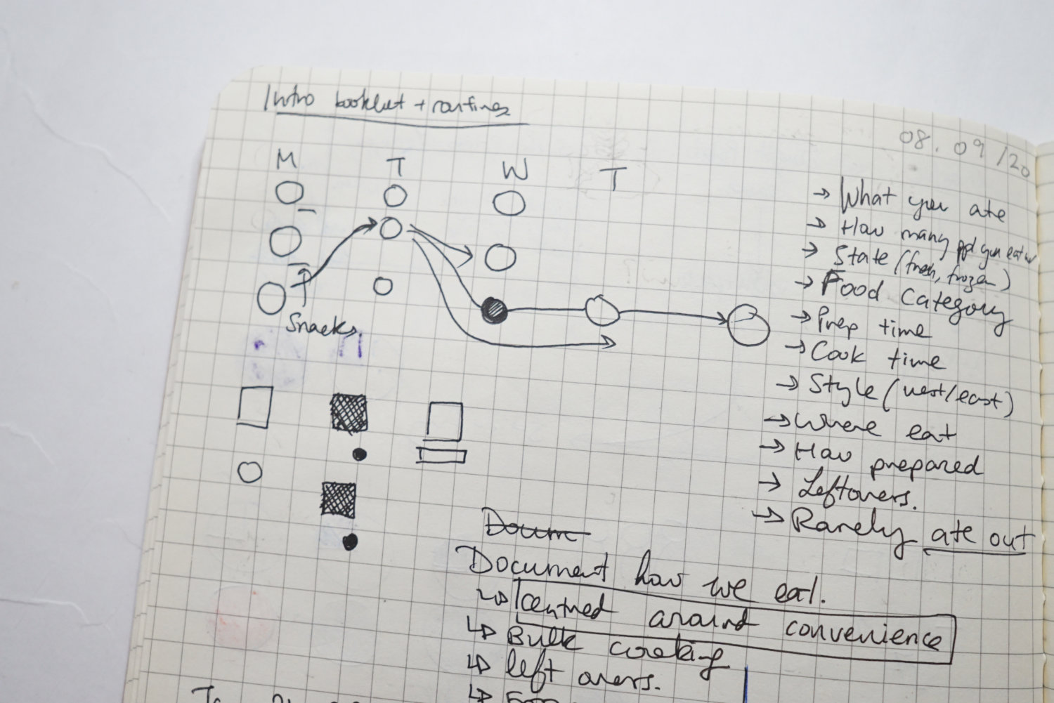
I collected a lot of data. It was so overwhelming. I usually over-collect data, it’s always easier to remove than to add to it. Here’s the list of variables I collected data on:
- cuisine style
- type of meal: breakfast, lunch, dinner
- who prepared the ingredients
- who cooked the meal
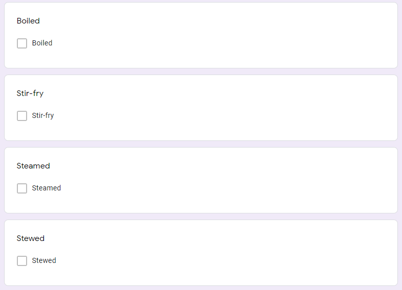
- cooking method: boiling, stir-fry, stew
- if the meal was made from leftovers
- category of ingredients: vegetables, meat, eggs, seafood
- type of ingredients: fresh, preserved, or frozen
- how many people I was eating with
- time it took to prepare and cook the meal
- where I ate: home, restaurant, friend’s place
- was it a special occasion?
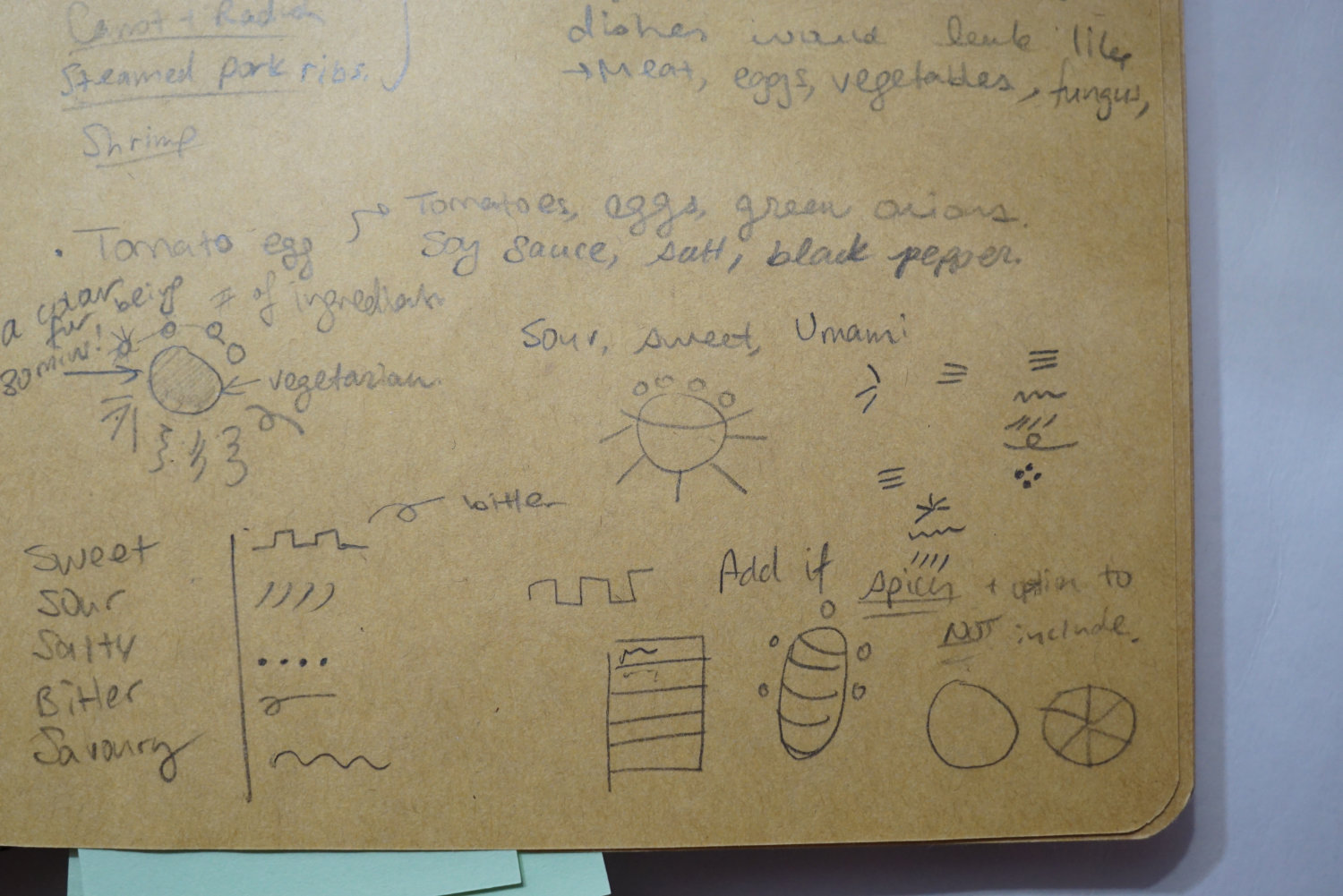
I had to narrow down the list, there’s no way I could show everything. The question becomes, how? How do I narrow something down? It’s really hard to make choices based on feelings. It’s easier to do this based on something more specific. I wrote out my main message in plain language on a sheet of paper. I referenced back to this every single time:
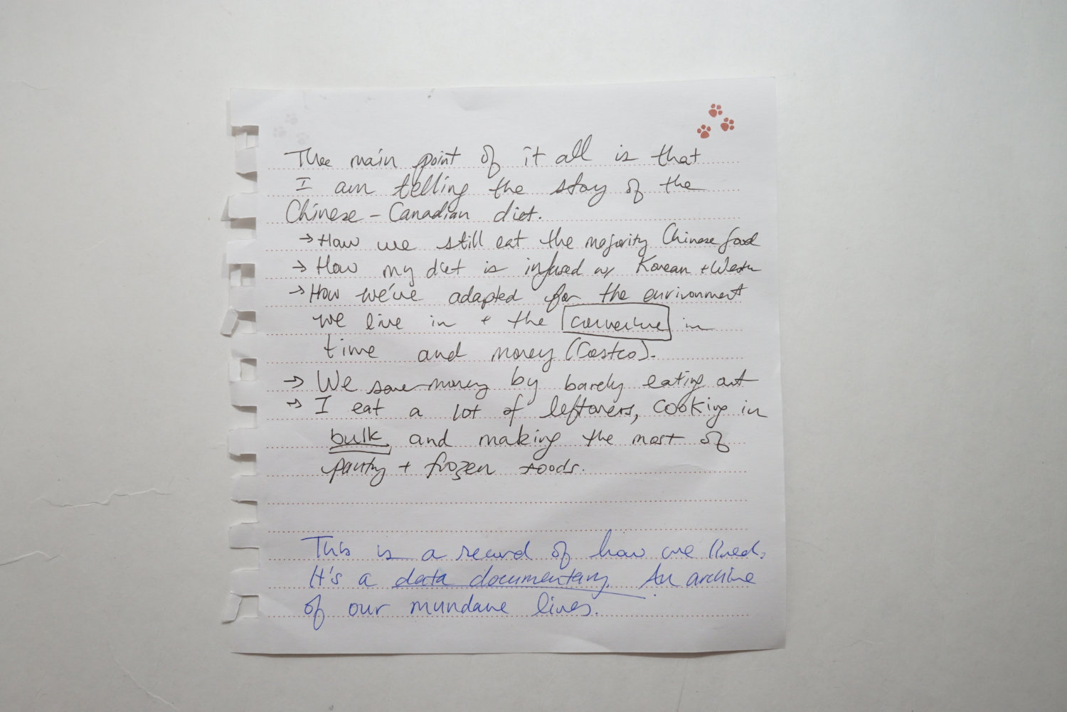
Main message: The main point of it all is that I am telling the story of the Chinese-Canadian diet. It's a story about how I eat Chinese food, how my diet has been influenced by my other cultures, and by the rapid pace of the modern life.
Teachable moment: As you explore your data, and have a hunch on what you want to visualize, Write down your main message in plain words on a sheet of paper. Keep this close-by to reference, it will help focus your narrative and what data to show.
This main message was a compass that helped me get more specific and focused. I finalized the variables to this list:
- Cuisine style: Just two generations ago, the diet of my family was strictly Chinese. There was no such thing as eating sushi or a steak. They didn’t exist in China at the time. In such a short amount of time, our diet has changed so drastically. I am eating foods from different cultures due to accessibility and convenience. Having access to various types of food is an expression of globalization and modernization.
- Type of meal (breakfast, lunch, dinner): Usually, the only time of the day where a meal has extra effort is dinner. Breakfast and lunch are sort of scraped together from leftovers or something from the freezer.
- Number of dishes that were fresh vs. leftovers: This ties into the ‘type of meal’ variable.
- Bulk cooking: Stews are very popular in Chinese cooking, they are hearty and healthy. Cooking food in bulk has been a smart way to make meals at home
- How many people I was eating with: A common trend that didn’t happen as much before is that many people are eating alone. It’s one of the reasons I think why mukbang has been in demand in recent years. Live-streams of people just eating has been enjoyable for viewers, it’s a ridiculous idea, but it’s something people want to see. Maybe because so many people are eating alone, they want to eat with others, even if it’s virtually.
- Time it took to prepare and cook the meal: A huge driver in our life is convenience and saving time. Many dishes I cook are stir-fries, and they can be prepared in a short amount of time.
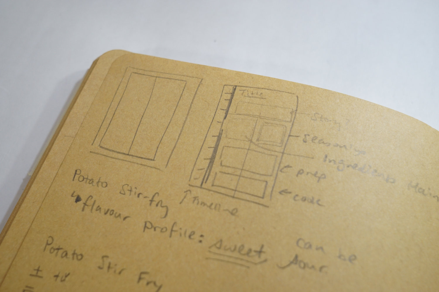
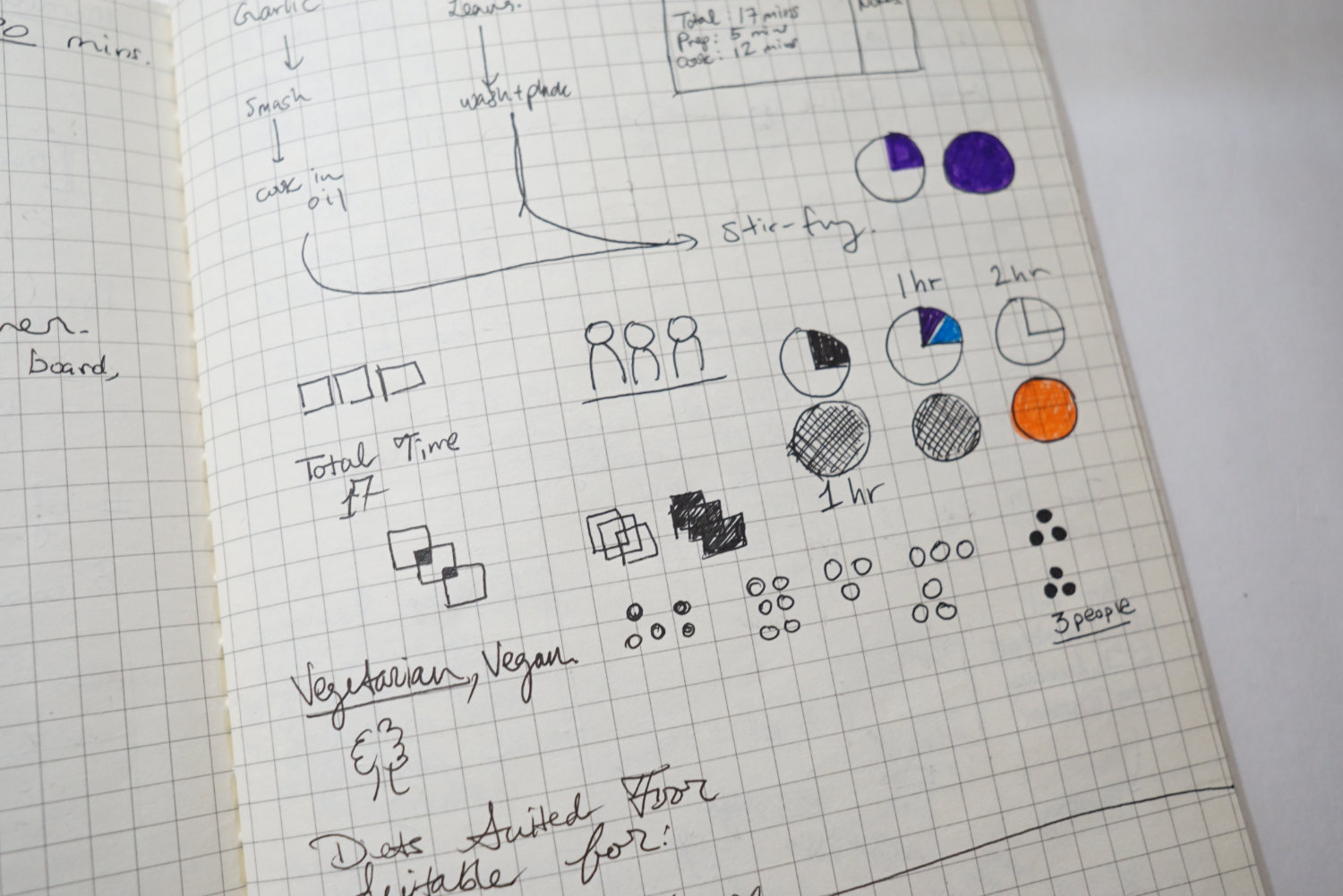
Shaping the data
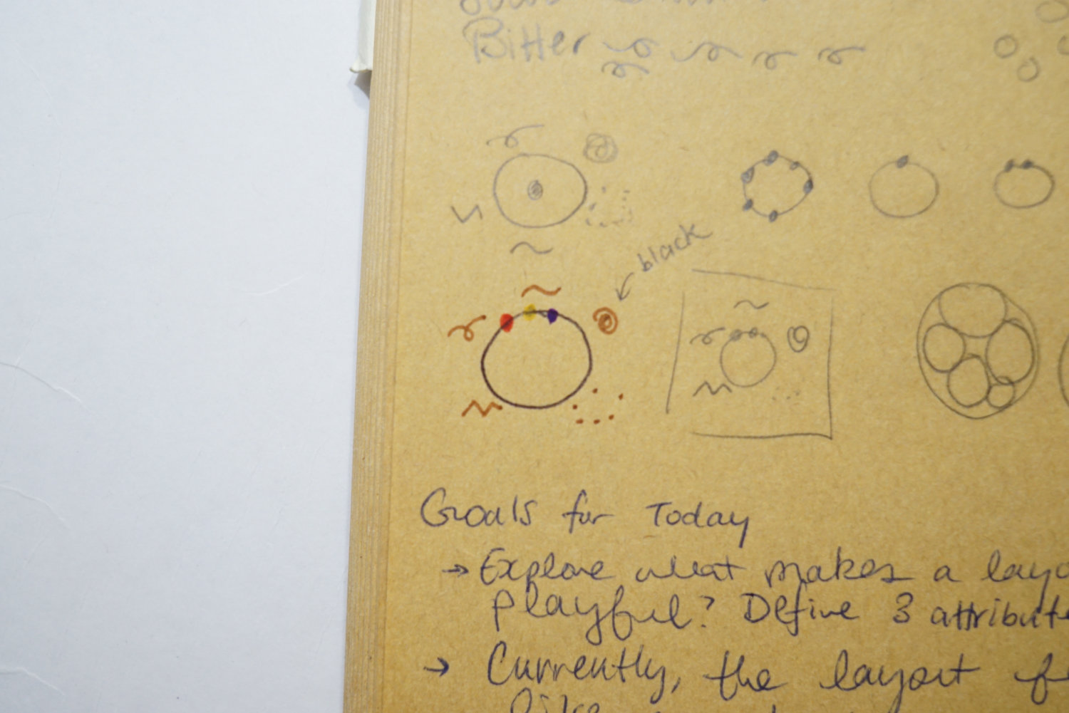
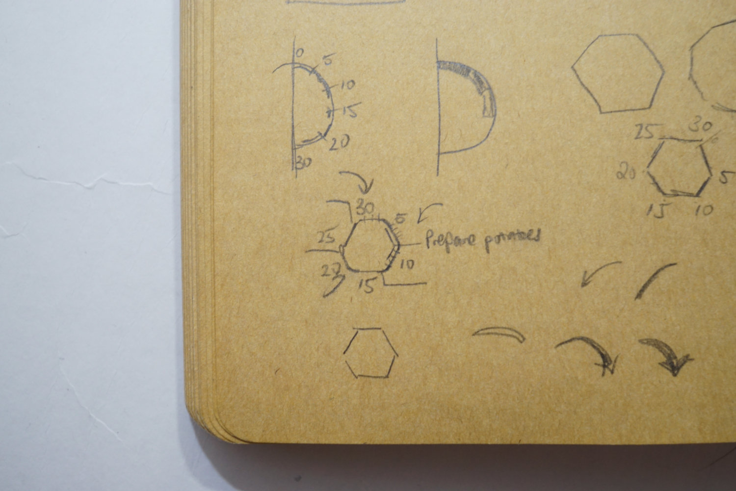
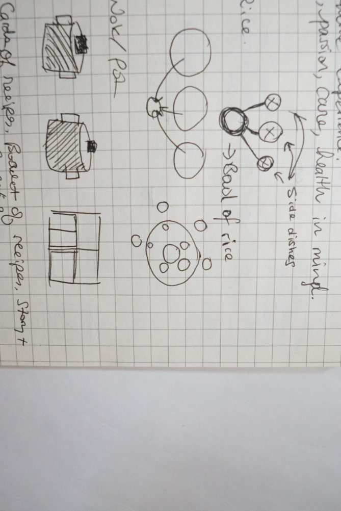
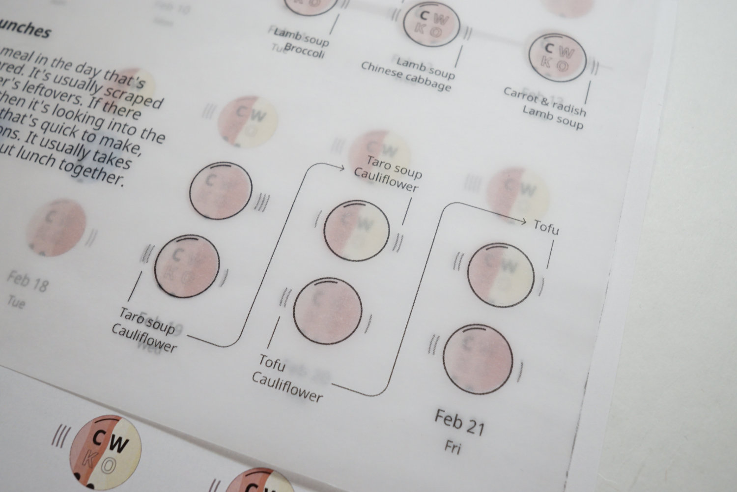
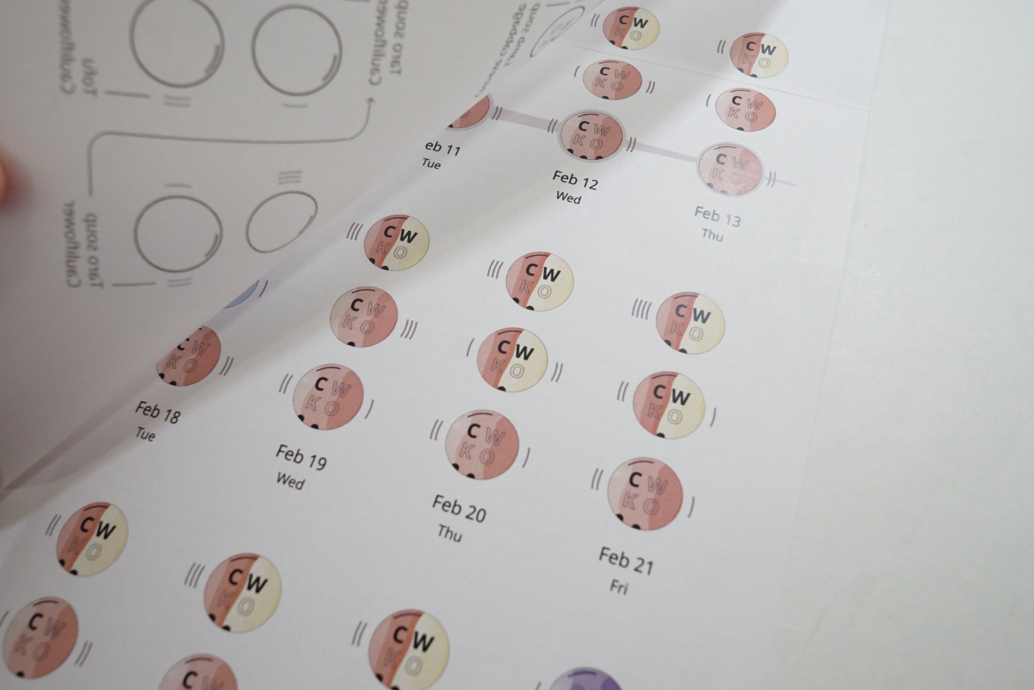
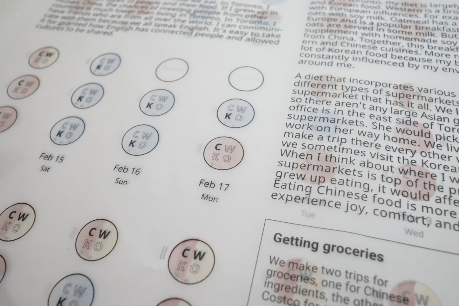
I sketched many ideas on how to visualize the data. Early on, I established that the circle would be an important shape to incorporate. Conceptually the circle comes up many times in Chinese cuisine. For example, round tables are common to make it easier for everyone to access the side dishes. Everyone eats out of a small rice bowl and take food from side dishes everyone shares. The circle gives everyone equal access to food and everyone faces each other.
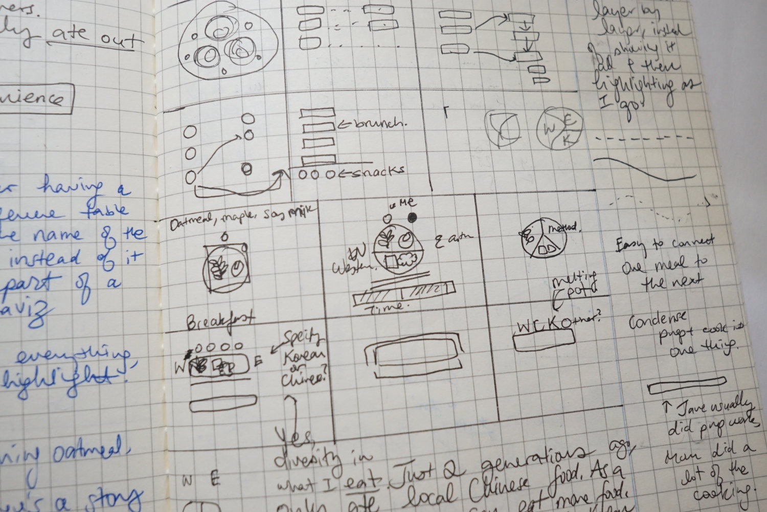
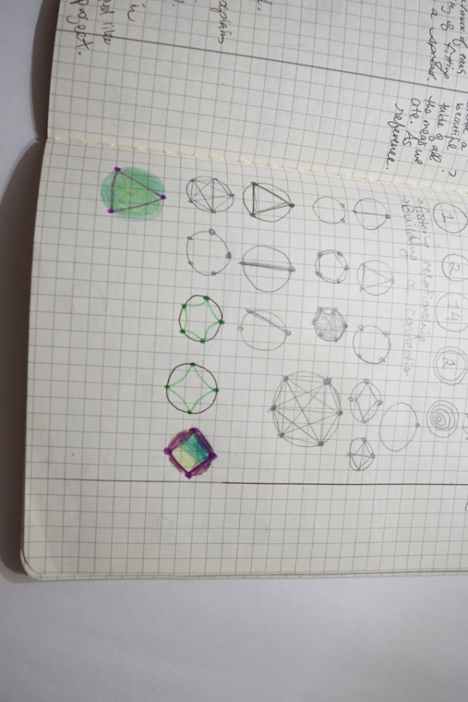
Mid-way through the process, I had about two weeks where I was stuck. I was hitting a wall with an idea and I had no idea how to break through. I kept going in circles.
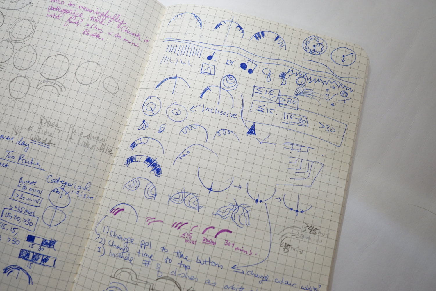
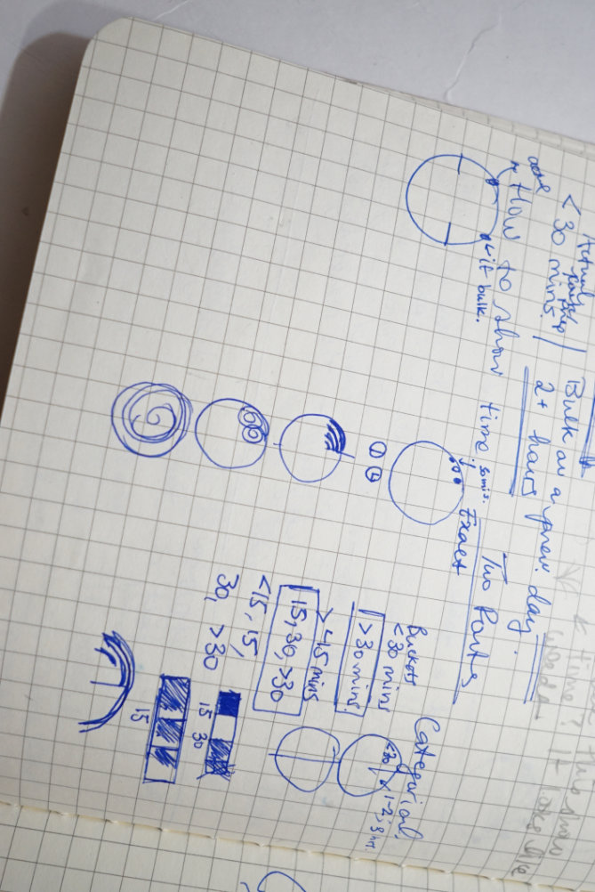
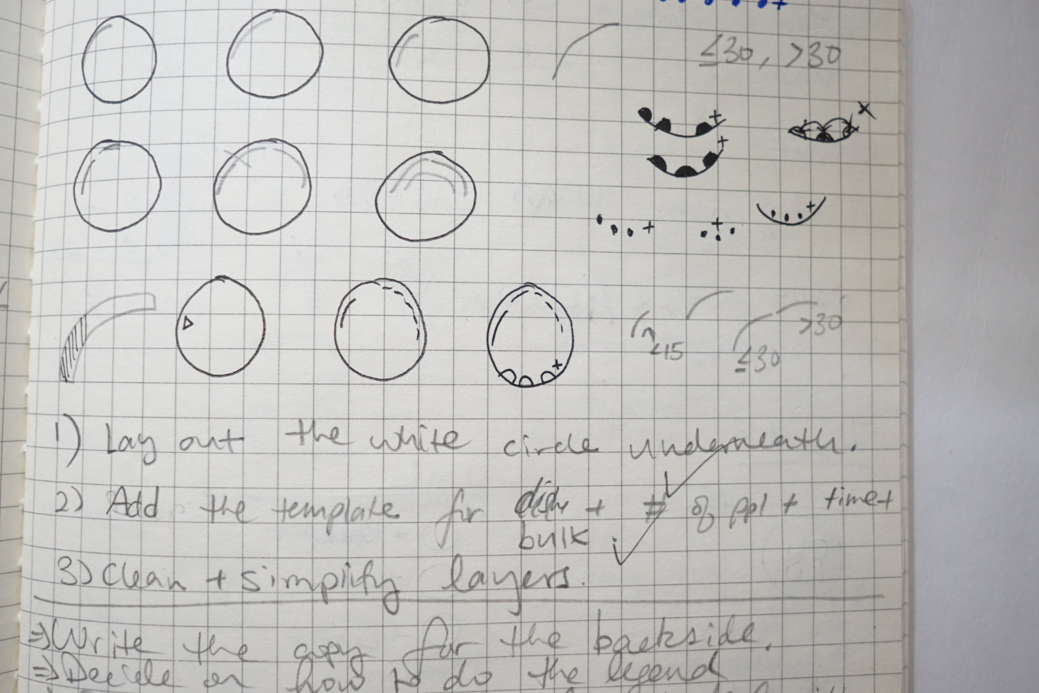
I was having challenges with how to show several variables and things just didn’t lay out neatly. I was losing hope at this point. I took a break from the process and let my head stew for a bit. I came back to my laptop and just kept moving things around little by little. Eventually, I got somewhere interesting. Iteration is key, even when there is no faith in it. This was a critical moment for me as I was able to solve my design challenges and move the project forward.
How I got out of a creative block by iterating.
Teachable moment: If you are ever stuck in your process, take a break and let your head clear out. If you are still out of ideas, then iterate by making very minor changes. You might spark a new idea from doing this.
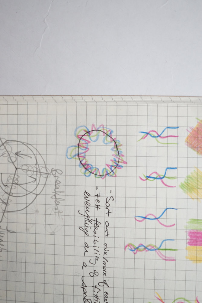
The Canadian cultural mosaic concept for colours
The Canadian experience is often defined as a cultural mosaic and I envision elements that intermingle, yet retaining its original composition. Some of my diet is a combination of different cultures. A simple example is what I have for breakfast. I cook oats and add my homemade soy milk to it. Oats is traditionally a Western staple. Soy milk is Chinese. These two ingredients come together to form a breakfast from different cultures.
I took my time exploring colours. My approach incorporates a lot of sketching.
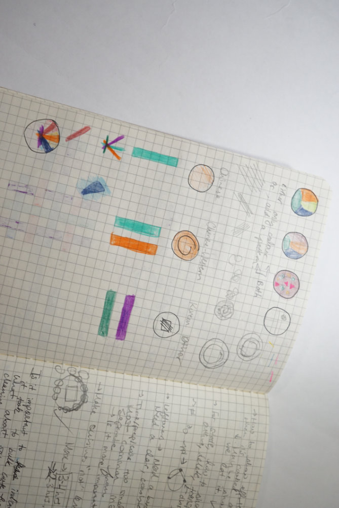
I eventually came across the idea of a visual metaphor that uses watercolours. It could be a good way to show cultures coming together, which represents the idea of cultural mosaic. This could be a great way to show the variable “cuisine styles”. I played around with watercolours and I liked how it turned out.
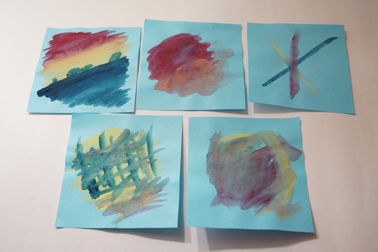
I tried this out Illustrator for a bit and eventually got the right feel for it. Since the colours aren’t solid, it might be hard to see them clearly.
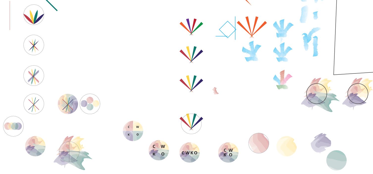
I double-encoded it with letters to make it more clear.
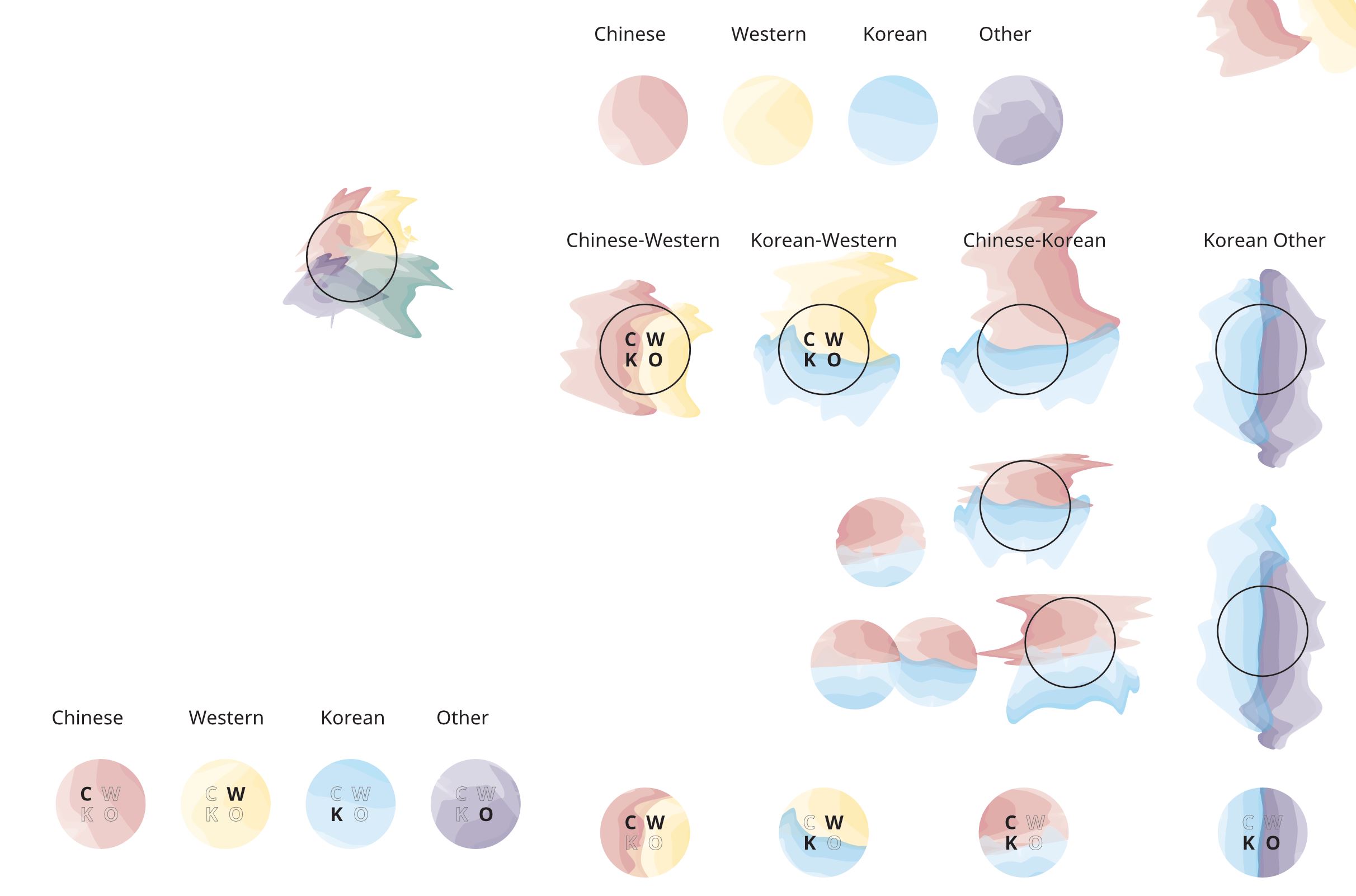
The final result:
Adding annotations through vellum
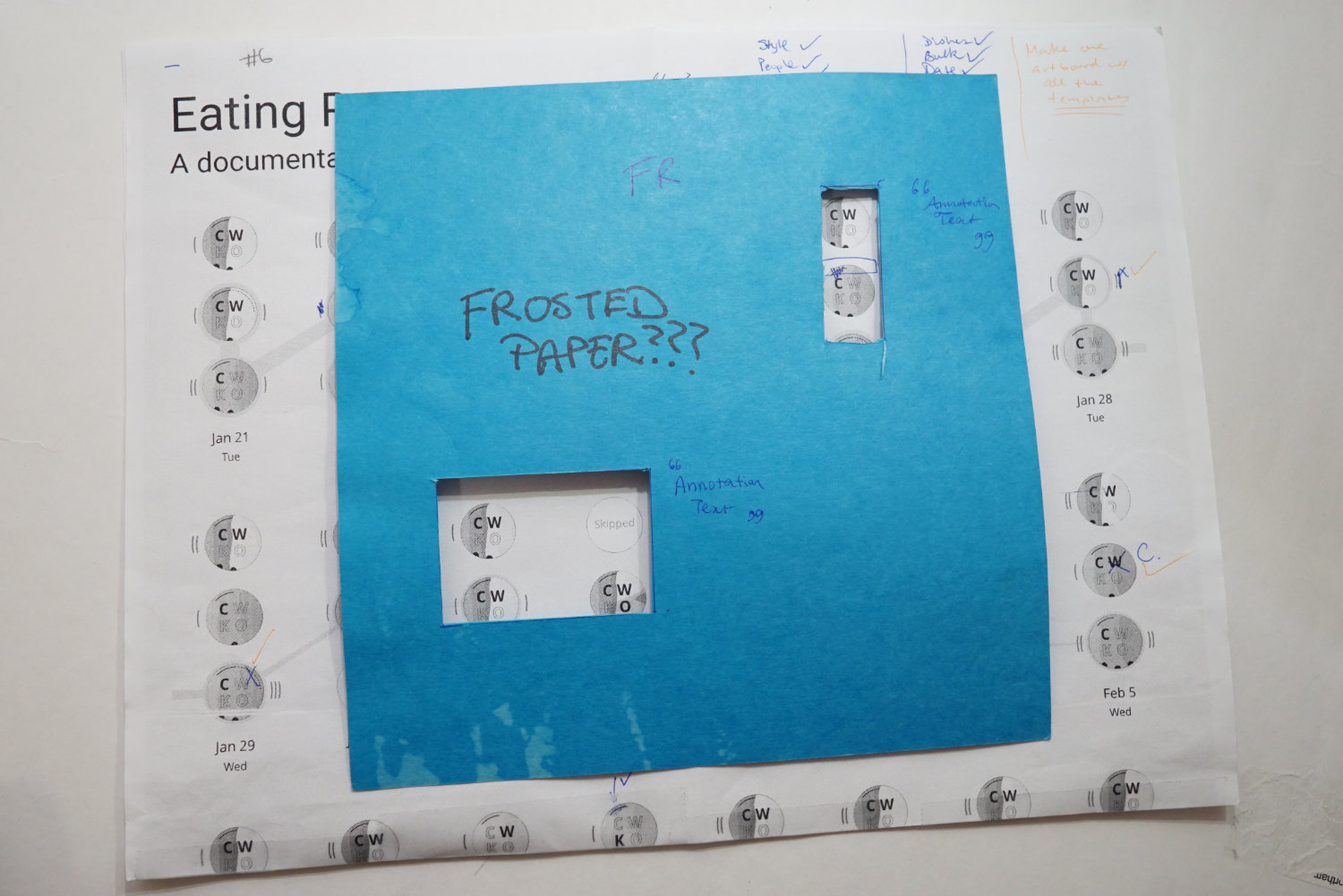
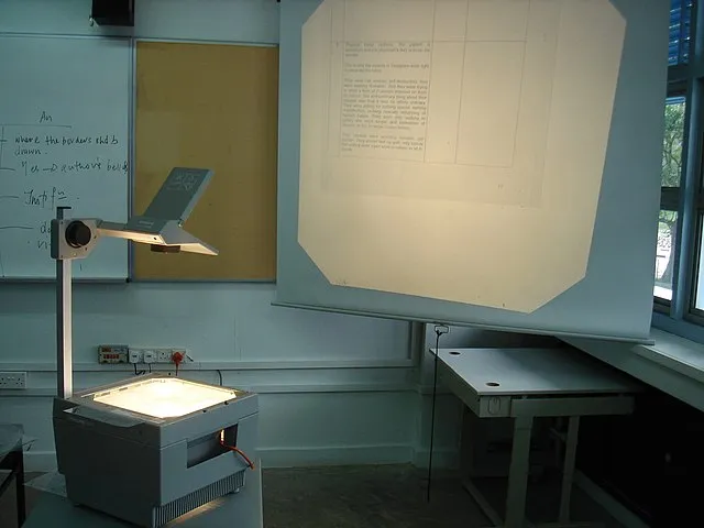
Since I was making something in print on a poster, I wouldn’t have much space to add context to the data. Annotations are very important in a visualization. If I gave you the final visualization, you wouldn’t know what to look for without someone narrating or a write-up to accompany it. A visualization by itself is static. To truly appreciate what it has to say, it needs narration. When I was in school, my science teacher used an overhead projector to mark-up diagrams. I remembered how she would overlay the transparent plastic sheet over a printed sheet and make notes. Maybe I could apply the same idea to the poster.
I looked up my options and came across vellum paper. Vellum paper is like parchment paper and they are translucent. They have been heavily marketed for weddings and as tracing paper. In my case, it was the perfect option. I bought a pack from Amazon to try it out. To my disappointment, printing on vellum was some kind of sick torture. I failed so many times printing on it, it kept jamming my printer. I had a 25% success rate printing on vellum. For every 4 sheets, only 1 turned out OK.
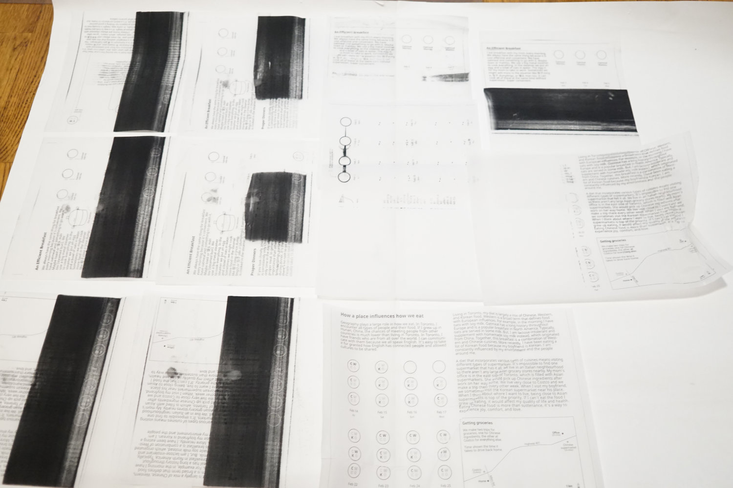
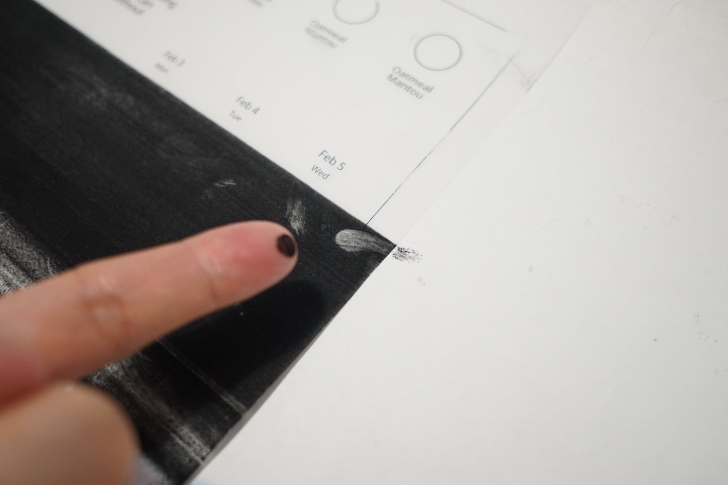
When the paper jams, it kept printing and all the ink would collect in one place. It's so dense with ink that I could just rub it off.
I didn’t have a good experience with vellum, but I was glad that I could get what I needed out of it.
To give the annotations more context, I provided an overview of the project on the back of the poster. A book has a section at the beginning of the book that introduces the book. I list some key themes that the data reveals and also a short bit on how the data was collected and processed.
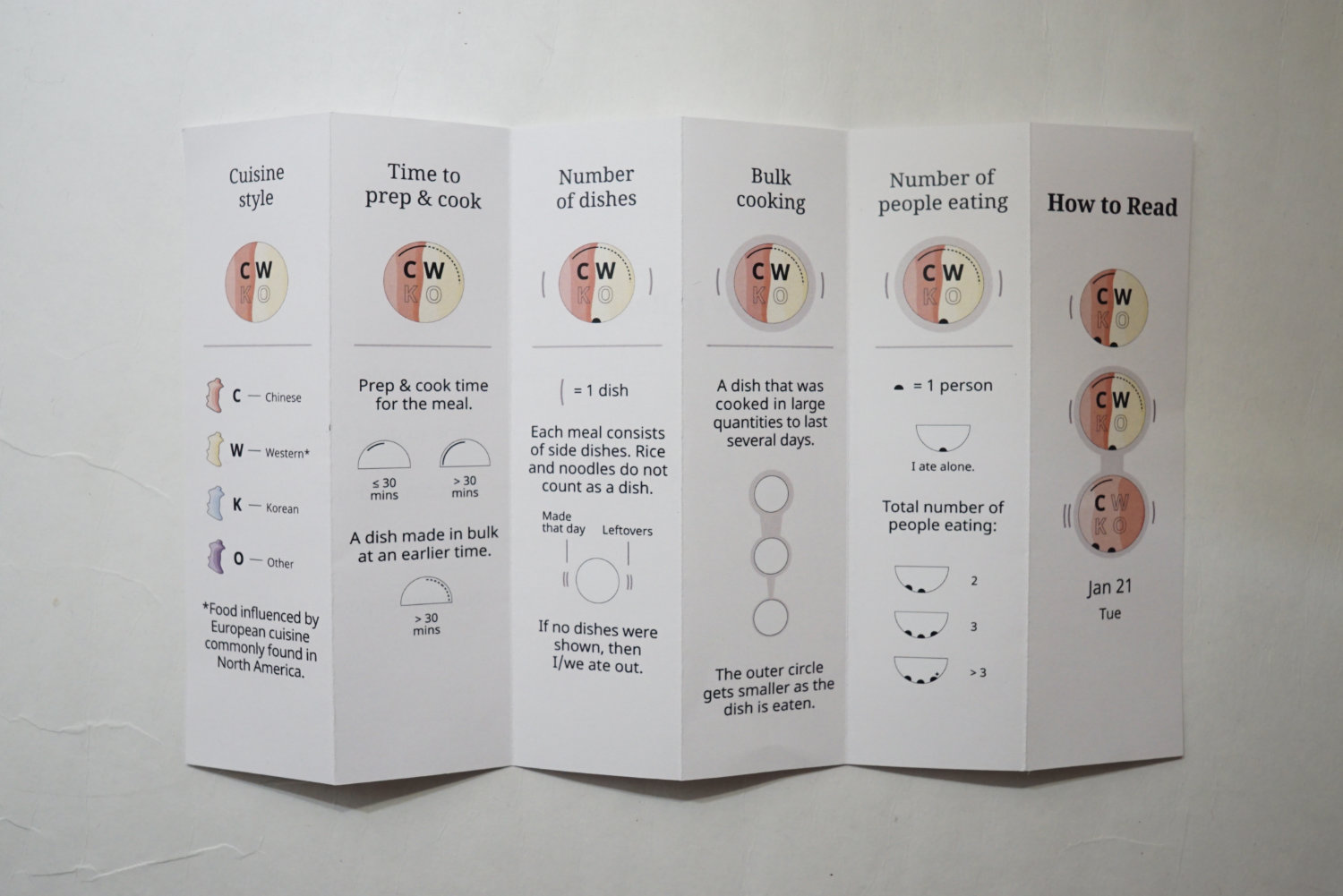
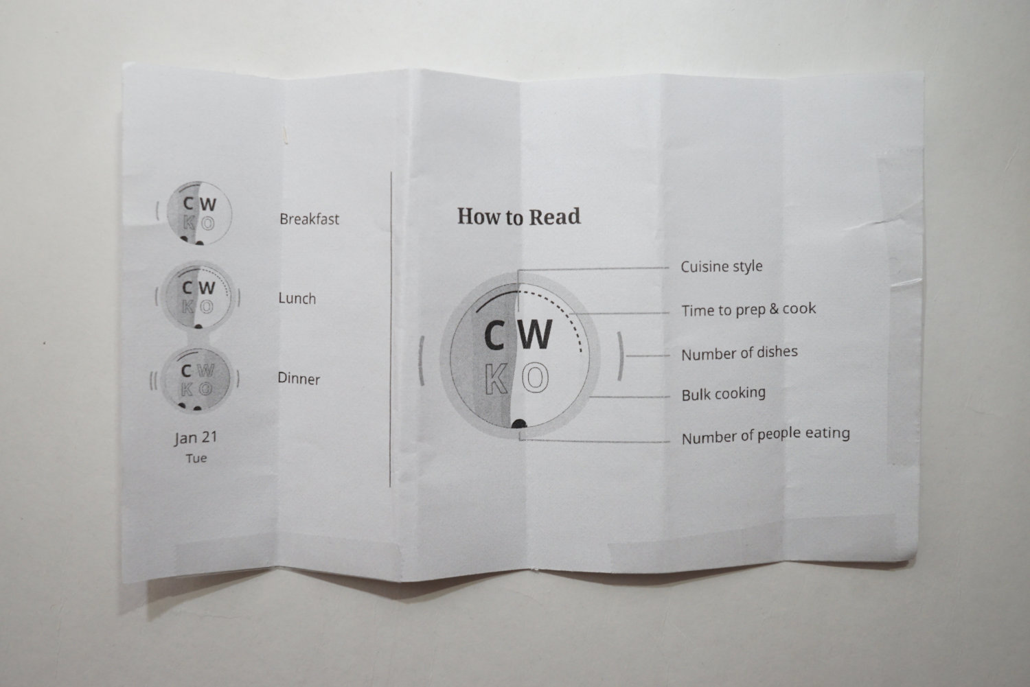
Designing the legend for the poster
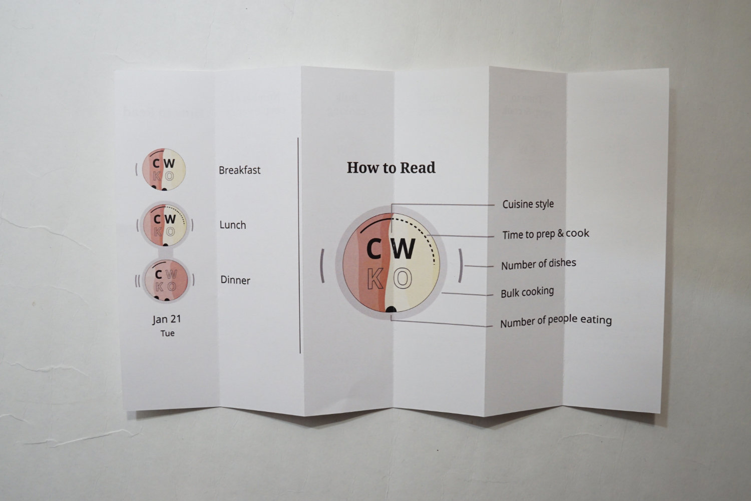
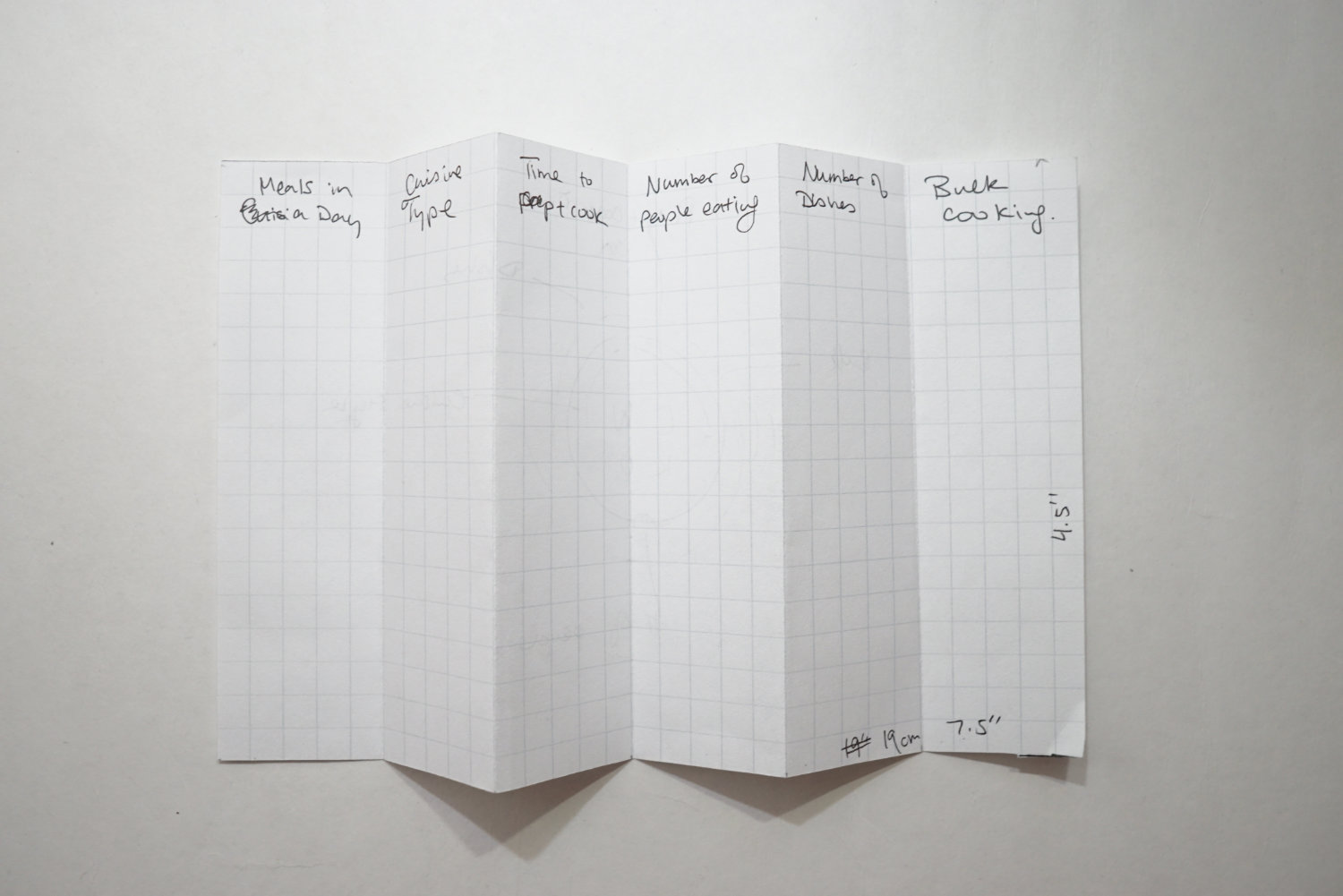
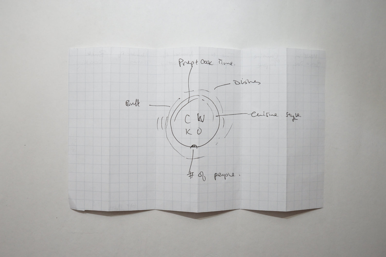
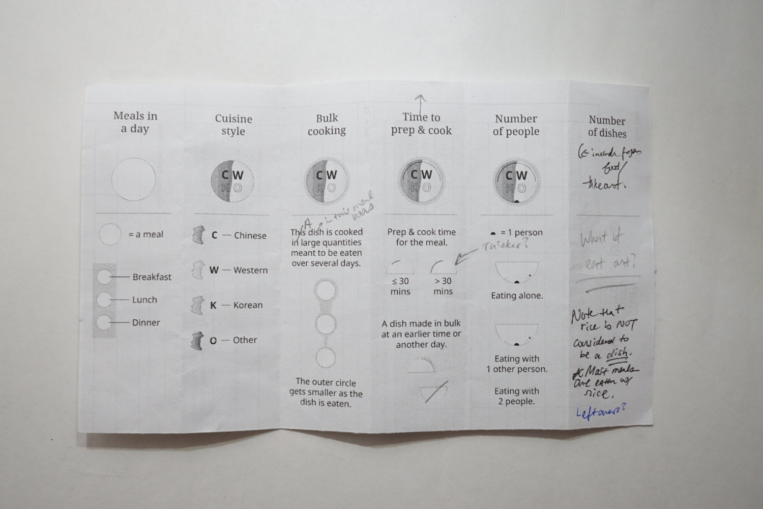
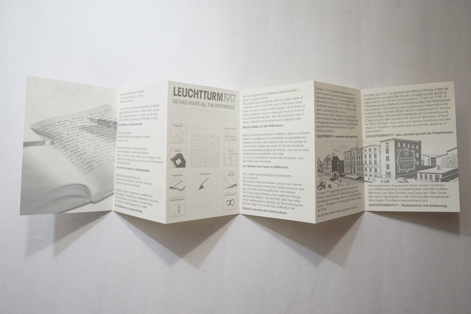
I needed a way to explain how to read the visualizations without compromising the layouts. I made an external piece for each component. The inspiration came from accordian brochures I saved. I kept these from things I bought in the past.
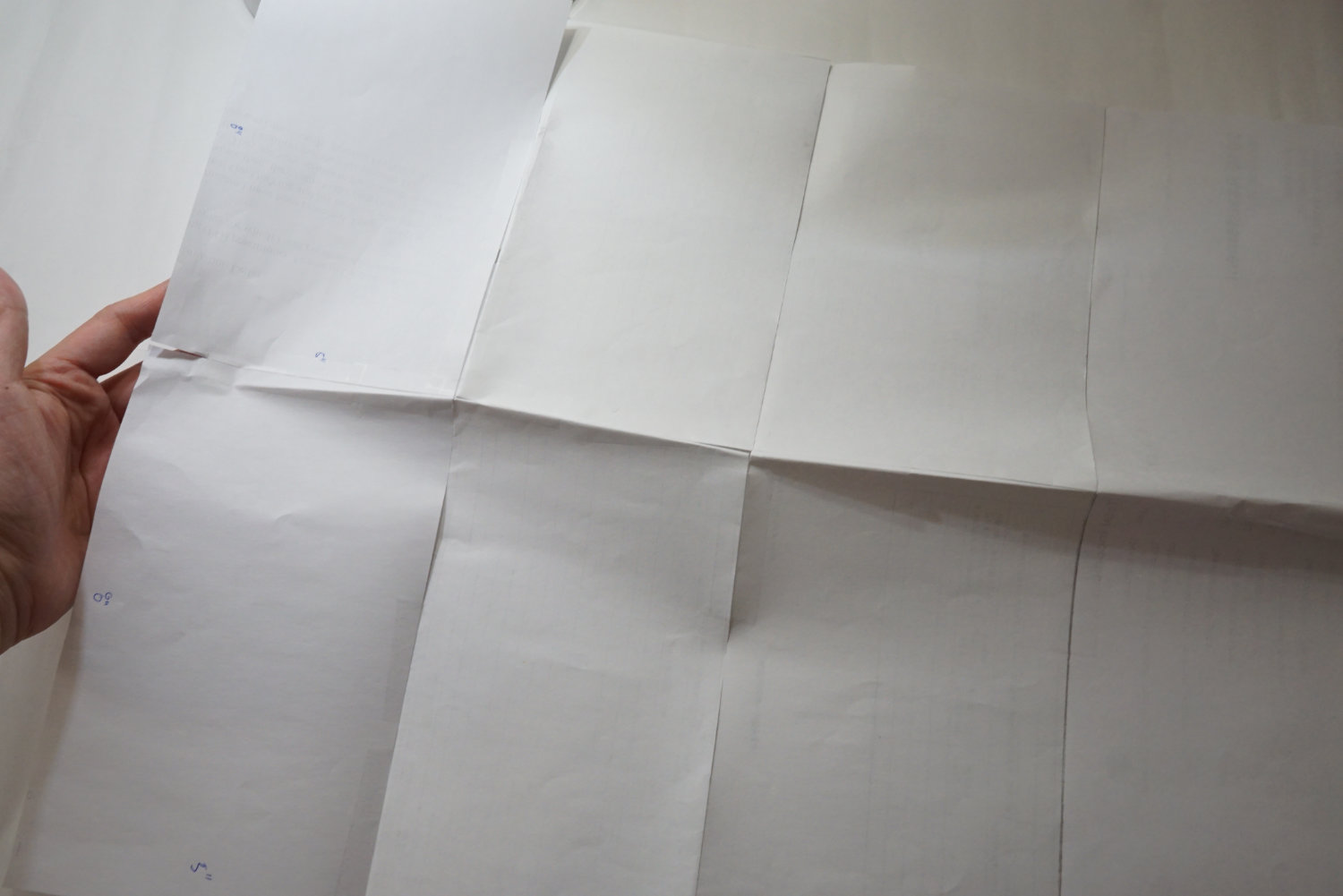
For the poster, I made a small thin brochure. It has 6 panels and is double sided. It is really simple and explains how to read the visualization in simple terms.
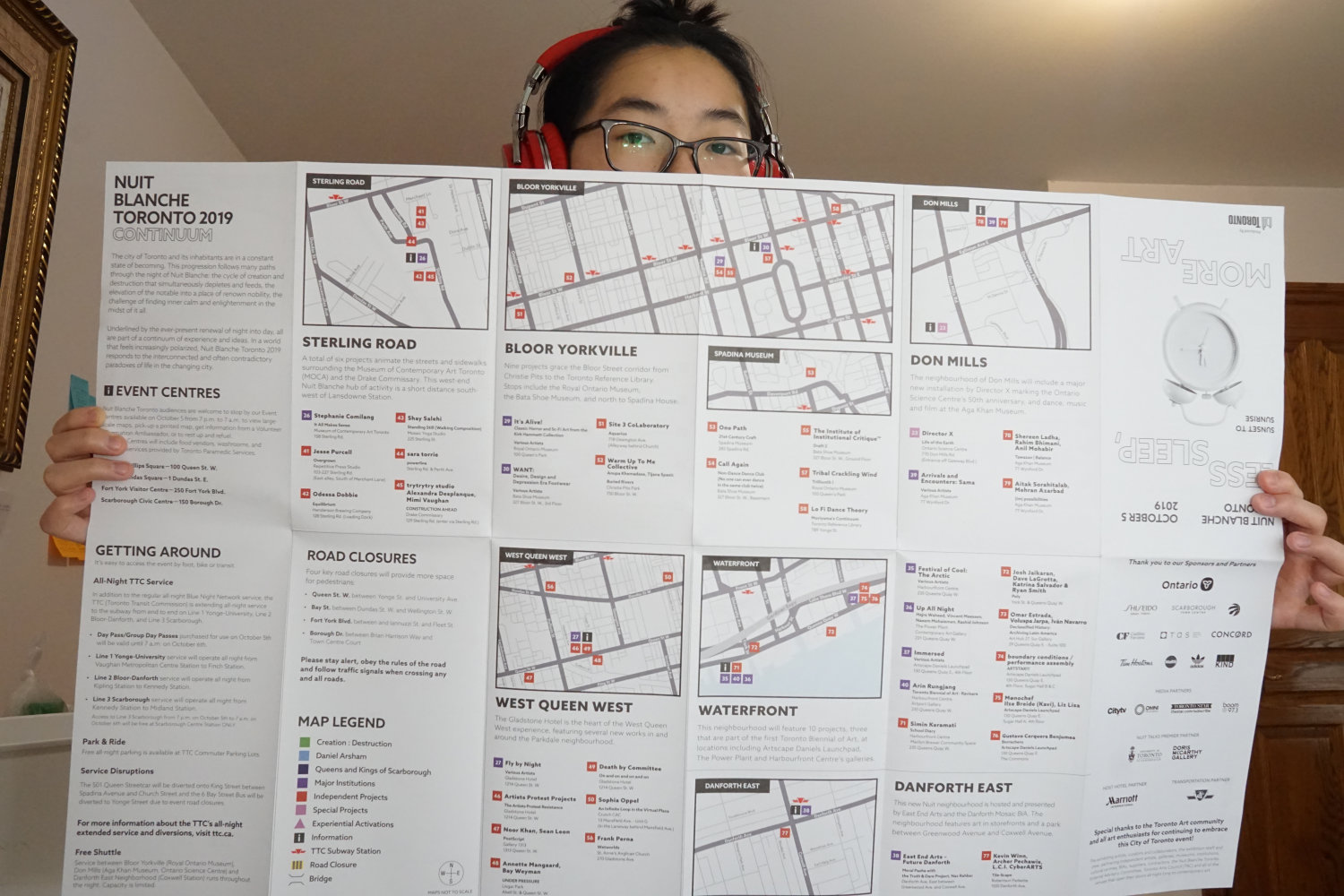
Production of the poster
I learned a lot about print production in this project. Let’s start with some inspiration. I had a couple of these brochures that I studied. They were all very large, and not traditional in size. The Nuit Blanche brochure is 31" x 19".
I cut some paper up and taped them together to test out some sizes.
In the end, I aimed to have the poster to be 28" x 18". I started up Illustrator to test out the sizes. I was setting up my margins and thought it would be a good idea to get these specs from a print shop so I can have it match their requirements. I called several print shops and realized nobody could print the size I wanted double-sided. I made a big mistake when I started this project without doing proper research on print shops. I spent several days researching and calling the shops. It was really annoying to learn that I couldn’t print a size that I saw possible in Toronto. I eventually found one shop (The Print House) that could do what I wanted in Toronto. The largest poster size they could printed double-sided was tabloid (11" x 17"). The catch was that my minimum order had to be $15, which meant I could print about 5 posters. I was fine with this, this was the most reasonable request within my budget. Phew!
Teachable moment: When making something in print, always work backwards. Check what is possible with the print vendors and work according to their specifications. Most shops will tell you how to set the document (such as bleed and margins) and will note what is the ‘safe space’ for printing. Make sure you also understand if they have requirements such as a minimum order.
Section 2: Viz the world, recipes
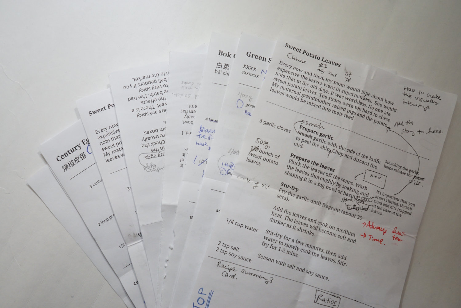
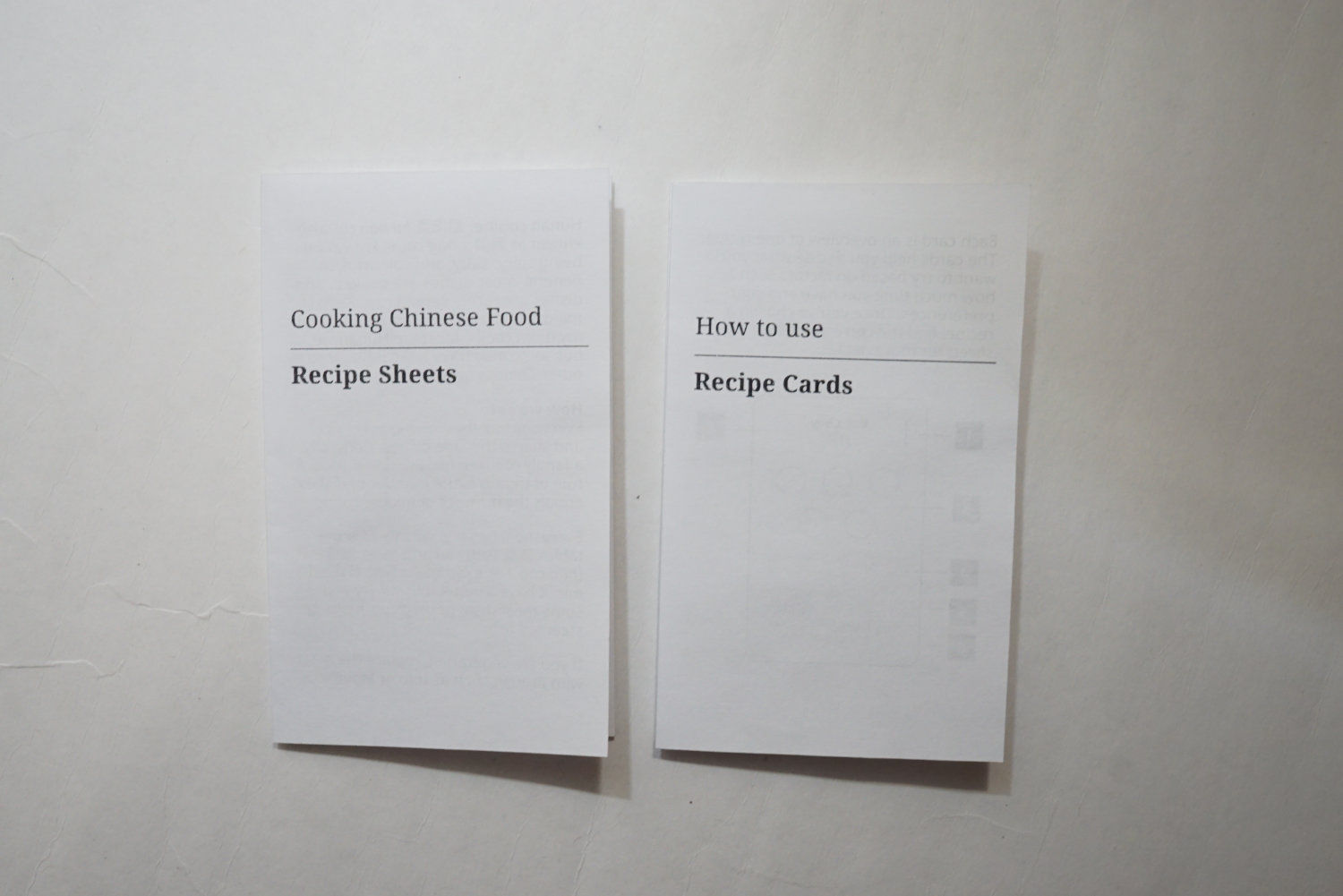
This is the second section of the project. There are two components: a set of recipe sheets and a set of recipe cards.
Recipe sheets: how to improve the recipe experience
I picked this up last year during a local spring cleaning event. There was a neighbourhood putting stuff they owned and letting anyone take them for free. There were books, toys, games, appliances, and so on up for grabs. I browsed through the books and found this cool PocketChef.
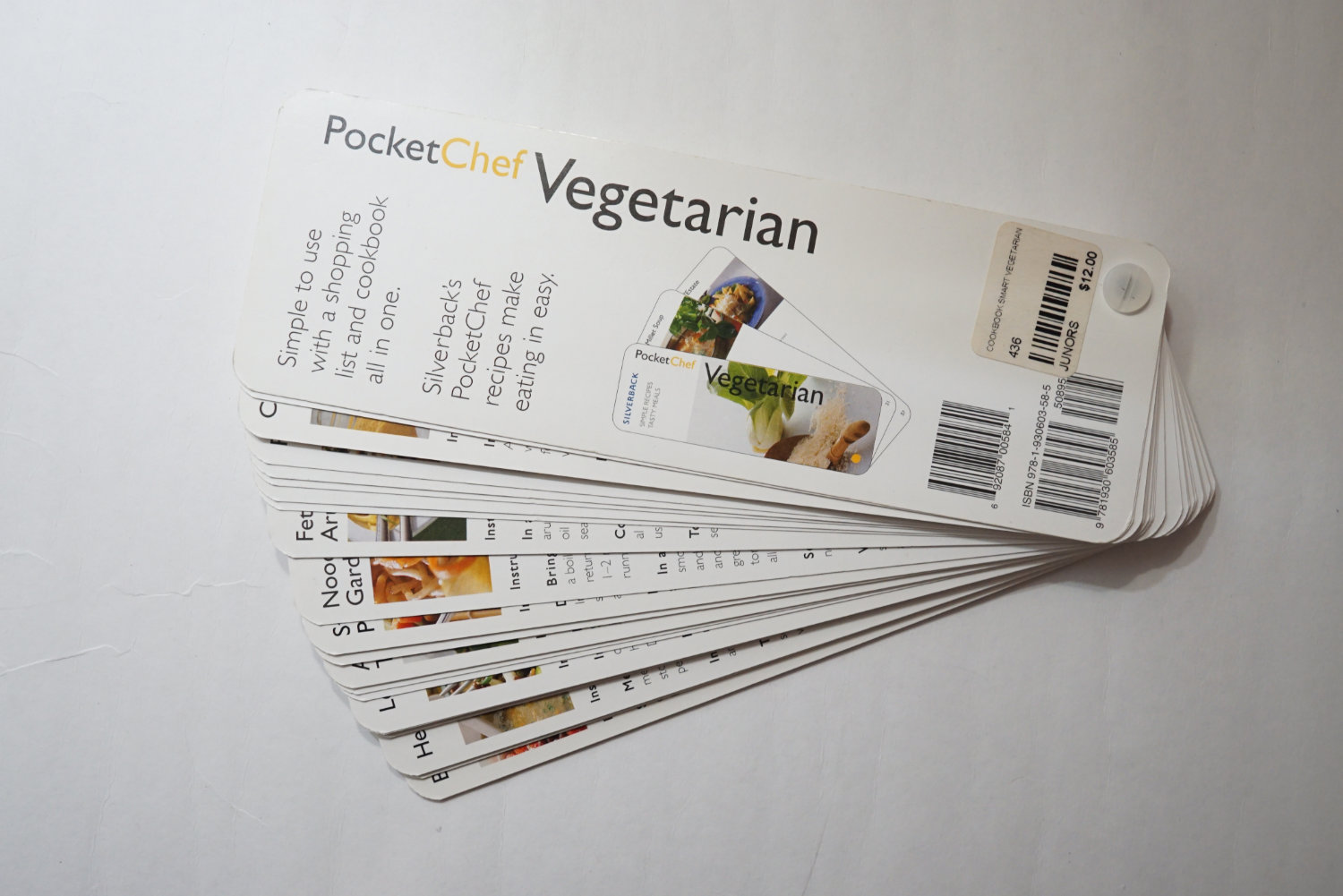
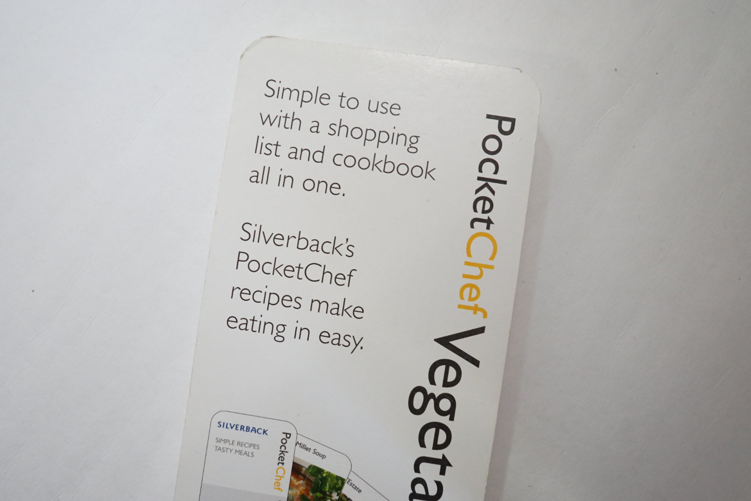
On the back, it says: 'Simple to use with a shopping list and cookbook all in one.'.
This was a mini cookbook. It was designed to be easy to carry around. Each card is a recipe, the front lists the steps and the back lists the ingredients. The ingredient list doubles as a shopping list.
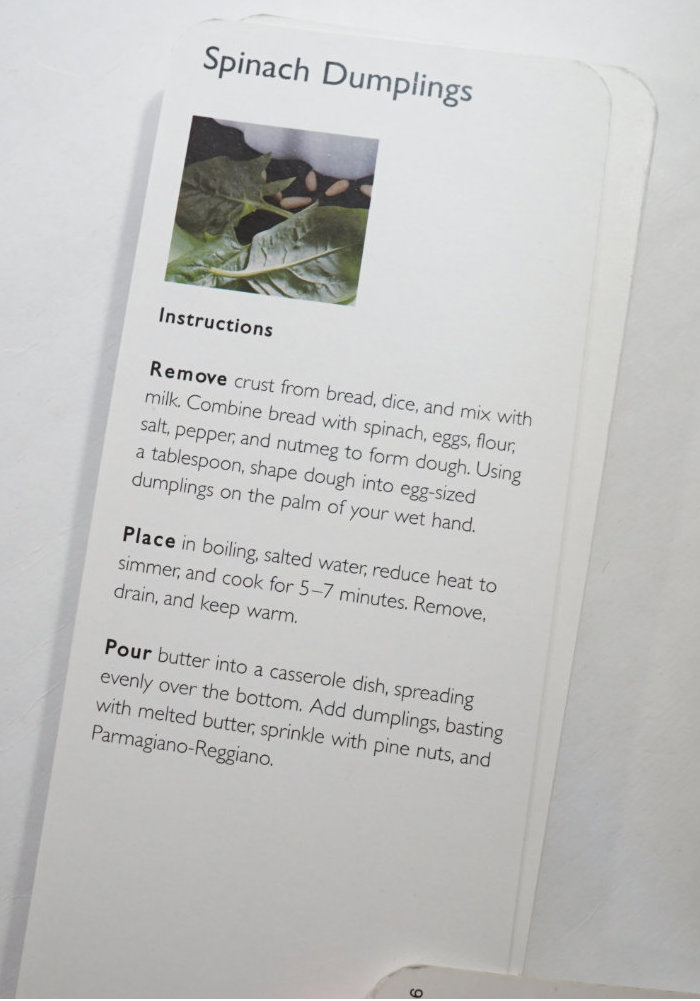
This side lists the steps.
This side lists the ingredients, which is also a shopping list.
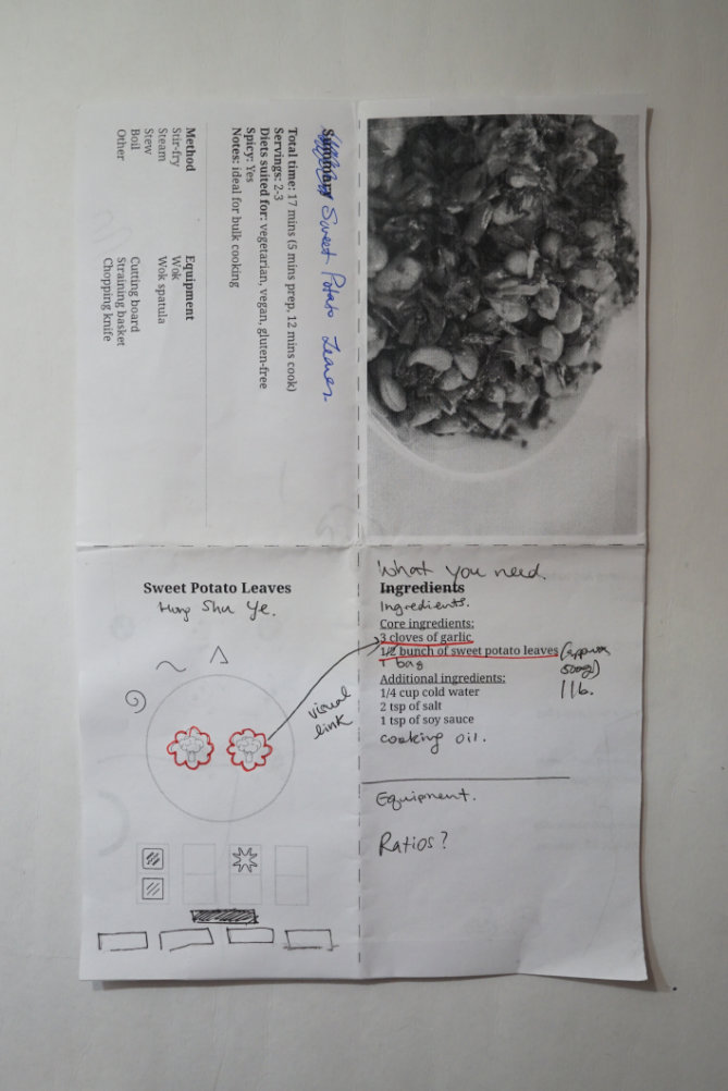
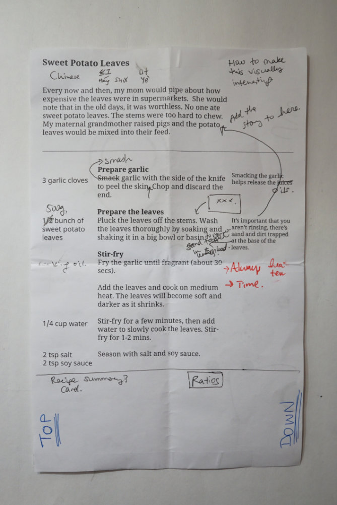
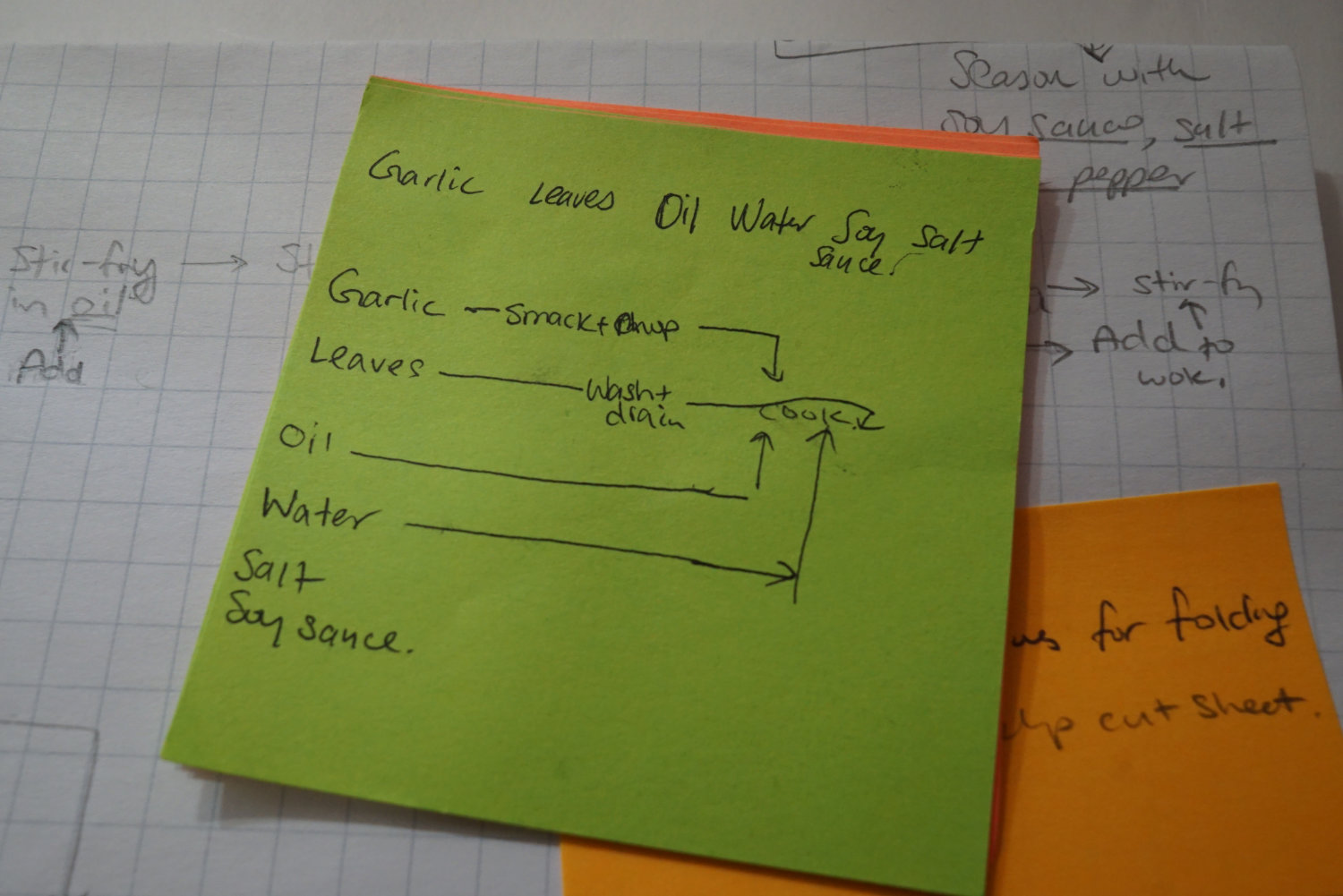
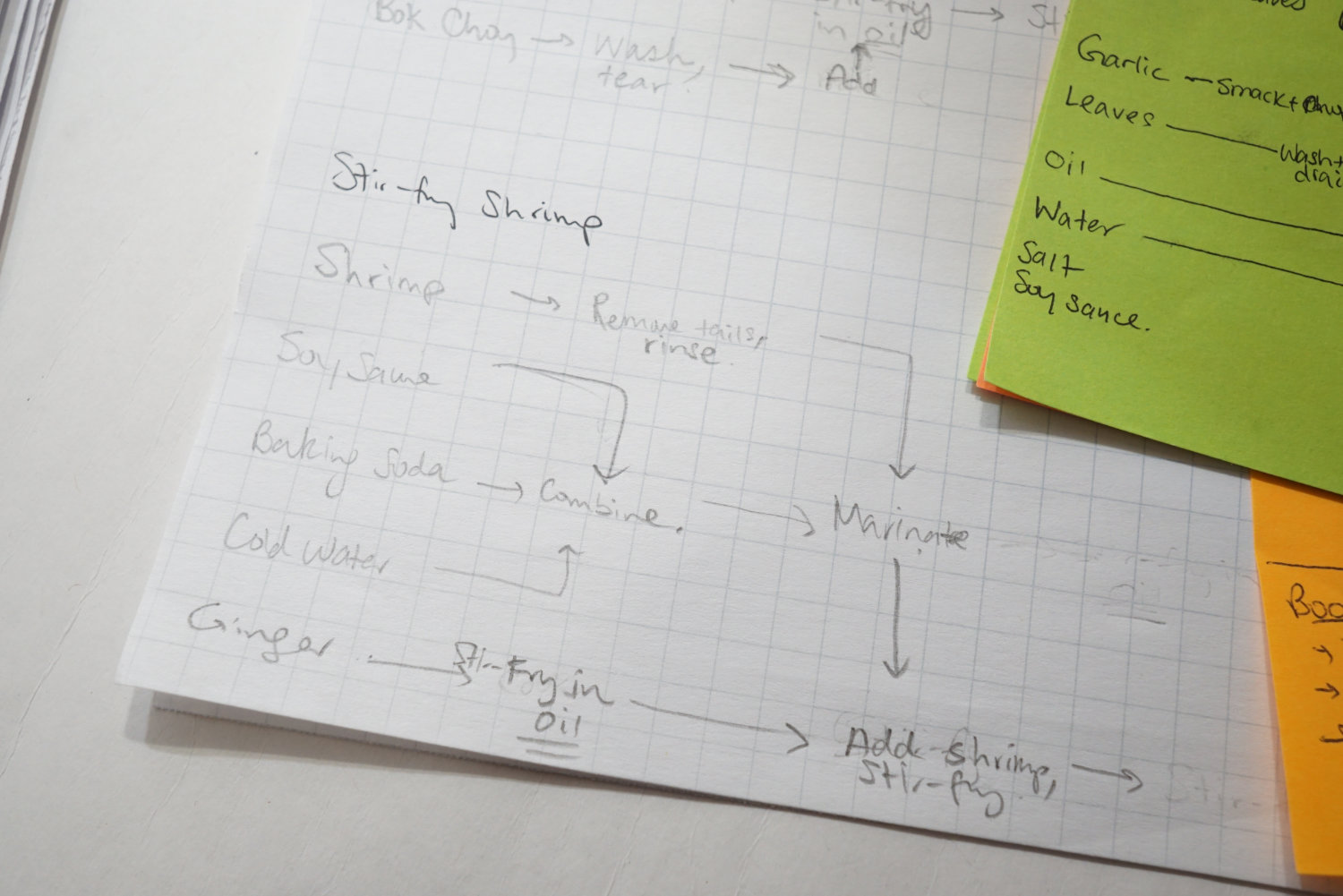
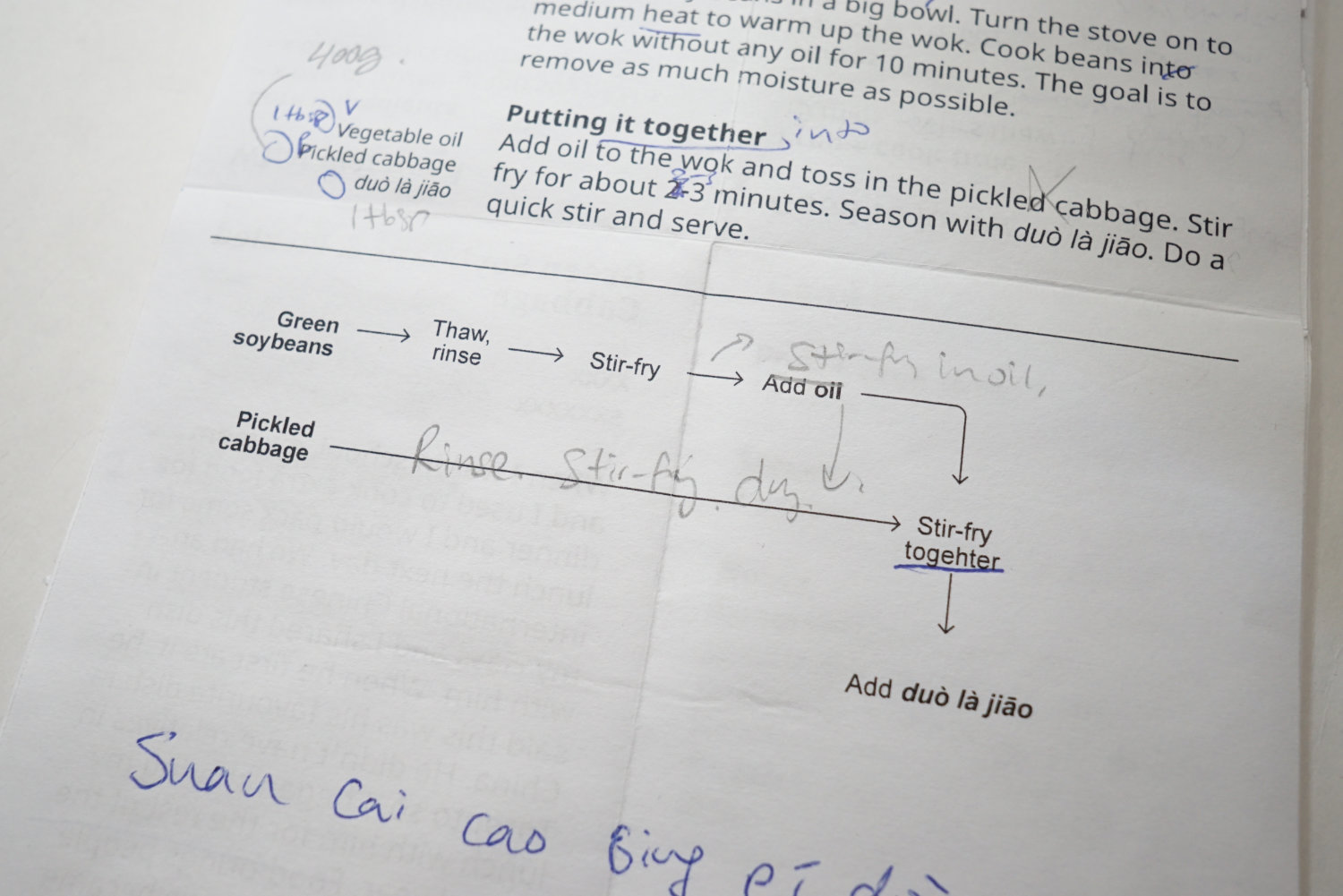
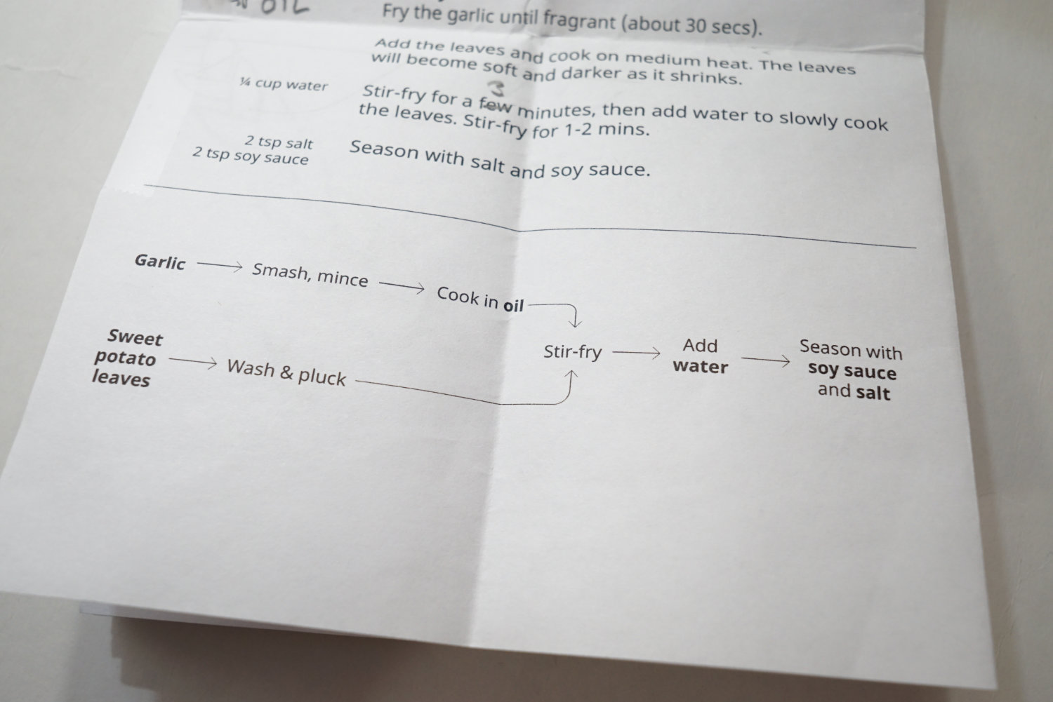
I really liked how the PocketChef was optimized for usability. Inspired by this, I came up with an idea of recipe sheets. Each recipe would be on a single sheet, double-sided. The front would be a summary of various information about the dish. The back would list in instructions in detail.
A recipe generally has the following information:
- ingredients list
- instructions
- time to prepare and cook
- number of servings
- a photo of the dish
I tested many variations on a half-letter sized paper to get my ideas out.
Recipe sheet: initial draft of the front.
Recipe sheet: initial draft of the back.
I really liked the idea of PocketChef as something that was easy to transport. The recipe sheet would be foldable and could easily transform into a shopping list.
An early version of how the sheet would look like if folded.
I think a lot of cookbooks dismiss a good user experience. The layouts aren’t optimized to be referenced. I don’t think this is intentional, it’s just something not seriously considered. I see a lot of opportunities to improve how cookbooks are designed and make them easier to use. To gain clarity and guidance, I did some simple user research. I Googled “recipe pet peeves” and came across a wonderful thread where people complained about all the ways a recipe could be better written. Perfect. These were all suggestions on how I could write a recipe well.
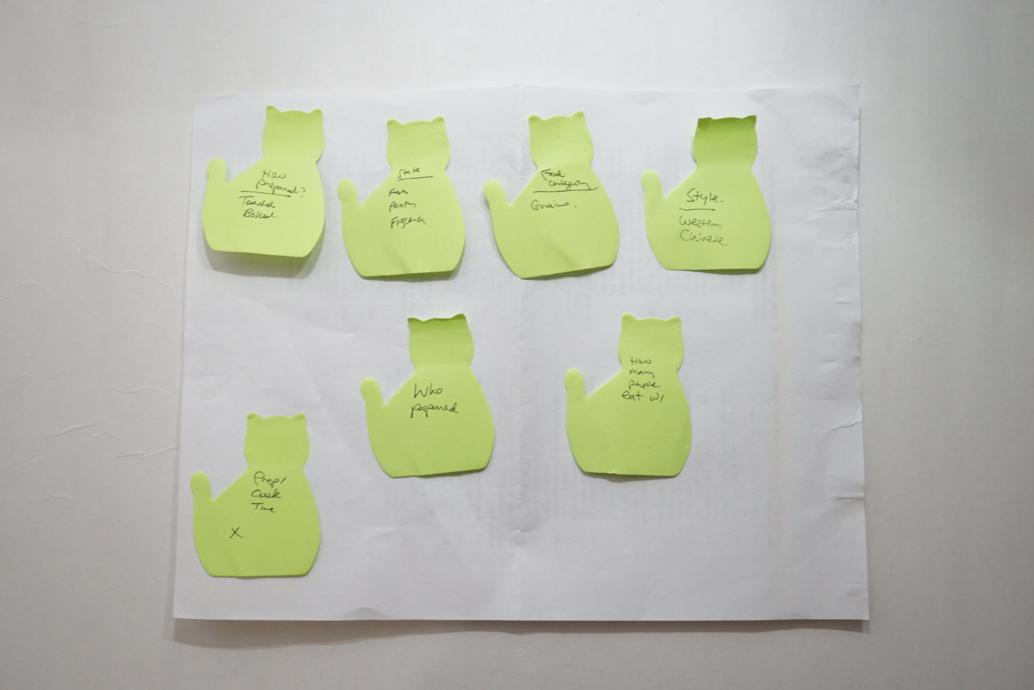
Drawing from my experience with the Tekken project, I wrote one comment per sticky note, and organized them into themes.
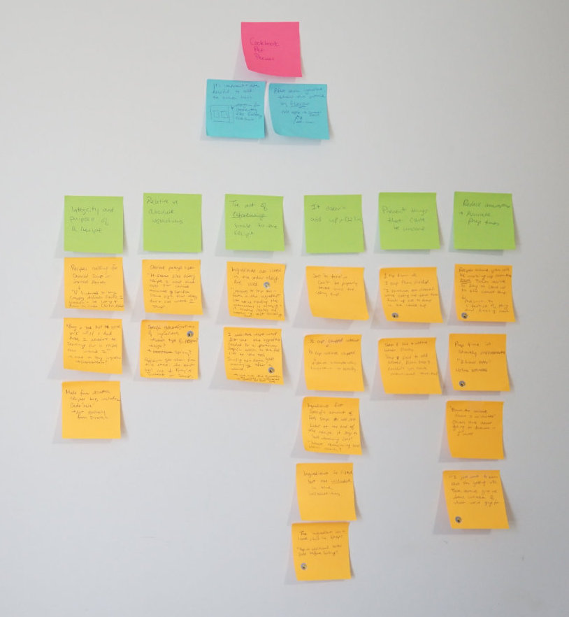
Research I collected from a Reddit thread on recipe pet peeves.
Here’s a quick summary of some comments from this Reddit thread that I found helpful:
List ingredients in the order they are used: “Having to skip back and forth in the ingredient list while reading the instructions is annoying and it always makes me worry I left something out."
Make it easy to reference the ingredients: “I wish more recipes would list out the ingredients needed for a particular step."
Don’t make assumptions, be clear with expectations: “Prep time is severely underestimated."
Make sure the steps make sense: “They list salt in the recipe, once with a specific amount. So I put that amount in when it calls for it. Later in the recipe it says to add the remaining salt. What remaining salt?"
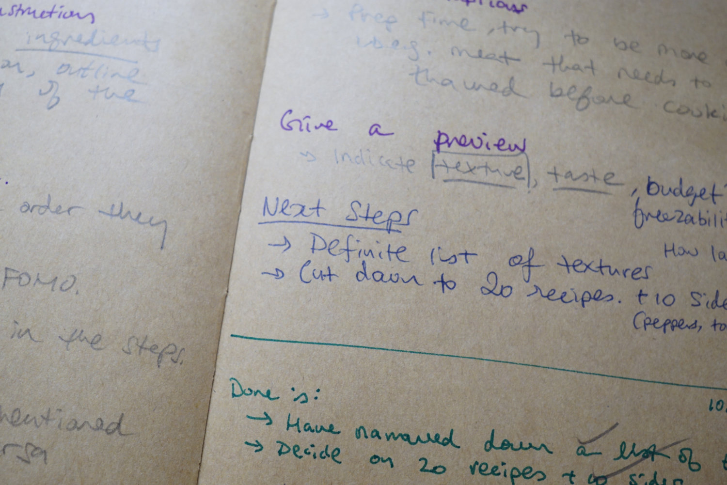
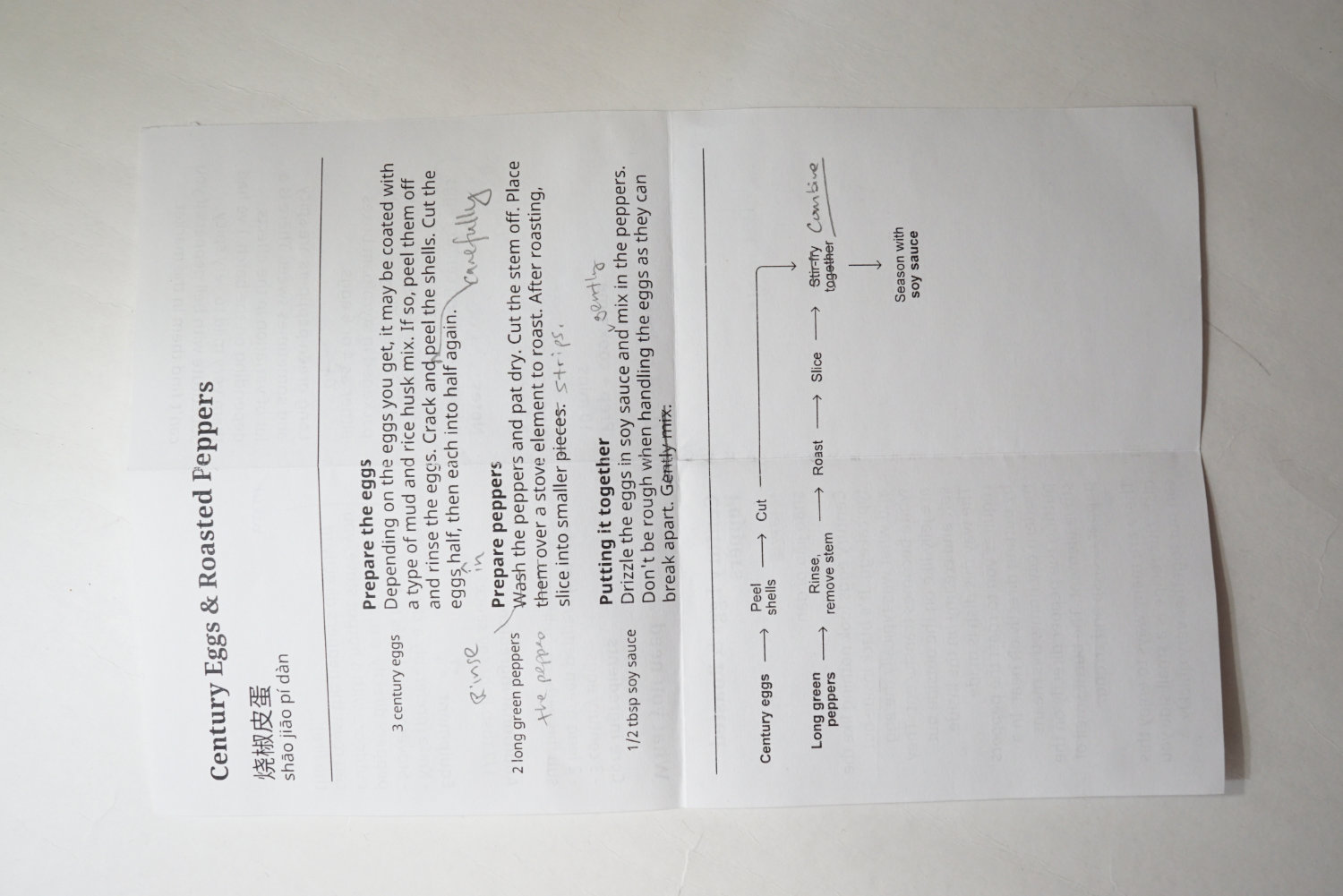
The comments heavily shaped the end result. For the front side, I tried to be as helpful and accurate as possible. I list the ingredients clearly and even included a list for equipment needed. There’s also a section for notes to help identify where to source the ingredients.
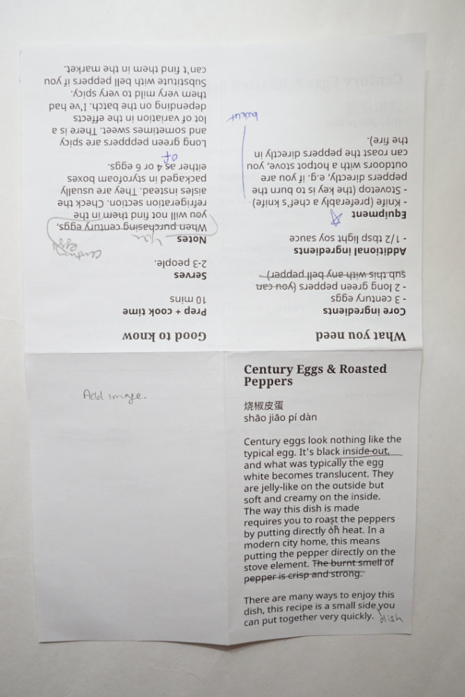
The back lists the ingredients in the order they are needed. In bold, each step is summarized. Finally, there’s a summary of the instructions at the bottom.
The idea for the summary came from a website called Cooking For Engineers. As I was doing some research on cookbooks. A lot of people recommended this as a great resource to learn how to cook.
This is a very smart way to summarize what a recipe needs. I think something like this is helpful for people who want to reference back a recipe but don’t want to comb through all the text. Recipes can get wordy and I think we could do better to make it easier to read.
I went through several iterations on how to design the summary.
I nailed something I was happy with after several attempts.
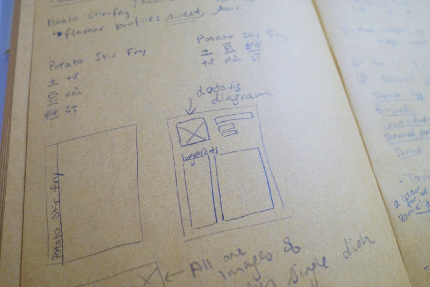
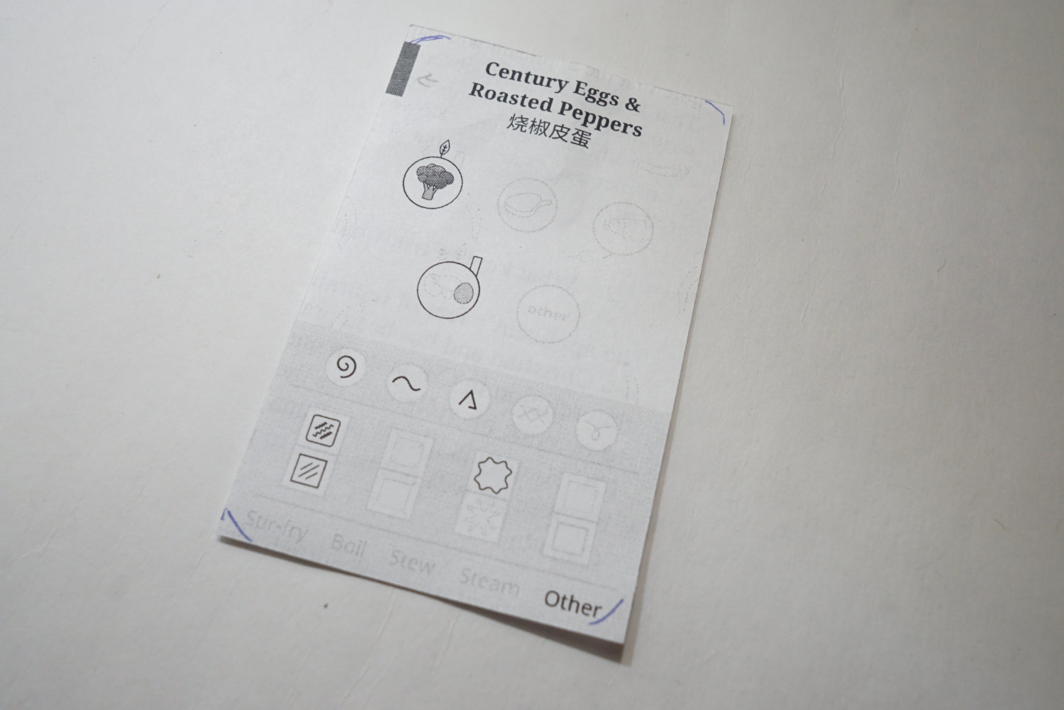
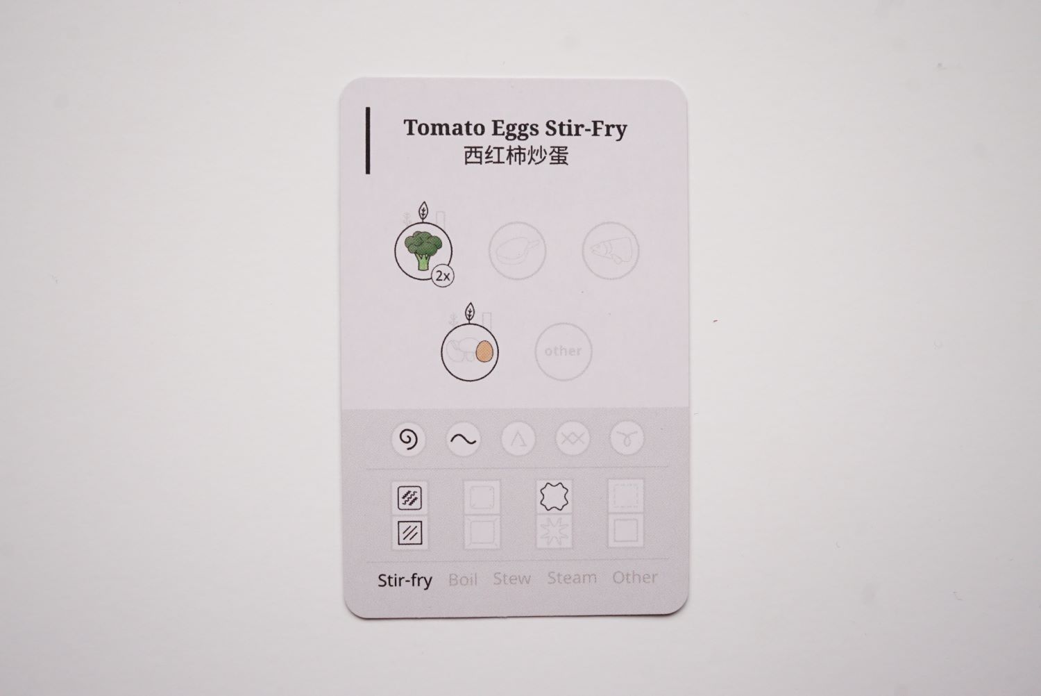
Recipe cards: making a choice on what recipe to try
I had an idea to make an overview of all recipes in a format like a table of contents. Initially in book format, I was going to make a spread that shows all the recipes as a summary through a data visualization.
The reason for creating something like this was because I wanted to help the reader choose a recipe to try. Have you ever been to a fancy restaurant, look at their picture-less menu, and wonder what the heck to order? You read the menu over and over again in hopes that you can extract a bit more information to inform your choice. This experience applies to a cookbook. If you’ve never tried a recipe, how would you know if you want to try it? Maybe you rely on the photo (if there is one) to guide you. But what about our other senses? If you think about your personal experience, why do you cook certain foods over others? Perhaps it’s because you enjoy how it tastes or maybe because it was quick to prepare. I wanted a way to help the reader make a choice.
Since the book format was tossed out the window, I switched to a card format instead. Instead of being confined to a spread with fixed number of recipes I could show, it is now in cards that can have more created at anytime. If I continued with the book format, then I could only show a fixed number of recipes.
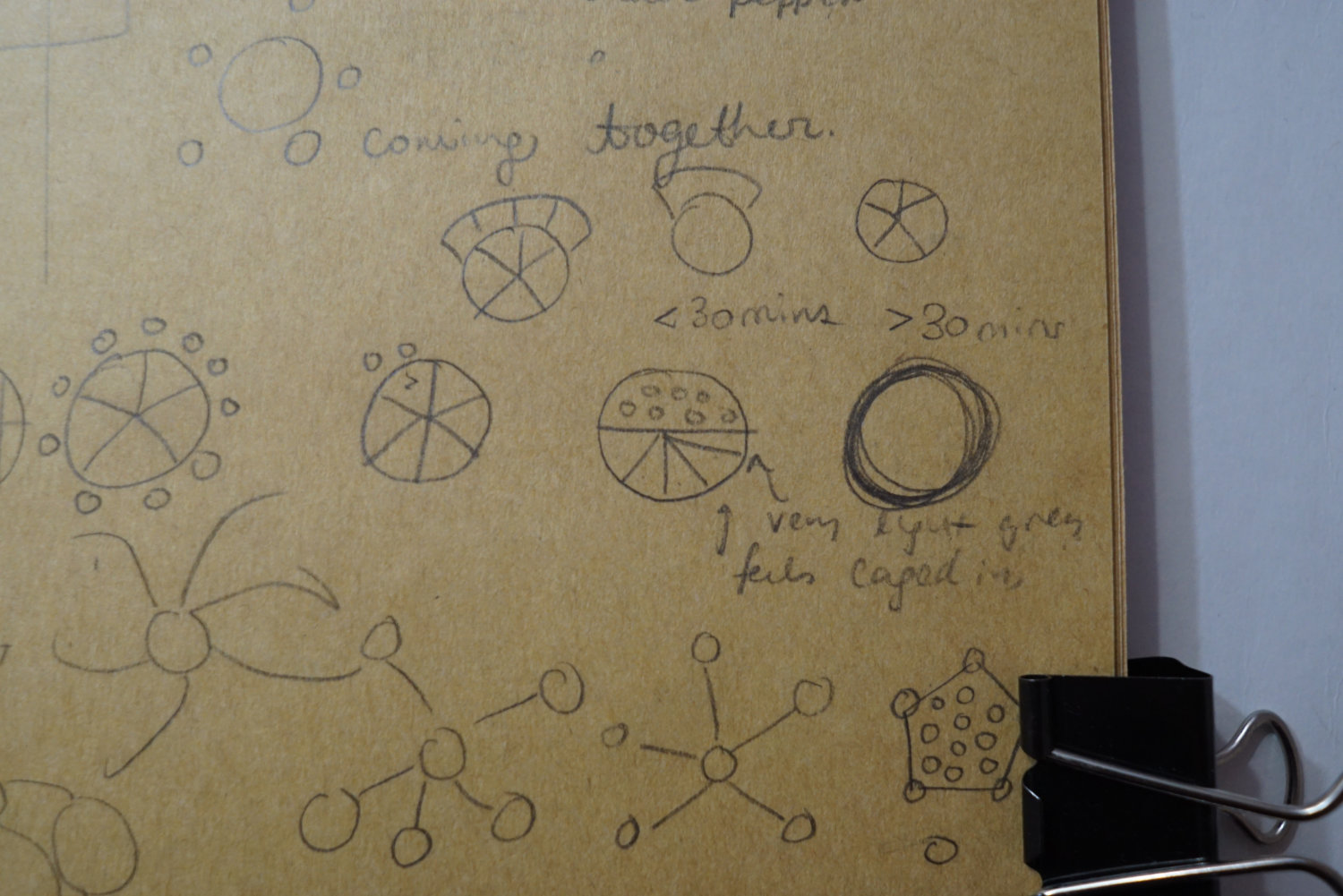
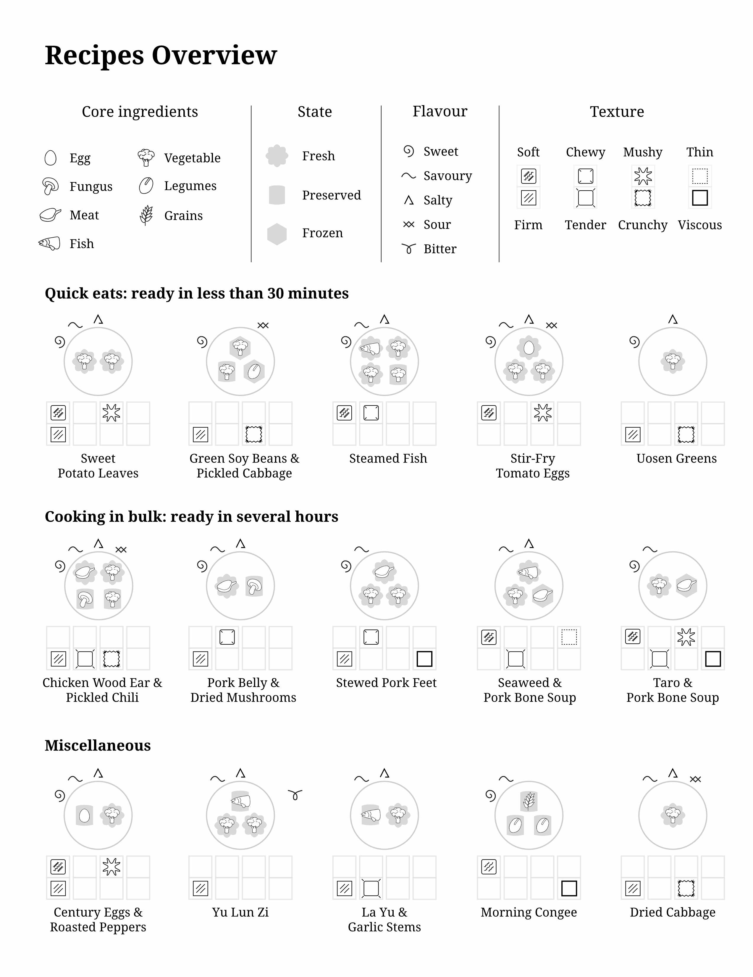
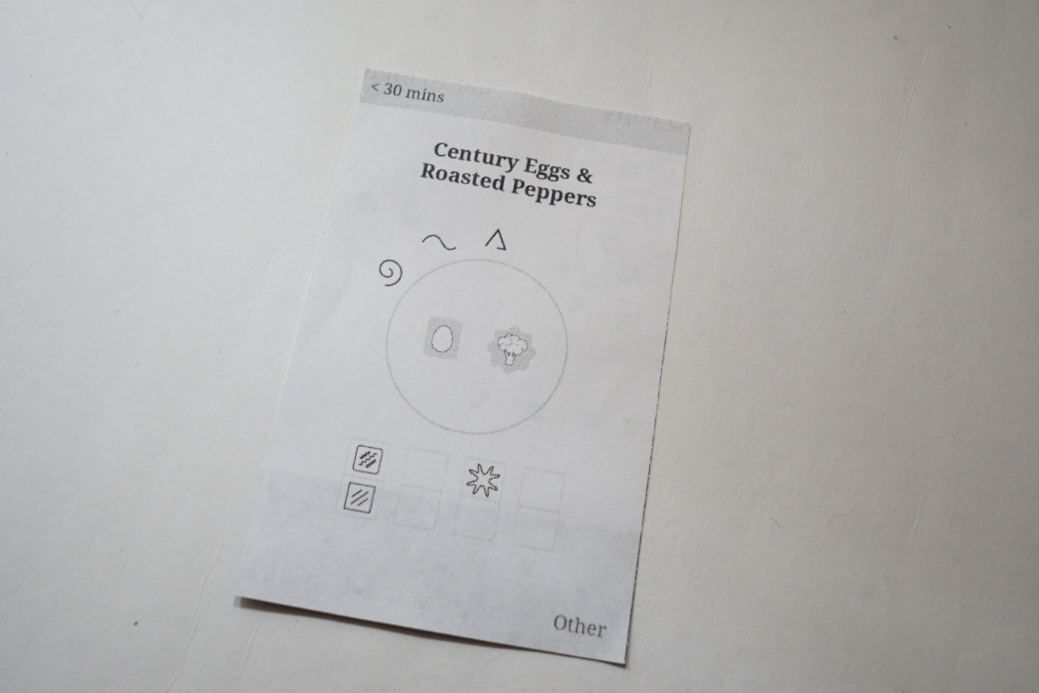
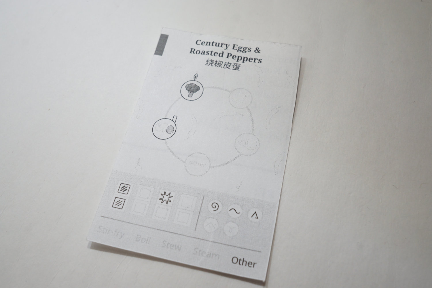
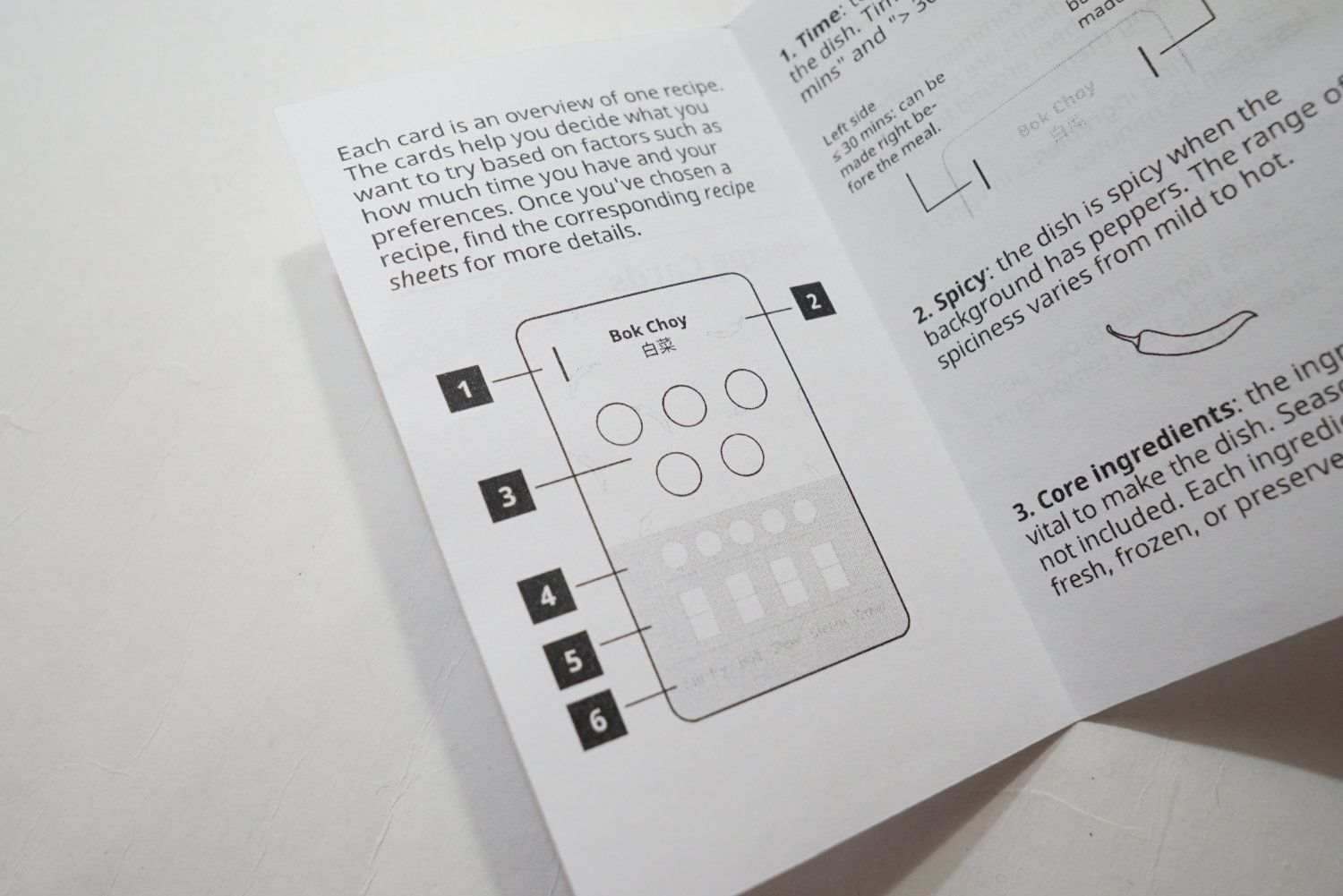
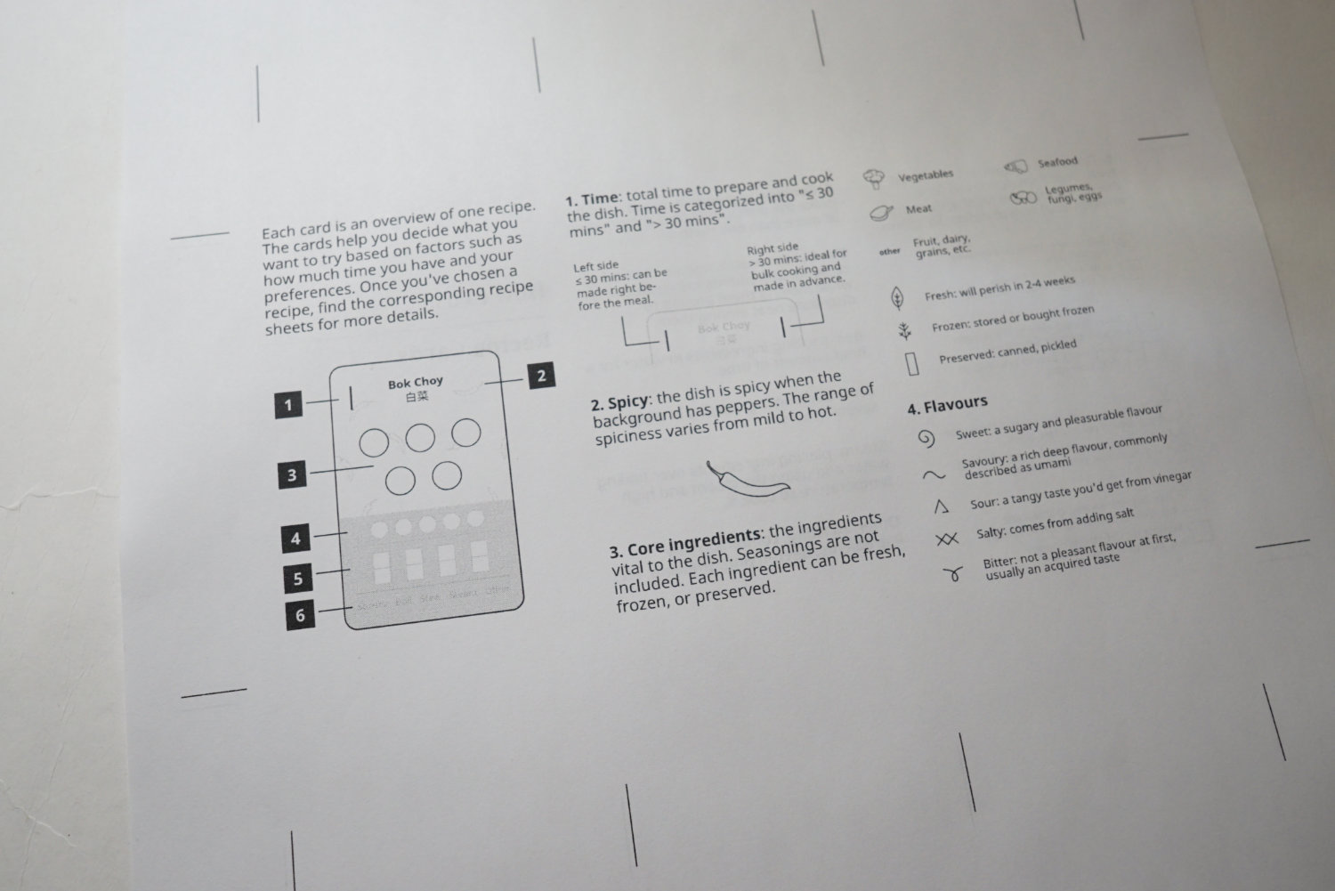
Each card would correspond to one recipe. These cards are a visual summary of what to expect for the recipe in terms of the following variables:
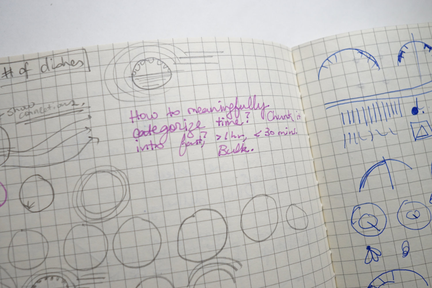
- Time to prepare and cook: I think the critical constraint about trying a recipe is time. Would you have time to make this recipe? In general, I categorize the time into under 30 minutes and over 30 minutes.
- Type of core ingredient (e.g. meat, vegetable, seafood): I think this is important to consider for dietary restrictions.
- Number of core ingredients:
- State of ingredients (e.g. fresh, frozen, preserved): This is an important consideration for convenience. If the recipe calls for fresh ingredients, then you should prepare them within the week of purchasing the ingredients. If it uses some preserved ingredients such as pickled vegetables, then you can plan your meals that could last for a couple of weeks.
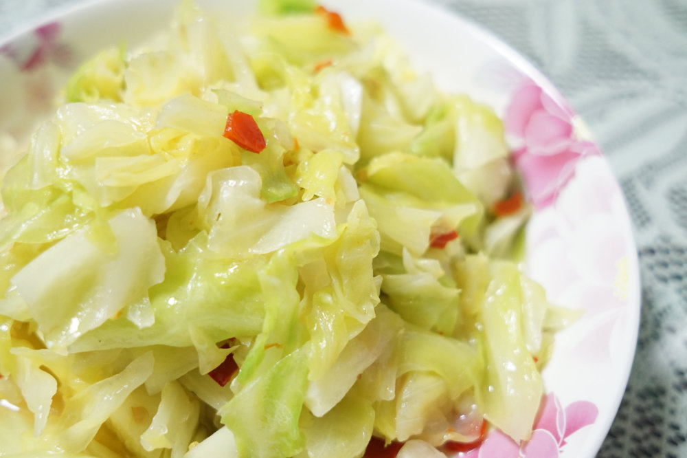
- Flavours & texture: Personally, I think these two determine what we desire to eat. It’s something that drives cravings. A good crunch from a lightly fried cabbage has a very satisfying feel to it. Or the sweetness of a taro stew.
- Cooking method: A good way to indicate what kind of equipment might be needed. Stir-fries call for a wok. Stews call for a large pot.
- Spiciness: Most Hunan food is spicy. So mentioning this is a good heads-up on what to expect.
Everything about these cards is meant to help you make a choice about which recipe to try.
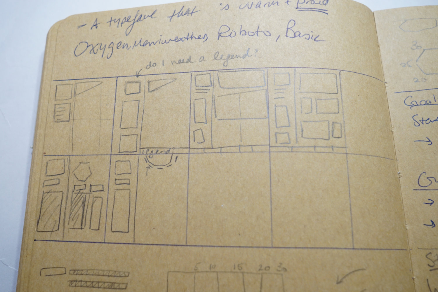
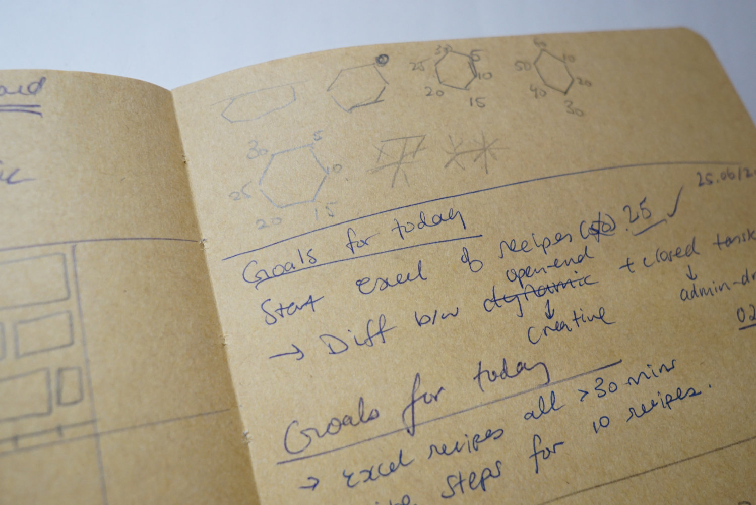
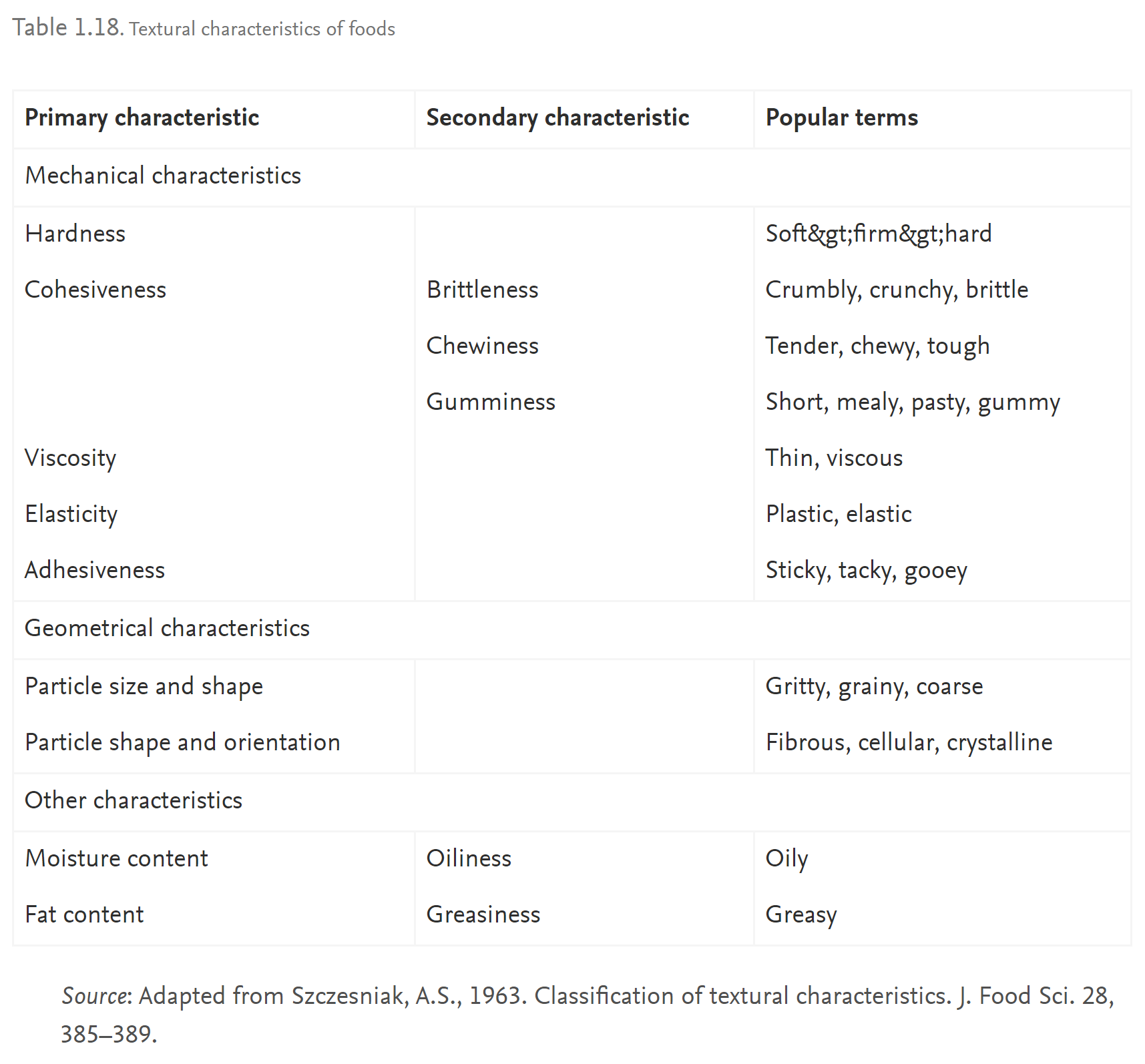
On a side note, I did A LOT of research on how to categorize textures. I found a very helpful list from a research paper on ScienceDirect:
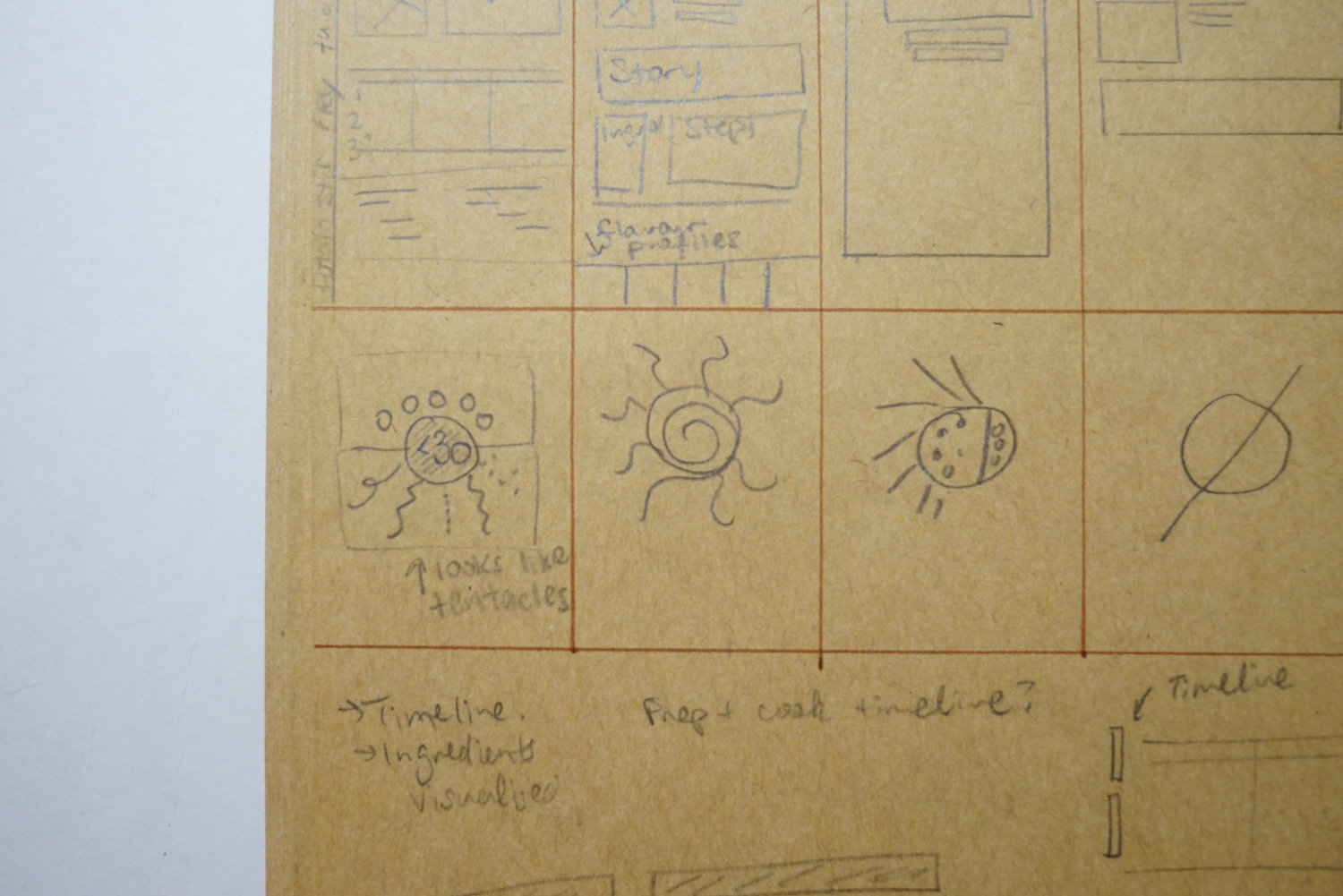
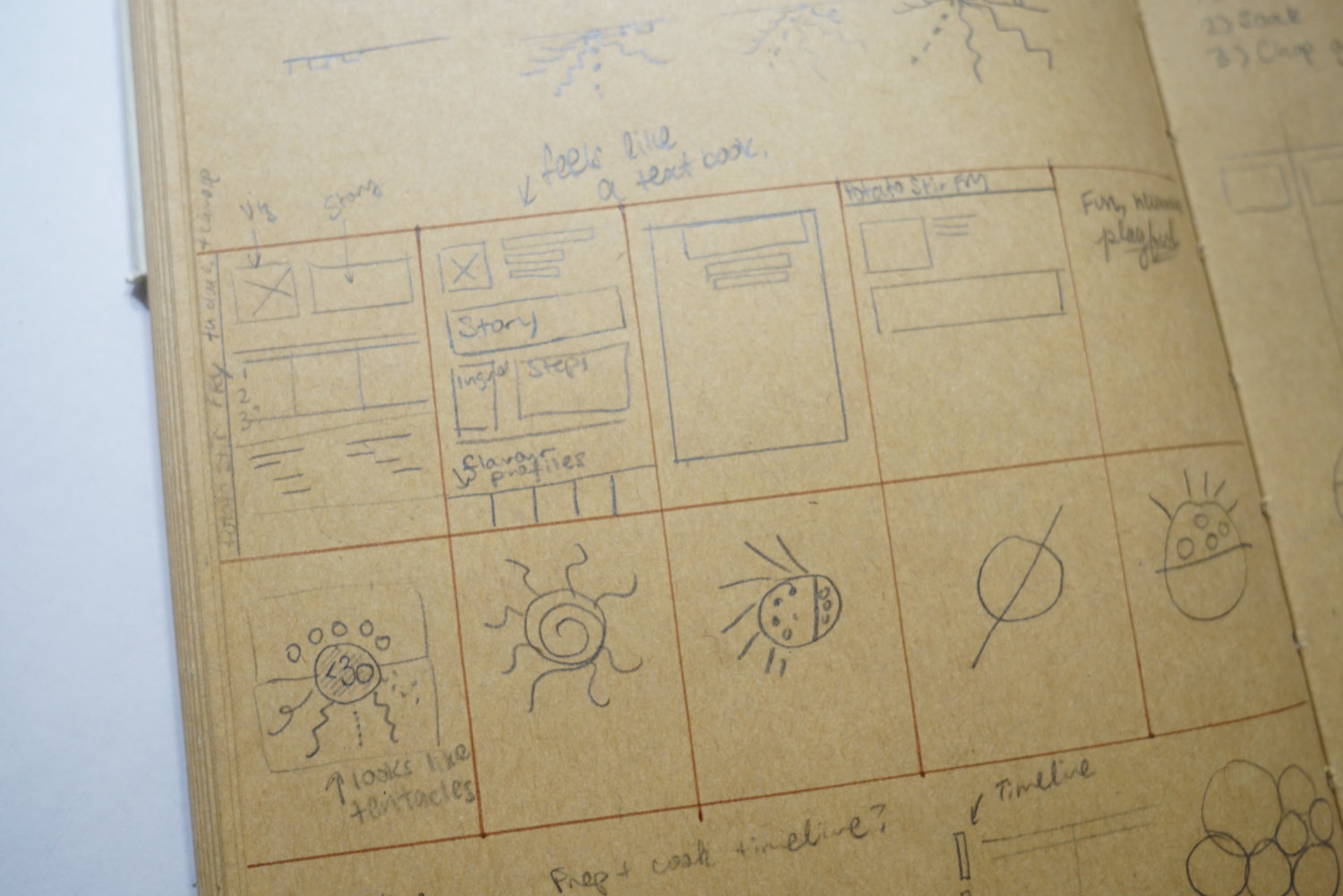
I tested a couple of designs to see what I’d come up with. They weren’t elegant and it felt too crowded.
The second iteration was when I was thinking more about hierarchy. Iteration 1 was very unclear about this. Where should your eyes focus first? Why were flavours more important than texture? I considered them to be equal so I moved them to the same section. I gave more prominence to the core ingredients.
The third iteration was where everything clicked. The layout and hierarchy felt just right. I had a lot of awkward white space in iteration 2 and the bottom section was too small. I guess third time is the charm. In the Tekken project, everything also clicked on iteration 3.
Through this project, I learned to draw with a tablet. This was something I’ve always wanted to do. I bought a simple Huion tablet, the Inspiroy H640P. I learned to use the tablet and traced over pictures I pulled from the internet. I eventually got the hang of it and drew all the illustrations for my cards. They aren’t great, but they will do.

The aspect of home cooking has a very human feel to it. It’s not mechanical and it has warmth to it. Learning to draw with the tablet on Illustrator.
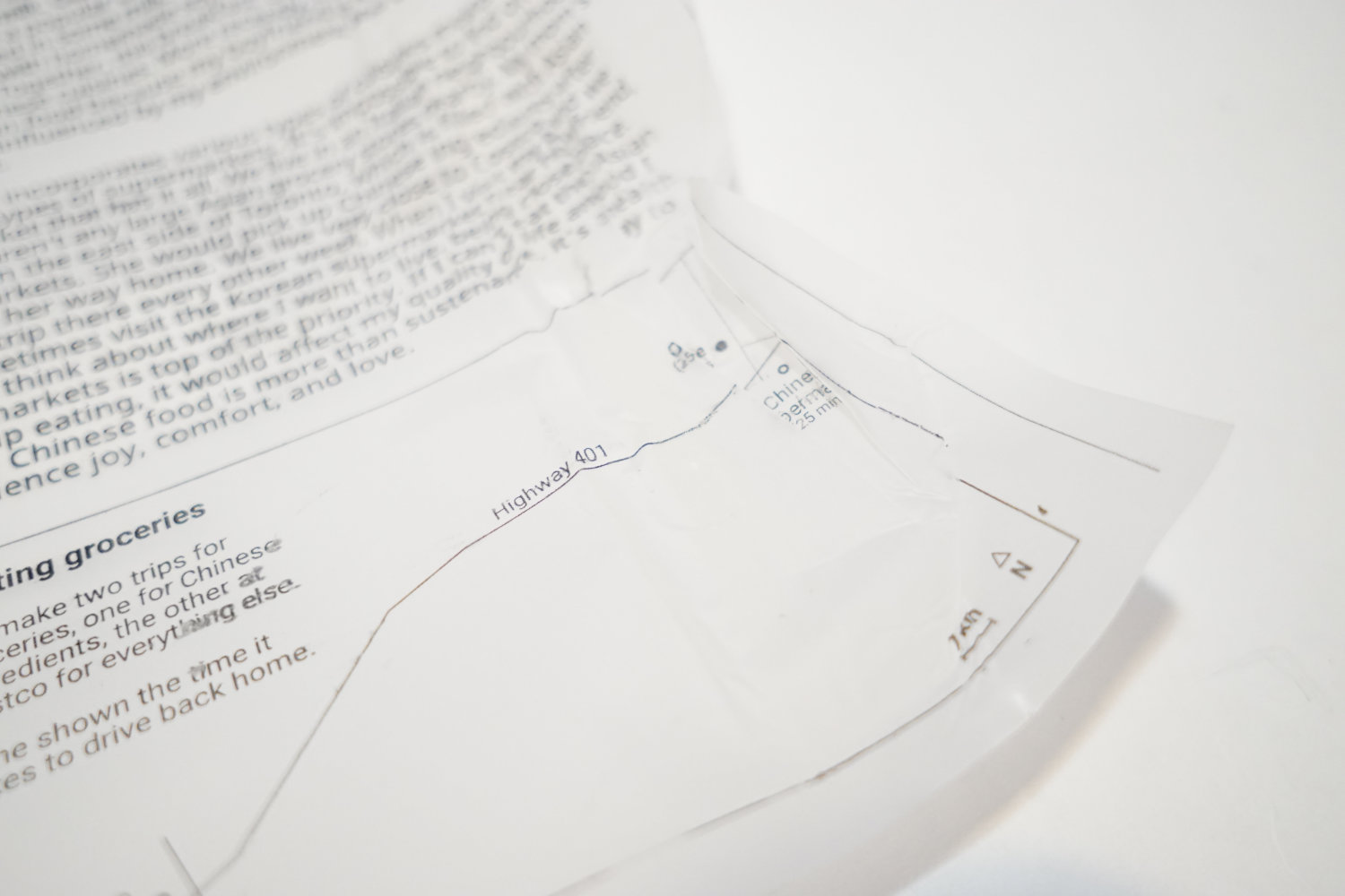
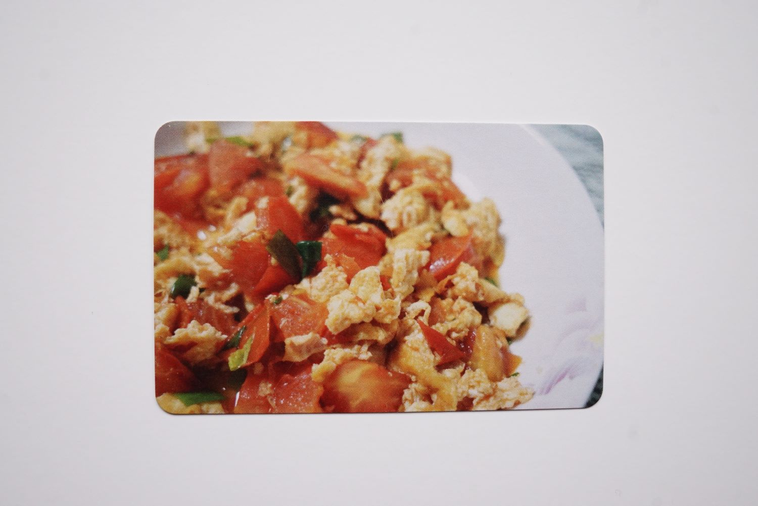
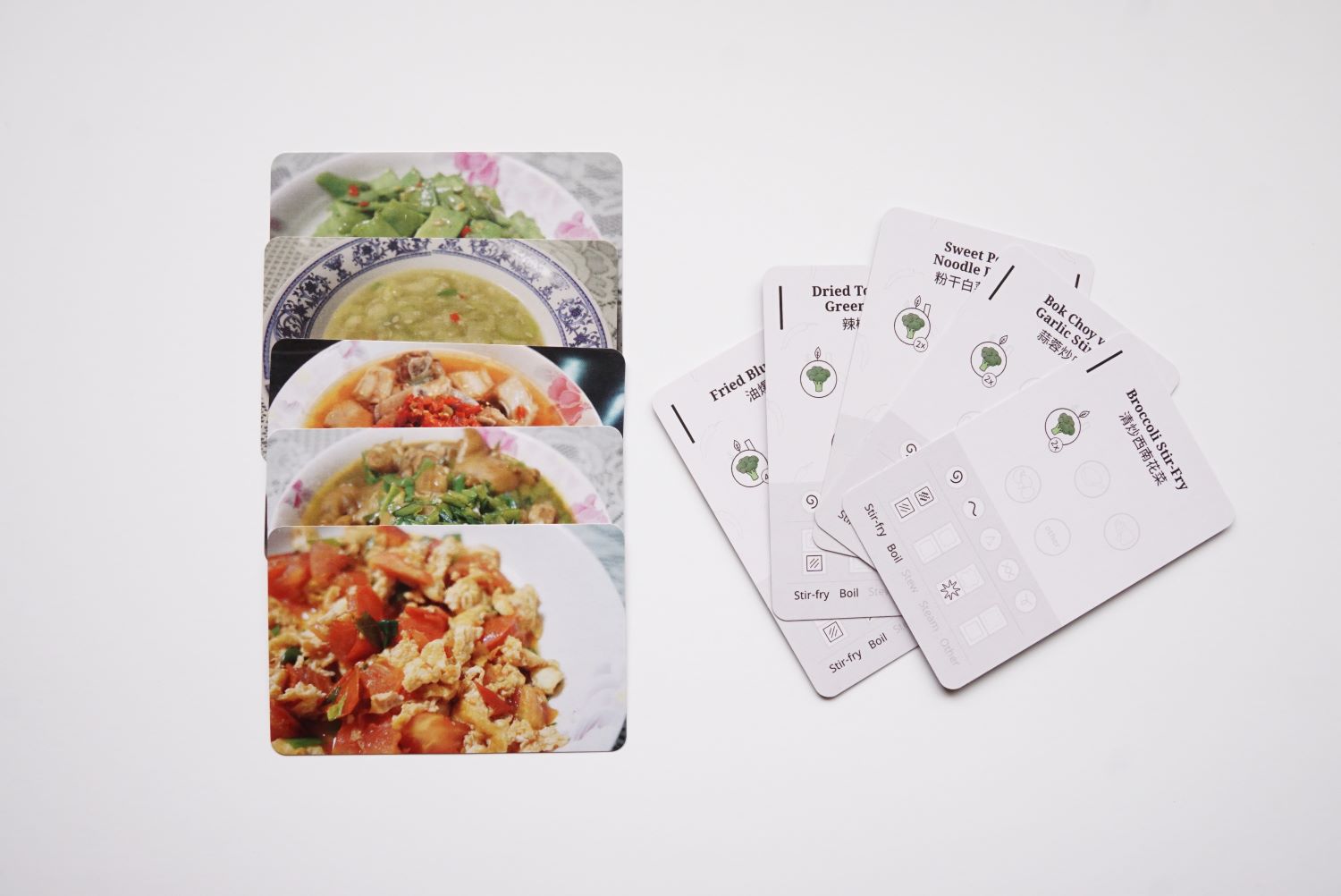
The back of the cards would be the image of the dish. I spent several weeks taking photos of what we ate. I had a lot of practice taking food photos. There’s some art to it for sure.
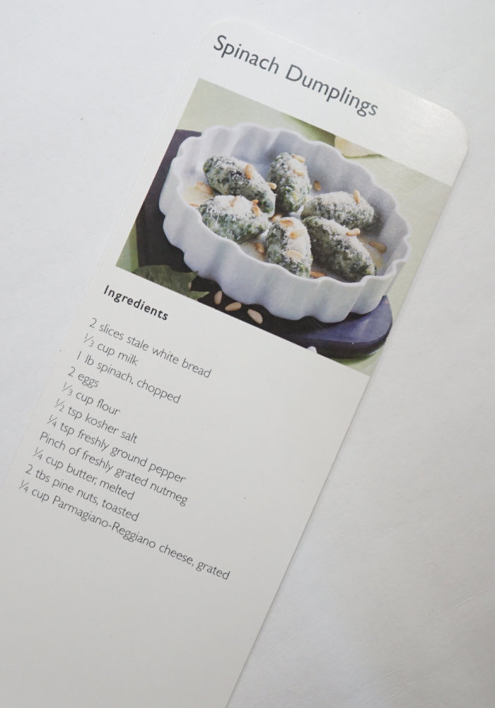
The final result surpassed my expectations. Here’s the front and back of one of the cards.
Legend for the recipe sheets and cards
For the recipe sheets and the recipe cards, they both have the same type of legend. A 3-panel accordion brochure. I printed both of these on my printer.
The inspiration came from the brochures I got from notebooks I purchased in the past.
I didn’t bother to get these printed at a print shop. They were designed to be done at home. It was tough to print double-sided while aligning the content of the front with the back.
Did you know that if you print double-sided, they aren't going to line up exactly. I printed the same page on both sides. If you look closely, it's off. I had to adjust for this when printing.
Production of recipe sheets and cards
For the recipe sheets, I printed them at home on my black and white printer. This didn’t need to be anything fancy.
For the cards, I had a hard time finding a vendor that could do the job. For my Tekken project, I printed it through a local shop (The Print House). I paid about $20 CAD for 10 cards to be printed on one side. I was aiming to eventually print maybe 100 of these cards so I needed something more budget friendly. When I looked at traditional print houses, the only option they had for printing cards were usually business cards, and they all had the same back and front. My search eventually led me to a vendor in Hong Kong. Is was hard for me to believe, but the only vendor I could find was on the other side of the world. They’re called BoardGamesMaker and they specialize in producing boardgames. For my purposes, they were perfect. No minimum order and even with shipping, it was a lot cheaper to use their services than my local shop. Their website makes it easy for me to upload my files and keep track of my project. For 36 cards (double-sided with rounded corners), I paid about $15 CAD for it, and it was about $12 CAD for shipping. Each card had a different front and back image. In total, I was looking at $27 CAD for a deck of 36 cards.
| Local printer | Hong Kong printer | |
|---|---|---|
| Number of cards | 10 | 36 |
| Sides | Single-sided | Double-sided |
| Price | $20 | $15 |
| Shipping | $0 | $12 |
| Total | $20 | $27 |
I was extremely happy with the final result. The quality was beyond my expectations for the price I paid. The card stock was quite thick and the finish is nice and smooth. It took about one month for the cards to arrive. The package had tracking so I could see where it was at any point of time. I suspect due to the pandemic, it might have made shipping longer than needed.
Leaving something behind
I went through a rough cycle of creativity completing this project. It dragged on for 12 months. Too long in my opinion. But due to the scope, it was hard to get it going. I managed to ‘complete’ it by making smaller sets. My original goal was to make 100 recipes. I ended up making only a small fraction of this. In total, I had 36 recipe cards, and wrote 6 corresponding recipe sheets. It was more important to me to get something ‘done’ than get everything done. I don’t like to work on something for too long because I could come to resent it. I know how I work and setting a deadline with a reasonable expectation was a healthy way for me to move on from this project. Due to the nature of the format, I could easily add more to it over time. Perhaps I do it in batches, another 30 recipes within the next year. I can take it slow and develop it as time allows. This project is deeply personal and very meaningful to me. It allowed my skills to blossom while preserving a small part of my family’s history.
One thought that came to me as I was making this project was: “Is this still considered as data visualization?”. I felt like I couldn’t define it as data visualization in a traditional sense since it lacked a lot of the classic charts you see. Yet, it was quantifying data. It was a weird moment to think about my work like this and it has prompted me to consider how I define my work.