Home / Blog
Why I'm Finally Learning to Draw
I've hit a roadblock in my dataviz creative process, so I set on a journey to learn how to draw. I embark on this new challenge motivated by my love of historical Chinese TV shows.
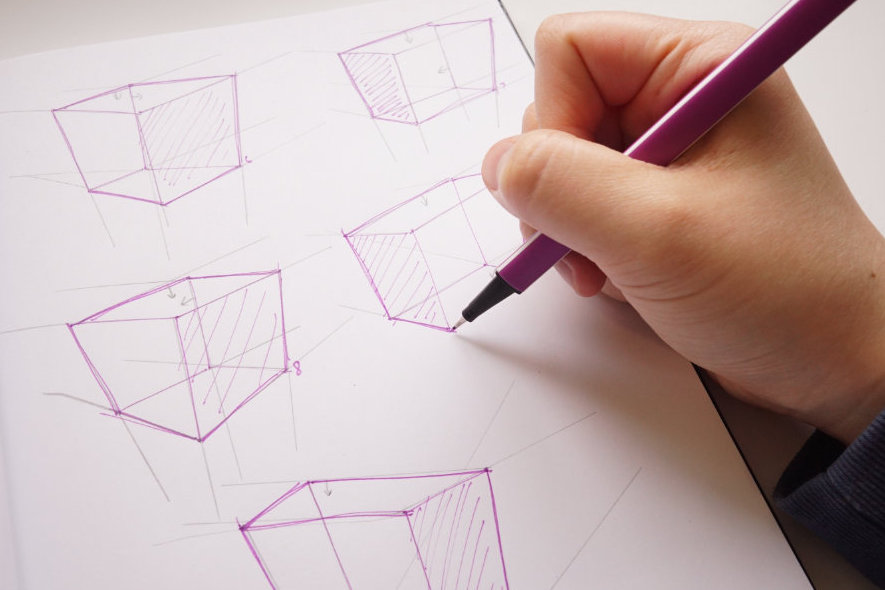
Table of contents
Looking at my past work
When I take an honest look at my recent work, it looks very logical. It is made up of simple shapes that work together to communicate information.
My recent work. Left: Tekken project. Right: The Food Your Grandmother Ate.
I’ve always felt that something was missing in my work. I was hitting a wall and I just couldn’t figure out what it was. I could never pin it down. One guess is that perhaps it lacked beauty. Beauty is definitely in the eye of the beholder, but I still think that most people can agree on something looking beautiful. I’ve never been good at making beautiful work. I struggle to put together interesting layouts and applying typography in compelling ways. It’s a shortcoming I feel severely insecure about. I always tell myself the same boring excuse: “I’ve never gone to graphic design school”, or “I’m not artistic enough”. The thing is, I know the principles of design well enough to make something that looks good, but not great. When I see beautiful work by other designers, I realize that I still have so much to learn. Despite calling myself a “designer”, I never felt like one. Recently, I’ve been pretty tired of telling myself I can’t make beautiful work just because I’m not capable enough. So, I am attempting to address this by learning how to draw.
Getting better at design through analogue methods
A question I often get asked by dataviz folks is “how do I get better at design?”. I don’t like being asked this question because I don’t have a good answer for it. Heck, I’m still struggling to learn design. People who tend to ask me this question usually entered the design field without any formal design education. In their job, they are valued for their problem-solving and analytical skills, rather than having good design chops. Despite this, they see value in learning visual design but don’t know how to acquire the necessary skills. My go-to recommendation for them is to learn about the fundamental principles of design, such as layout, hierarchy, colour, and typography. It sounds like a lot, and it can be, but you don’t need to learn all of them in-depth to start seeing results. For layout, I can give a 5-minute crash course on how to use a grid and it will solve 90% of common design problems. But, the real question then becomes, how do they wield these principles to put together something visually appealing? That’s a lot harder to teach and I think it’s what people are actually trying to learn when they ask me “how do I get better at design?”. I’m sure they’ve seen creative work by the likes of Giorgia Lupi and wanted to make something similar, something that would make someone stop dead in their tracks to take a moment to admire, something like art.
I took drawing lessons sporadically when I was younger and viewed it nothing more than an extracurricular activity. I was never serious about it until I was studying design strategy as part of my postgraduate studies. I had a classmate who was an industrial designer and he sat behind me in the studio. He was the first person to show me the ropes of drawing to communicate (for context, I went into this design program straight from a science degree). I was in the middle of a group project and we had to show our idea visually. I struggled to draw it on paper and wondered how to get it done. He was always sketching during class so I thought he might have pointers for me. He introduced me to drawing in perspective and gave me a crash course on how to draw a line with the entire arm, not the wrist. Ever since, I started to draw on my own time to get better. Little by little, I started to see the details of the world around me. Suddenly, a new lens was added to my life.
In case you didn’t know, perspective is what gives a three-dimensional feeling to a flat image such as a drawing or a painting. In art, it is a system of representing the way that objects appear to get smaller and closer together the farther away they are from the viewer.
Source: https://www.liveabout.com/perspective-drawing-definition-1123070
I used to practice drawing while on the subway. In this sketch, I am practicing to draw the chairs in the train in perspective. This sketch was probably from 2016 or 2017.
I used to practice drawing by copying what I saw in front of me. I would pull up an image online and do my best to draw it freehand. Over time, I started to get better at seeing things. I started to notice what was always there. Take the mundane blue sky as an example, if you ever tried to paint it, you will realize that you don’t have enough colours to truly capture it. There are so many shades in the sky and until you try to replicate what nature effortlessly produces, it’s hard to truly appreciate its beauty. Developing skills to draw is extremely important for me to analyze the world around me. There are so many lines in the world I can’t see yet because I am not artistically mature enough.
Design has accelerated into a digital-first industry within the past two decades. The rise of programs such as Adobe has made it extremely easy for people to freely create and edit their creations. Nowadays, the role and the definition of a designer has shifted so much. No longer is it restricted to artistic folks, it is now a job title that is more accessible than ever. You can be in a role that designs websites and know very little about how to draw by hand. And that isn’t a good or bad thing, it’s just a result of what the industry demands. The challenge I see with this is that you can learn all the principles of how to design websites, and struggle to make something that can capture attention. And I think this is because the foundation for analogue practices is missing.
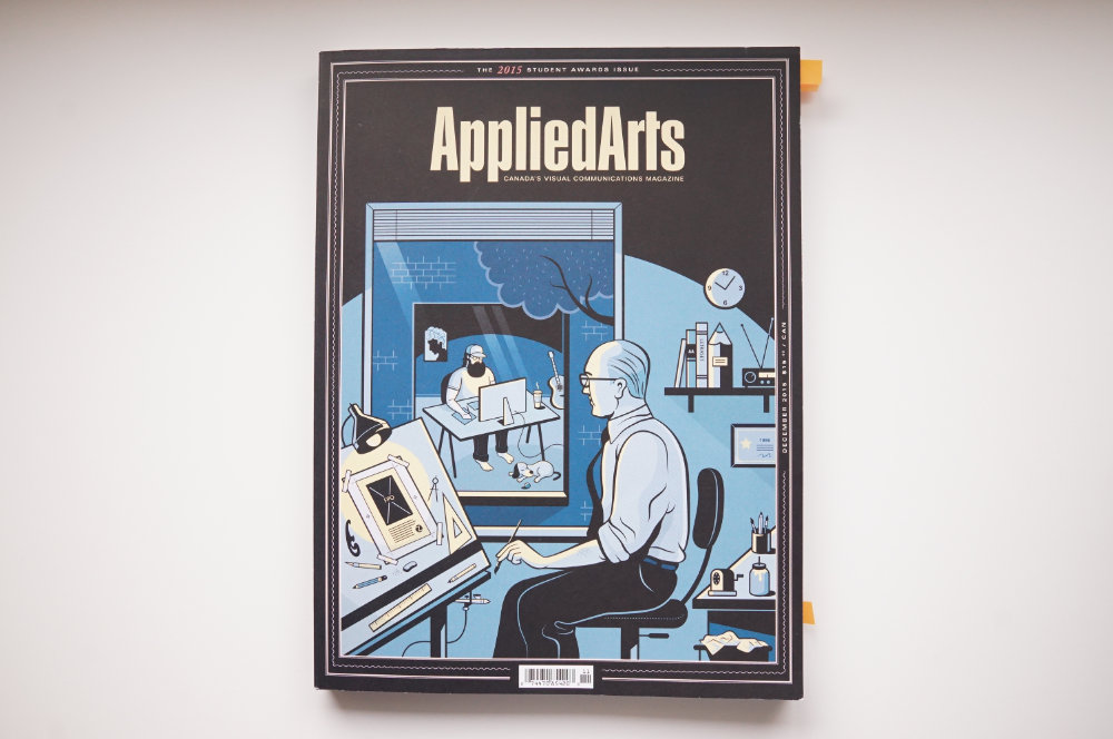
The cover of this 2015 Applied Arts magazine left a deep impression on me. It shows the shifting design industry. Here's the description about the cover: '...Michael Zavacky, McMillan art director and resident illustrator, has crafted a wonderful portrait of the youth and the veteran -- a theme often addressed in our Student Awards annual'.
From my observation of the design industry, the distance between the modern designer and skills in analogue practices has grown wider and wider. Whether or not this is problem is up for debate. Because we can argue that with the way modern professions has progressed, people are better off specializing in a specific skill than trying to amass a wide range of them. Maybe it doesn’t make sense for a web designer to know anything about things like composition, texture, lighting, and so on. But I want to challenge this. I watched a talk by Paula Scher, a partner at Pentagram, about her work redesigning Microsoft Windows logo. At one point during a client meeting, she bluntly asked “Your name is Windows, why are you a flag?”.
Thinking about the metaphor of a window for the Windows logo, she proposed that it made more sense to consider the logo in perspective.
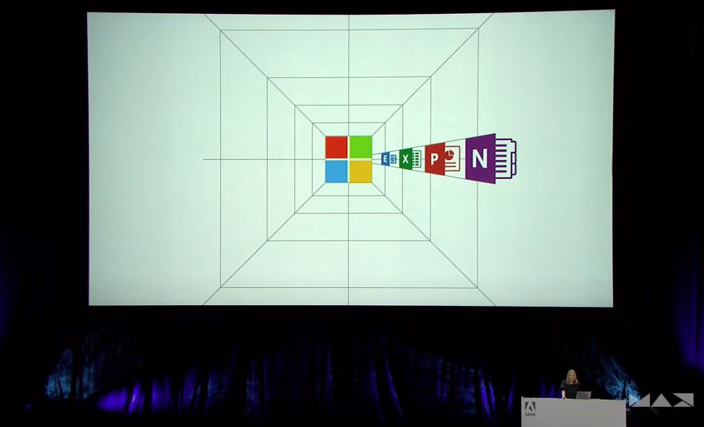
Living, Breathing Brand Identities with Paula Scher at Adobe Max 2020.
What’s super interesting about her calling out the Windows logo looking like a flag is that it feels like something a layperson might casually say. When I first encountered the new Microsoft logo, I didn’t have a strong reaction to it. At the time, I knew nothing about perspective, yet when I saw it, it looked like it still made sense to me. Why? It’s because I have seen an actual window that looks like that before. The idea of a design making sense, even to a layperson, is extremely hard to capture, because it relies on our understanding of how the world works.
This example of Paula Scher and Microsoft was a huge wake-up call for me. I saw what a real expert looked like in the design field. It’s not someone who knows how to use the latest design software, but someone who has fundamental knowledge of how to see the world. Before she was a designer, she was an illustrator, and by default she knew about the principles of how life takes form. And this is something that learning design purely from a digital route cannot teach. It can’t teach us how to see the world. Anyone can create something in perspective on Illustrator with a grid. It’s not hard to do. But to draw it freehand on paper and really understand where each line should go is a completely different story. Analogue practices forces you to think carefully about what you do and be intentional with it. There is no room for error because you can’t just Ctrl+Z it. You can teach a website designer how to add elements to a page, but to teach them where it should go is harder. And I think this is the value of going deeper into the fundamentals of design. I truly believe that making great designs requires an understanding of lighting, composition, form, texture, construction, and so much more. This list isn’t an answer to “how do I get better at design?”, it’s an answer to “how do I get better at representing the world in my design?”.
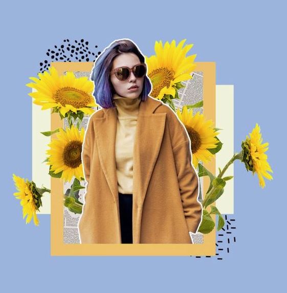
To clarify, when I say analogue, I mean anything that’s not digital: painting, sketching, screen printing, graffiti, sculpture, stop-motion animation, calligraphy, flipbooks, and so on. Say you want to make beautiful collages like the one below, then why not go back to how it used to be created? You can cut out sections from magazines and glue them together. You will learn a lot about composition, contrast, tone, and colour. Say you want to get better at typography, maybe you could try your hand in calligraphy. It will teach you the patience to look at the various curves the type presents.
If you ask me today “how do I get better at design?”, I will still recommend you to study the fundamentals of design because it will help you get the job done. But, if you want to hone a craft and truly master what you do, I will say learn to create offscreen. It will enrich your work and you will develop a deeper understanding of what you’re doing. It might take some time to actually see results, but it will be worth it.
Learning how to learn
Learning a new skill is easier said than done. Although I have some understanding of how to draw, I still have a very long way to go. I don’t have all the fundamentals down and I need to put more mileage into it. Learning to draw is not an easy feat to take on. It’s terribly scary and I am paralyzed by the different paths I could take to learn. But, I am really good at staying focused when I learn on my own. I had a lot of practice when I was teaching myself dataviz skills through my own personal projects. There are two key things I do to make sure I succeed:
- The first is to be personally engaged. If I want to learn anything, I make sure the topic is something I care about.
- The second key thing is to look at learning as an iterative process. I fail a lot, but I don’t let that stop me. There are many times when I hit dead ends or I don’t keep up. I still beat myself over things like this, but I am a bit kinder to myself now. I take a break, and come back to it. I try to change my mindset and view them as opportunities to improve.
To motivate myself to learn to draw, I decided to set a goal of learning to draw traditional Chinese clothing. I have grown up watching a lot of historical Chinese dramas and they continue to be part of my life. The sets and the costumes often take my breath away. This was the perfect topic for me to study. Not only can I study beautiful designs from the past, I can also learn more about my heritage and culture through the clothes. I’ve always wanted to get better at naming the different types of garments in Chinese history and this is the perfect opportunity to do that.
Alright, time to give you some eye candy. Here are some shots pulled from some of the Chinese TV series I’ve watched. They continue to motivate me to get good enough so I can one day draw them by hand.

The story of this show is about how a woman with no education or family background builds a successful business empire. The embroidery in this shot of actress Sun Li's clothes is so beautiful, it does a great job portraying the innocence in her character early in the series. (Nothing Gold Can Stay, 2017).
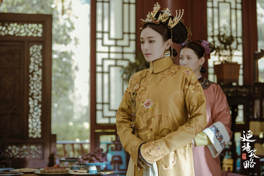
This series is set in the 18th century and has the classic trope of concubines scheming for power in the royal palace. Any series set in a palace always features exquisite costume design filled with beautiful embroidery. Take a close look at her hands, she has fingernail guards on which was a sign of status and power. (Story of Yanxi Palace, 2018).
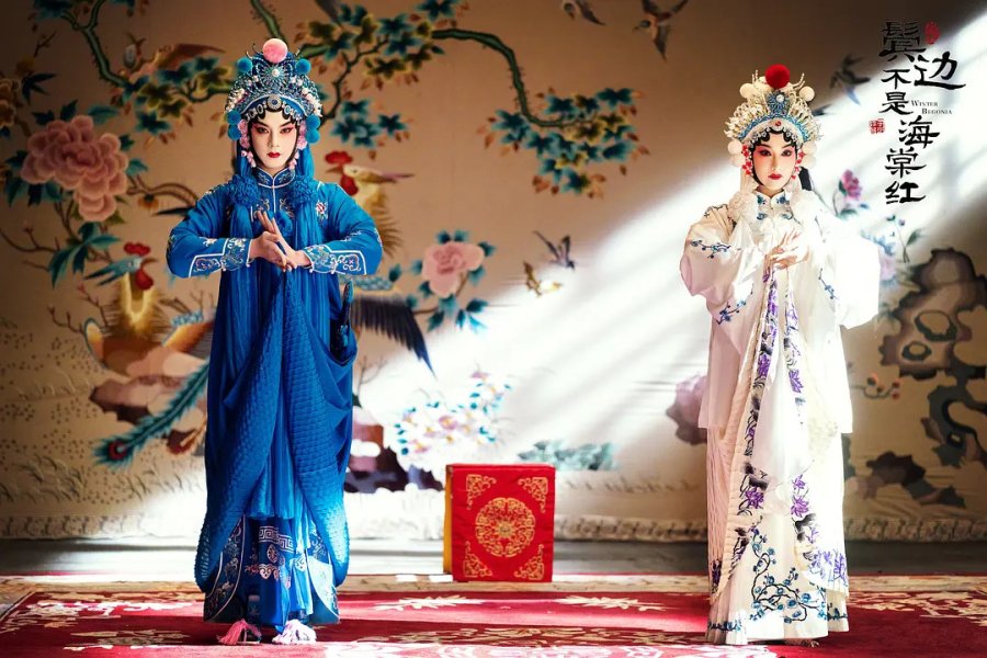
The story in this show centres around Peking opera set in the 1930's. The sets are gorgeous and the detail in the costumes are insane. There were over a hundred costumes that were beaded by hand. (Winter Begonia, 2020).
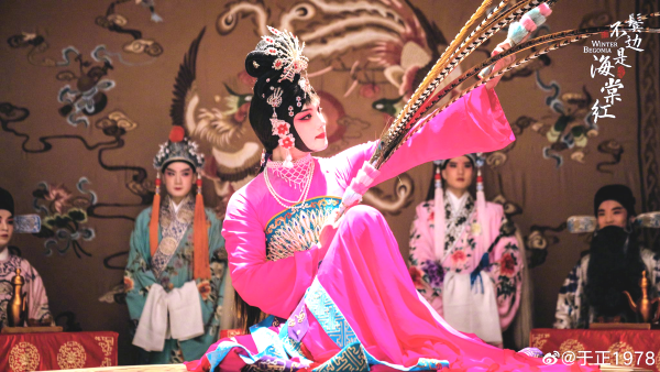
Peking Opera is tradtionally performed by men, this shot shows actor Yin Zheng, the protagonist of the series. He played the role so convincingly well. The production crew also invited well-known opera performers to ensure accurate portrayal of the craft. (Winter Begonia, 2020).
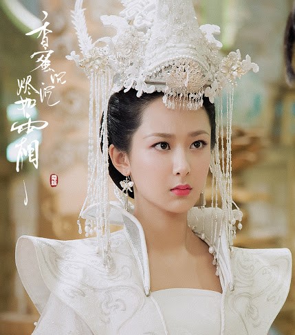
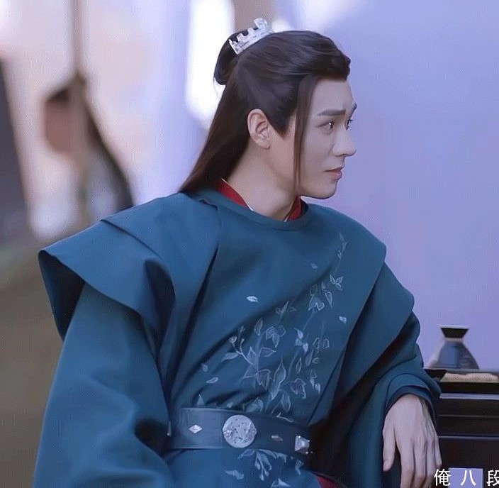
I'm a huge fan of Yang Zi and this was by far one of her most popular xianxia (Chinese fantasy) series. The headpiece is just *chef's kiss*. (Ashes of Love, 2018).
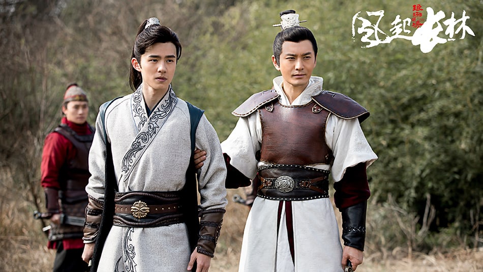
Here's Liu Hao Ran and Huang Xiao Ming acting as brothers from Nirvana in Fire 2. I really appreciated the simplicity in the clothes, it wasn't over-the-top and it still managed to capture their character's personality so well. (Nirvana in Fire 2, 2018).
I fell in love with this piece at first sight, the colours are so well balanced and the way the folds are created around the shoulders adds a nice soft look to it. (Word of Honor, 2021).
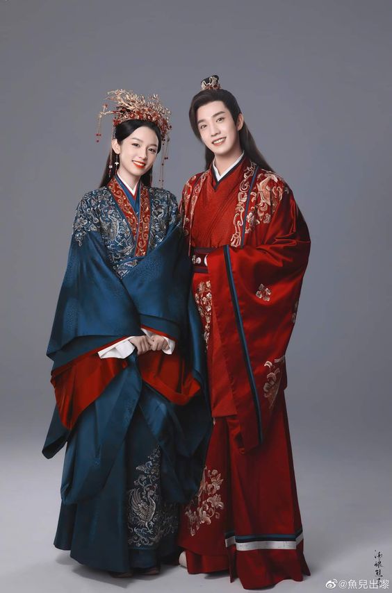
These two got married in the story and this is what they wore for their wedding, *sigh*, it's just so stunning. (Word of Honor, 2021).
Cool, so I have all this inspiration in my life to get me motivated to learn. Time to take action. Around the end of 2020, I made a decision to buckle down and get better at drawing. I’ve always hated structured courses and liked to just dive right into it. The problem with this approach is that my knowledge becomes patched with sporadic gaps. I don’t understand everything I’m doing and I lack a strong foundation. For example, I started off my learning by embarking on a challenge to draw 100 different models. Unsurprisingly, I struggled to see it through.
The drawings I made were lacking and I really struggled to figure out how to improve. The one good thing about an approach like this was that it had lots of short cycles of creation and I was able to very quickly identify my weaknesses. After each drawing, I would make small notes on how to get better the next time. I would also ask questions, such as “what’s the appropriate proportion for a body?”, or “how do I show the nuanced curves of the muscles in the arms and legs?”. I wasn’t able to complete 100 drawings, I quit around the 80th drawing. I knew I needed more structure to scaffold to with my learning, but more importantly, I needed to be part of a community. A very important lesson dataviz taught me was the value of finding people who shared similar problems with me. The establishment of the Data Visualization Society was a pivotal moment in my career. I was no longer on a disconnected island trying to figure it all out by myself. All of a sudden, I was surrounded by people just like me. I applied this same idea to learning to draw. I found one community called Art Fundamentals on Reddit (which is more commonly known as Drawabox). I didn’t immediately check it out at first, but over time, I kept seeing the posts from the community in my feed. People were posting their completed homework almost everyday, I was getting confused. I didn’t realize what the community was about, I thought people just posted stuff they were sketching. I eventually learned about the program. It’s a free resource that teaches the fundamentals of drawing. They have a Patreon page and students can buy credits to get their homework critiqued by the instructor or the teaching assistants.
Since March, I’ve been working through the lessons at a slow pace at night. I completed lesson 1 by mid-April and I just started the 250 box challenge 😲. This challenge is the real deal and I’ve seen many comments from other students on how it drastically improved their ability to draw. It’s going to be a while before I can start lesson 2. The instructor emphasized multiple times that the lessons were extremely dense and it requires consistent effort to finish it. Welp, I still watch lots of Chinese dramas so that’s going to keep me motivated to see this through lol.

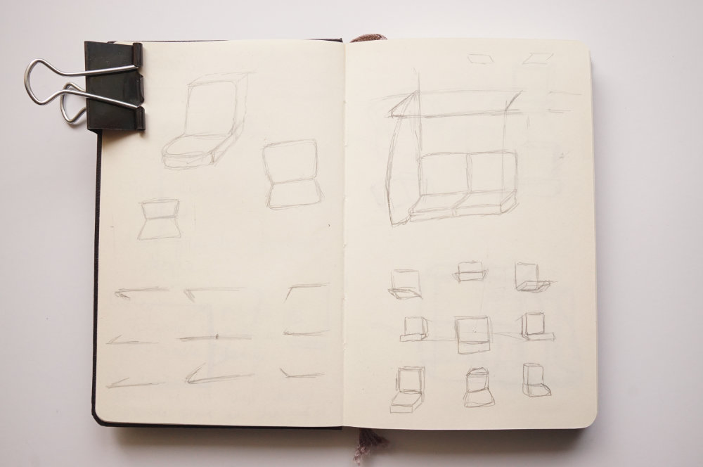
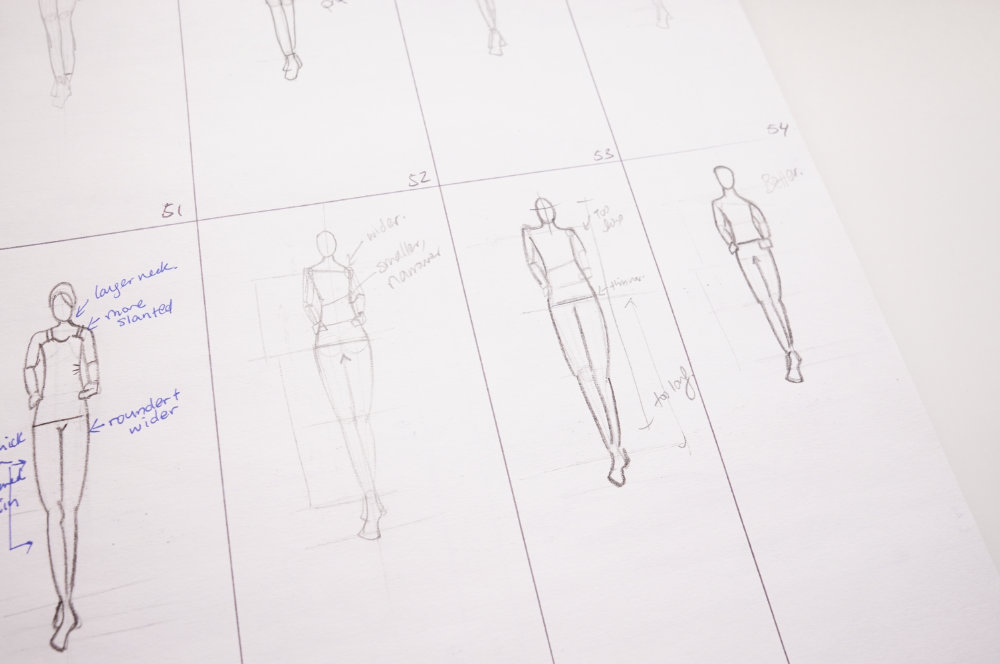
My 250 box challenge. As you can see, I have a long way to go. As of writing this post, I have just finished drawing 20 boxes.
Conquering my fear
Does it matter if my work is beautiful or not? I wonder this from time to time. If my work can effectively solve a problem, why should it matter if it looks beautiful or not? After sitting down to write this blog post and thinking more deeply about what’s missing in my work, I think the problem is more generic.
When I start to sketch shapes to represent data, I become hesitant. I pick up my pencil, but then I immediately put it down and proceed to stare at the blank page. I am paralyzed with fear. I restlessly pace in my room as I try to figure out what to sketch. And the fear I have is a fear of expression. I’ve only become aware of it recently. It’s an odd thing to notice. Even when I look at the type of things I used to draw for practice, I only copied existing pieces of work because that felt safe. I never created from my imagination and that frustration bottled up with every encounter of a blank page. It was as though there was a cap put on me and I just needed to find a way to loosen it to release something.
Maybe I realized my fear when I saw the video below by the instructor from Drawabox. It was what convinced me that he was credible and he actually knew how to teach drawing. He has a total of 8 lessons. The first one you go through is called “Lesson 0: Getting Started”. This lesson talks about the mindset of an artist, such how to overcome the fear of a blank page and finding ways to enjoy the act of drawing.
These are things that I can relate to from dataviz design. I have a lot of fear when I work on a new project and it often feels too overwhelming as I start. I think the hardest part of doing anything creative is overcoming the voice inside our head that advocates for us to believe we can’t. It’s a really hard battle to have because it’s so easy to succumb to giving up. The fact this instructor spent a huge section talking about this makes me think he truly understands what his students pain points are. There’s one practice he makes mandatory for all his students, it’s called the 50% rule. As an artist, he emphasizes the importance of spending 50% of your time to freely create for the sake of it. This really spoke to me as a dataviz designer. I have made a hobby into a career and that has taken the desire to create out of it. I hesitate a lot and second guess my design choices. It’s tiring and it’s made me realize that I need to find more ways to have a creative outlet that’s just for me. Not for work or for an audience. Just for me.
Maybe if I learn to draw, it can help me overcome my fear a bit. It might help me find something that I was afraid to tap into all these years. Perhaps it’s learning how to express my emotions. It’s a tough thing to talk about, I come from a family that didn’t show affection too much. When my friends used to hug me in high school as a way to greet me, I would freeze not knowing what to do. Of course, I learned to hug back, but it gives you an idea of where my starting point was.
I’ve always hated being complacent. I try to come up with interesting and new ways to do something. It’s the only way to keep me engaged. I’ve done lots of work on the practical side of my work. I’ve worked out the aspects of problem-solving and I have a process in place to make something that people will find useful. Now, I want to also find ways for my work to evoke more emotion visually. When it comes to the story of my pieces, it has deep meaning and purpose, but I am not good at reflecting that visually. I think if I can figure this out, I can break through my challenges and overcome my fear. Who knows, this might be the start of a new style, or maybe, a new me.